Articulate has launched yet another Storyline 360 update and we are pretty darn happy about this one!
You can read the whole release details here.
But let’s get back to why are we so stoked about this one! Do you think it’s 360° images? They are cool and we actually took a careful look at them. But we’ll get back to that later on as it isn’t the thing we were most excited about!
Modern player customisation
Yepp, that’s right, that is the most exciting thing for us and hopefully you too! When we started to use Storyline, switching to the custom navigation and menu was the first thing we did. Simply, because we felt the player didn’t go particularly well with the visual style and content of our courses and templates. However, our mindset changed when we started to use SL360 and got introduced to the Modern player.
Modern player has great features that we appreciate and want to use, for example, accessibility tools and built-in menu. Mostly, it has a sleek, minimal and, yes, modern design. We must admit, if the Classic design stood out, the Modern one blends beautifully with almost any course.
However, as it had just two options – Dark and Light, sometimes it felt too bold. Mainly – we felt that the white one is more appealing but we also tend to use plain white background a lot. The white slide background blending in with the player wasn’t something we looked for.
The new customisation options allow us to combine the sleek look of the modern player with any course or template theme colours.
360° photos
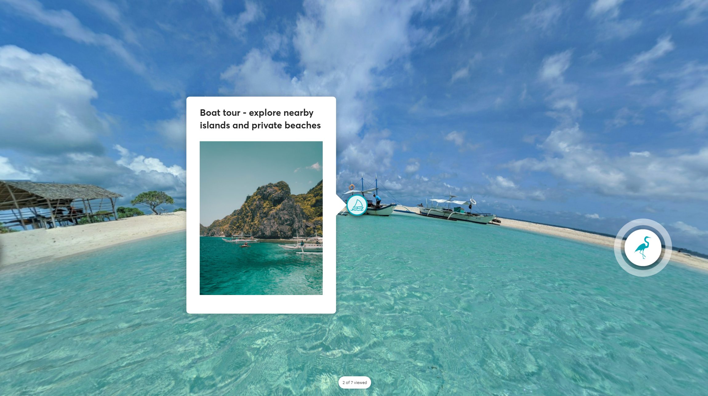
We admit, at first we didn’t really understand or see the appeal of 360° photos. However, we played with them a bit and now we can see how they can play a significant role in engaging learners. We quickly created a few slides, exploring the options new update lets us enjoy.
You can see our quick creation below:
So, now the most important – what is great and what could be better?
We know this is a Beta function at this point. Most likely, we can hope for improvements or changes when the final version is released. We also know we haven’t tested and played with this function for a long while – just a day or two, so there can be a lot of space for us to still learn new functions or broader scope on how to use the ones we’ve discovered. However, here is our summary of things we have discovered so far:
What’s great:
- 360° images are a quick way to make awesome stuff!
- Built-in markers and hotspots allow creating effortless popups in seconds.
- Triggers are a nice addition, however, they are quite limited. We hope there will be more triggers that could interact with 360 images.
- The Content library has a huge collection of different icons to use within 360° image.
- It is nice that markers and hotspot popups can be adjusted. However, the scope of the settings could be improved.
What’s not that great:
- It seems Ctrl+Z or Undo/Redo aren’t working in the “Edit 360° image” view.
- Published course loads rather slowly and sometimes you see a blank screen where the 360° image should be. It doesn’t have this problem if a course doesn’t contain 360° images.
- Currently, it seems that only font type, size and colour can be changed for the built-in popups. It would be great if multiple text blocks or media blocks could be inserted in one popup.
- It is not possible to select multiple popups or multiple elements when editing content within 360° image.
- Right now it is not possible to add other elements in the 360° images, only on top of it. When doing this, those elements (like custom navigation or button for another popup) do not stay in a specific position within the image, but always hover on top of it.
- It is possible to choose icons (for the markers) only from the ones Storyline offers, it isn’t possible to add our own. As we typically create our own icons, this isn’t the greatest news for us.
- Formatting options are sort of confusing and lacks broader choices. Right now because it is not possible to style elements differently within one 360° images. It is not possible to change colours of individual popups, only choose between light/dark themes or rounded/sharp corners for all of them. But you can change colours or icons for separate markers.
- There is not an option to change the ring around the marker – to remove it or at least change transparency or size.
- If the marker or hotspot is placed on the lower side of the image, sometimes it is impossible to see the full popup text.
- Looks like the built-in popup title will always stay bolded even if it was taken off.
Overall conclusion
As always, we are excited when Articulate introduces new products or features within their products. Articulate Storyline 360° is one of the main tools we work with on a daily basis, therefore we welcome updates with open arms. Modern player customisation was long-awaited, same as with some very needed bug fixes. Of course, accessibility improvements are always a must!
However, not surprisingly the most noticeable change is the 360° images. Also, as previously mentioned, we understand 360° images is a beta feature right now, so it could look quite different later on. It is likely (and hopeful) that in a year or so none of the items in the “Not that great” list would be still relevant!
Comments