For quite some time users have impatiently waited for Articulate Storyline to have responsive features. And in the end of 2016, the responsive features were delivered with new Articulate Storyline 360!
Storyline 360 is a part of all-included subscription pack named Articulate 360. It contains all tools you need for creating various types of e-learning content.
The new Articulate 360 package is ready for responsive courses. It comes with a product named Rise which helps you to create fully responsive courses by using pre-made design samples. It is a really fast, super easy and simple way to create courses as you only need a web browser and a content to work with. The pre-made design allows to create fully responsive courses in no time and they work great on all mobile devices.
Though if you are just like us and are using the Storyline on the everyday basis, and like to customize your courses, the Storyline 360 comes with great features for responsive course making as well:
Responsive player
The new Storyline 360 comes with the refurbished player which has 5 layouts, based on the device the course is being watched on. If the course is played on a computer, it has the traditional Storyline all-around player with sidebars. On previous versions of Storyline, if the learner was watching the same course on a mobile device, for example, iPad or smartphone, he saw the same course and player but scaled in size so they could fit the window. That ended up by taking the all needed screen space and filling it up with storyline built-in elements and leaving a smaller space for the actual course.
The new player on mobile devices has a sleek and neutral design which takes up just a narrow amount of one sidebar or bottom section of the screen. This frees up the much-needed space for the actual course content, so even on a small smartphone screen, there is enough room for your course layout.
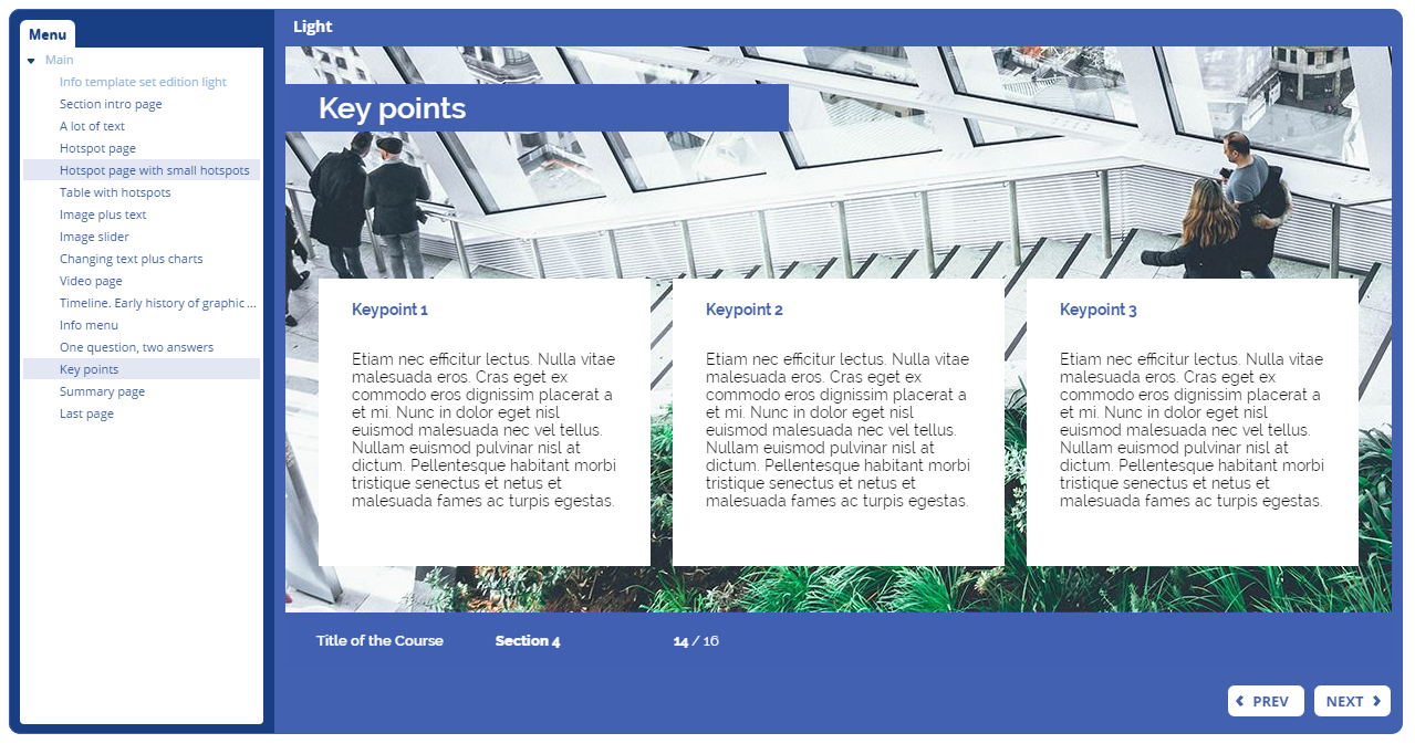
A default view of built-in Storyline player.
Also, if you decide not to use Storyline built-in player and want to to use a custom menu or go without the player, you will end up with your player on desktop devices and the dark mobile player on mobile devices.
No need to build the course in 5 different views
On Storyline 360 you don’t need to build your course in a desktop view and adjust it to fit properly on tablet portrait or mobile landscape mode. You build just one version of the course and Storyline scales it down to fit the corresponding device’s screen. Therefore, you don’t need to spend additional time building responsive courses. And, when building the slides, you can easily check the responsive preview to see how the exact page would look on a smartphone or tablet.
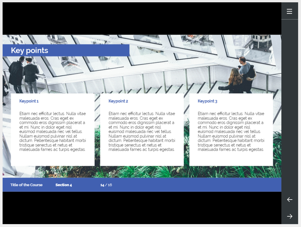
Articulate Storyline built-in player, the landscape view on a tablet.
More space for the course
Hence the new player is taking up way less space than the original player, you will have noticeably more space for your course on the screen when viewing on mobile devices.
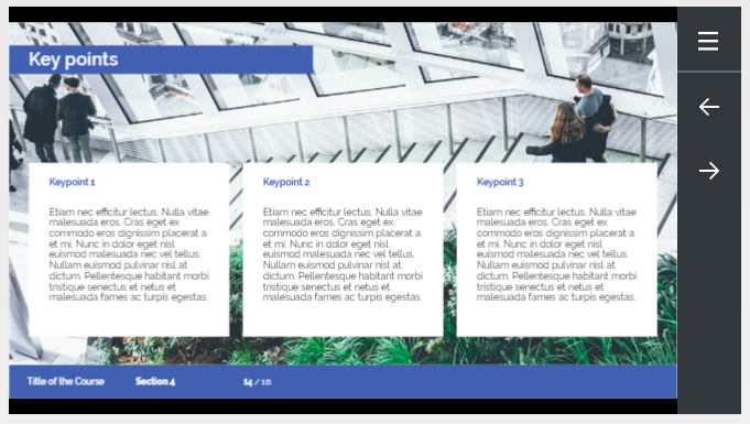
Articulate Storyline built-in player, the landscape view on a mobile device.
Mobile gestures
Storyline 360 comes with the support of mobile gestures as swipe between pages and user-friendly zoom by pinching fingers. The zoom function comes in handy when the user is viewing the course in a mobile device with a small screen. As the contents are scaled down, sometimes it can be a bit challenging to read all the text without zooming in. 🙂
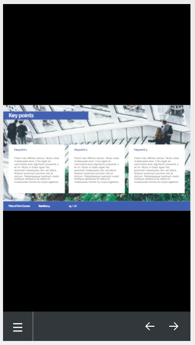
Articulate Storyline built-in player, the portrait view on a mobile device.
Choose between portrait and landscape orientation
By default, Storyline supports desktop mode, tablet portrait and landscape modes and the same two modes for a smartphone. If you just want the learner to use landscape orientation – easy, you can just simply disable the portrait orientation before publishing. When learner will try to watch the course is not supported orientation, he’ll be asked to rotate his phone to have the correct layout displayed.
Really easy to convert from older projects
If you have a project built in Storyline 2 or even in an older version, you can simply open the project in Storyline 360 or Storyline 3. Then select the “upgrade” button and the course will be upgraded, so it is compatible with the newest Storyline version. By default, Storyline will have its default gray player for the desktop view and the dark grey for mobile devices. Therefore, if you are using a custom player or want to change the color schemes, you should do that before publishing the course. Then you publish the course – congratulations, now you have the responsive player. We must admit, that is quite quick and easy!
Our custom players
To make it easier for you, we have customized the built-in Storyline players for some of our template sets. Right now we have them for Dark, Light, and Minimal Facelift. You can see examples, by clicking links below:
Adventure template set demos –
Minimal Facelift template set demos –
- Minimal Facelift Info template set
- Minimal Facelift Test template set
- Minimal Facelift Quiz template set
- Minimal Facelift Click and Reveal template set
Light template set demos –
- Light Info template set
- Light Test template set
- Light Quiz template set
- Light Click and Reveal template set
Dark template set demos –
- Dark Info template set
- Dark Test template set
- Dark Quiz template set
- Dark Click and Reveal template set
Explore all Storyline templates
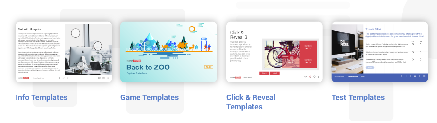
This is only a small part of our Articulate Storyline template library. Explore hundreds of course starters, games, click & reveal, info pages and test templates built specifically for Storyline. Click the button below and see all of our Storyline templates!
Comments