Lectora has built-in features for responsive course development. You can build courses like before and when you need to enable responsive content, you can do it with one click in course settings. When you enable your Lectora responsive course settings, Lectora automatically creates brake points for your content. You can then adjust content objects for each break point separately. Unfortunately you can’t adjust size of the brake points. Here is a screenshot how it looks in real life. You can see mobile phone portrait and landscape, tablet portrait and landscape and desktop versions with one click in the upper part of the screen.
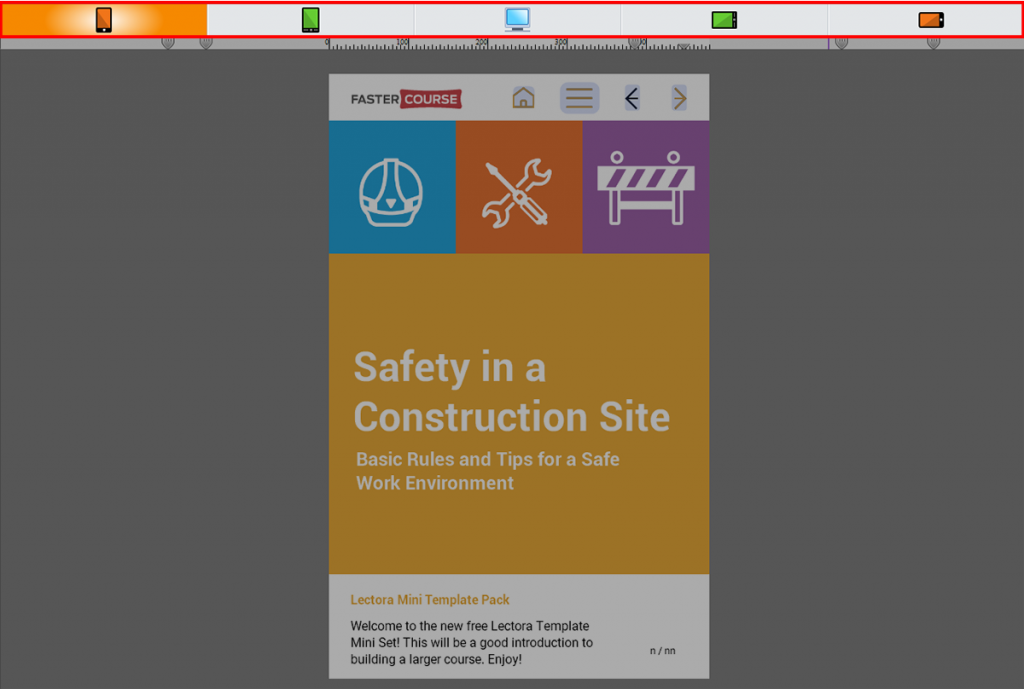
All the objects in responsive projects are color coded so it is easy to see which object is adjusted for different screen sizes. Lectora’s performance creating large content is great. You can copy objects from other responsive projects and the Lectora will keep object positions. Published content is scaled proportionally until it reaches the next breakpoint and then content layout will change.
Reasons to choose Lectora:
Great performance with complex projects
Color-coded objects
Works as expected
Suggestions:
We would want an option to adjust breakpoint size, maybe this will be added in the next versions?
Explore all Lectora templates
Explore hundreds of course starters, games, click & reveal, info pages and other test templates built specifically for Trivantis Lectora. Click the button below and see all of our Lectora templates!
Comments