Earlier I wrote about gamification templates for Articulate Storyline, now let’s talk about other templates we create to make your work smoother!
As mentioned before, we all have seen various layouts of text and image template – text on one side, text on other, an image on the top part of the screen, on the bottom or maybe split into pieces throughout the screen. These pages are really great for intros or to sum-up statements, give an explanation to a single term or situation.
What if you want to have more information on a single screen? Adjusting the font size or margins may save up some space, but the final result won’t be what you had in mind. Awesome way to declutter the screen is to use various click and reveal templates. Actually, we really love them, so we have created a bunch of designs for you! We hope you’ll like them same as we do!
Explore variety of layouts
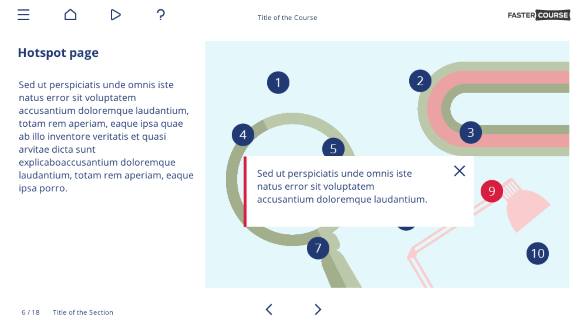
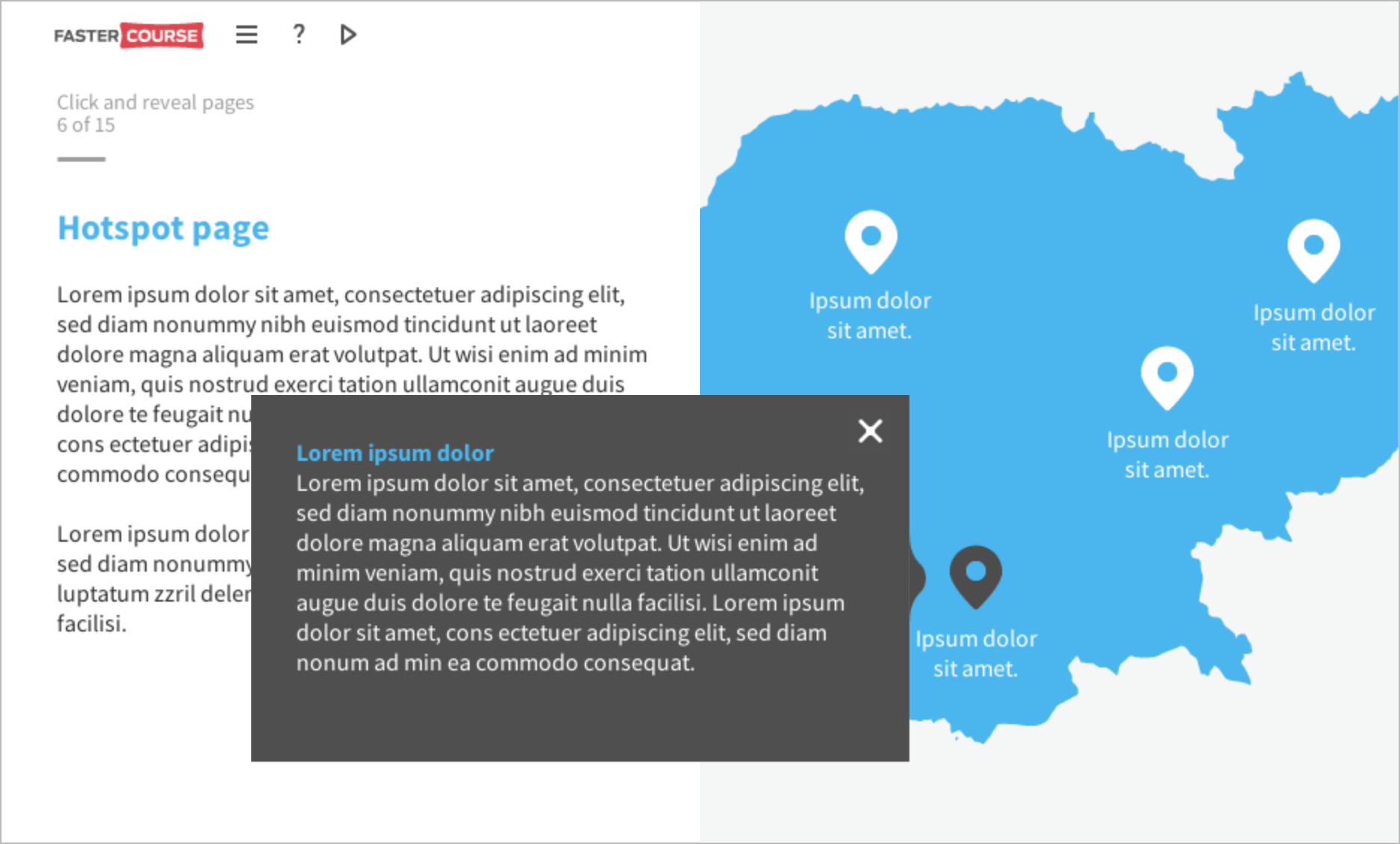
Let’s start with simple hotspot templates. Almost all of our template sets include at least one kind of image with hotspots on it. The popup size varies from your needs and our designs. For the most of the cases, you can simply adjust the shape of the popup by dragging it by its corners. We find these Storyline templates extremely useful, if you have instructive images, for example, building plans, escape routes, maps or layouts. You can adjust the hotspot positions to the featured areas and then describe and explain them in popups.
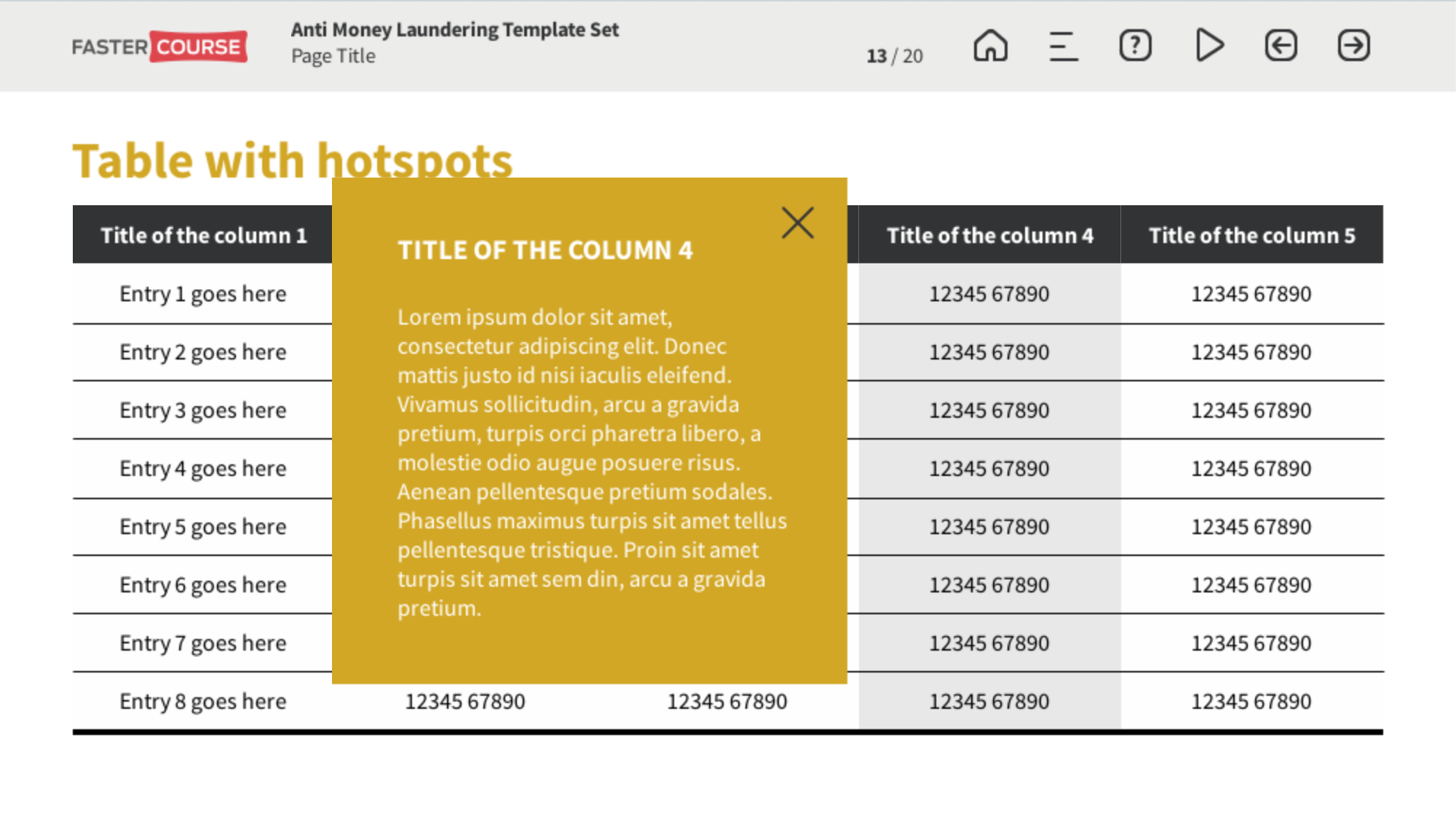
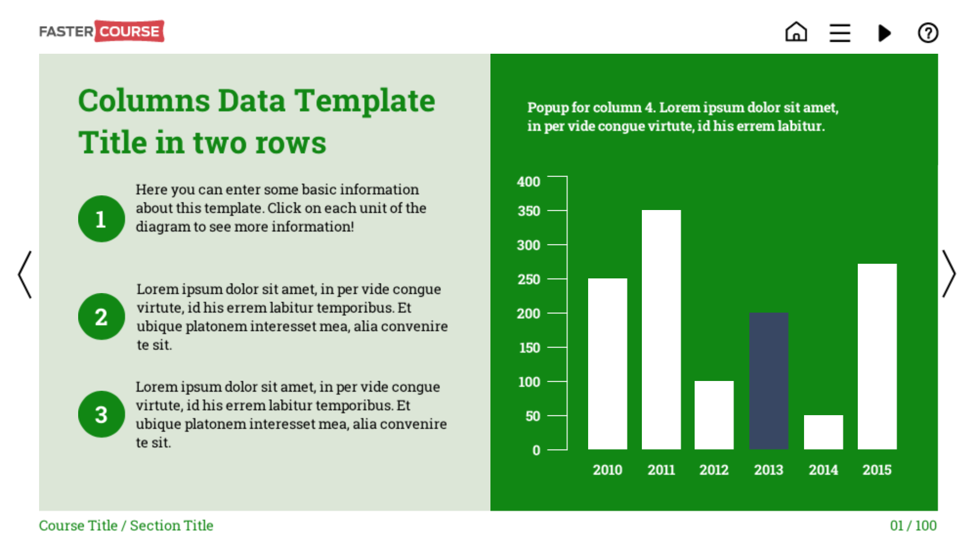
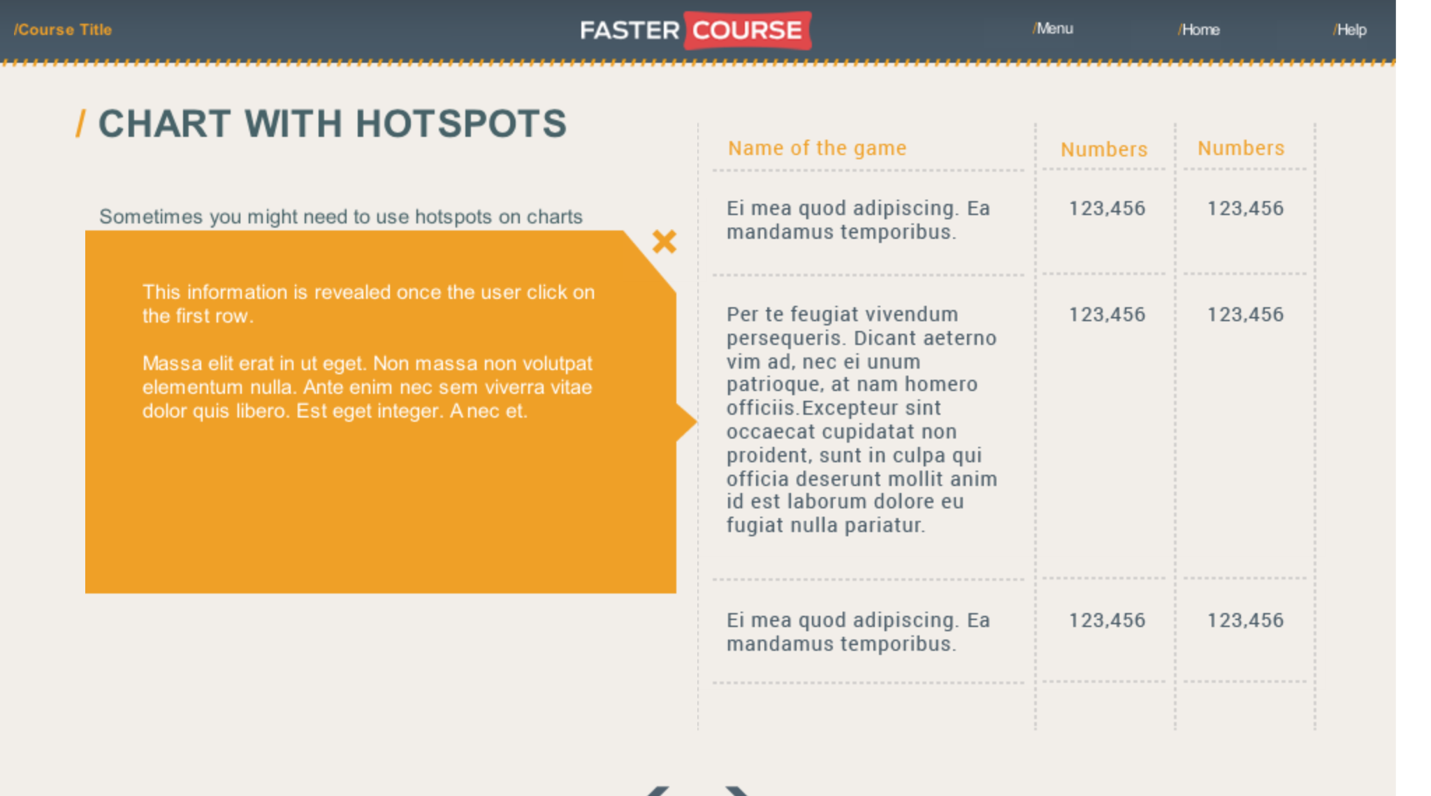
The same goes for our table hotspots and popups – we think it is a really great way to explain the visualised values. We have Storyline templates with tables, where each row and/or column opens a popup. You can easily change it to some particular row or a single popup for the whole table. The same goes for our graphs. Some of the Storyline templates are focused to explain each graph, some – to give extended information.
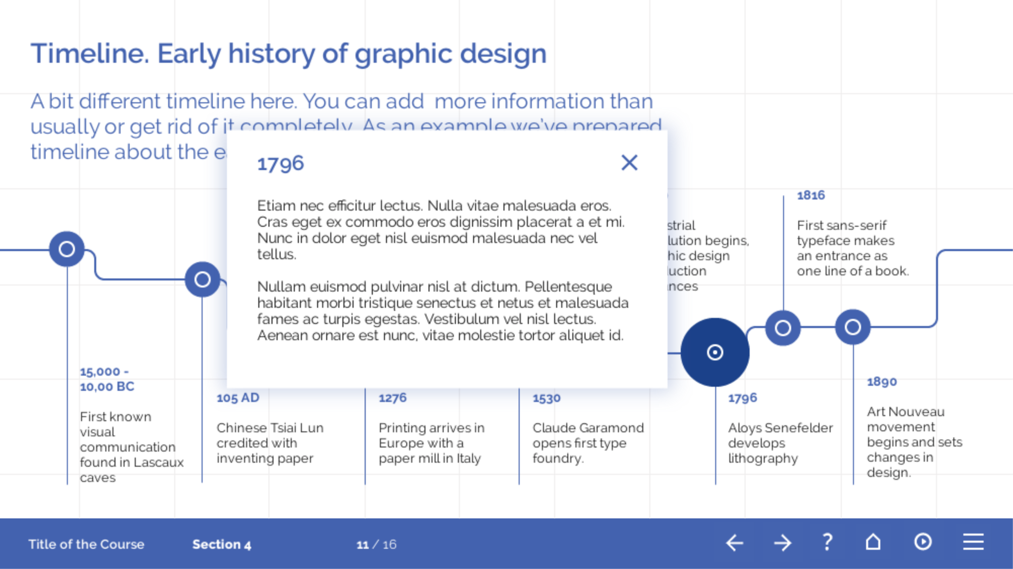
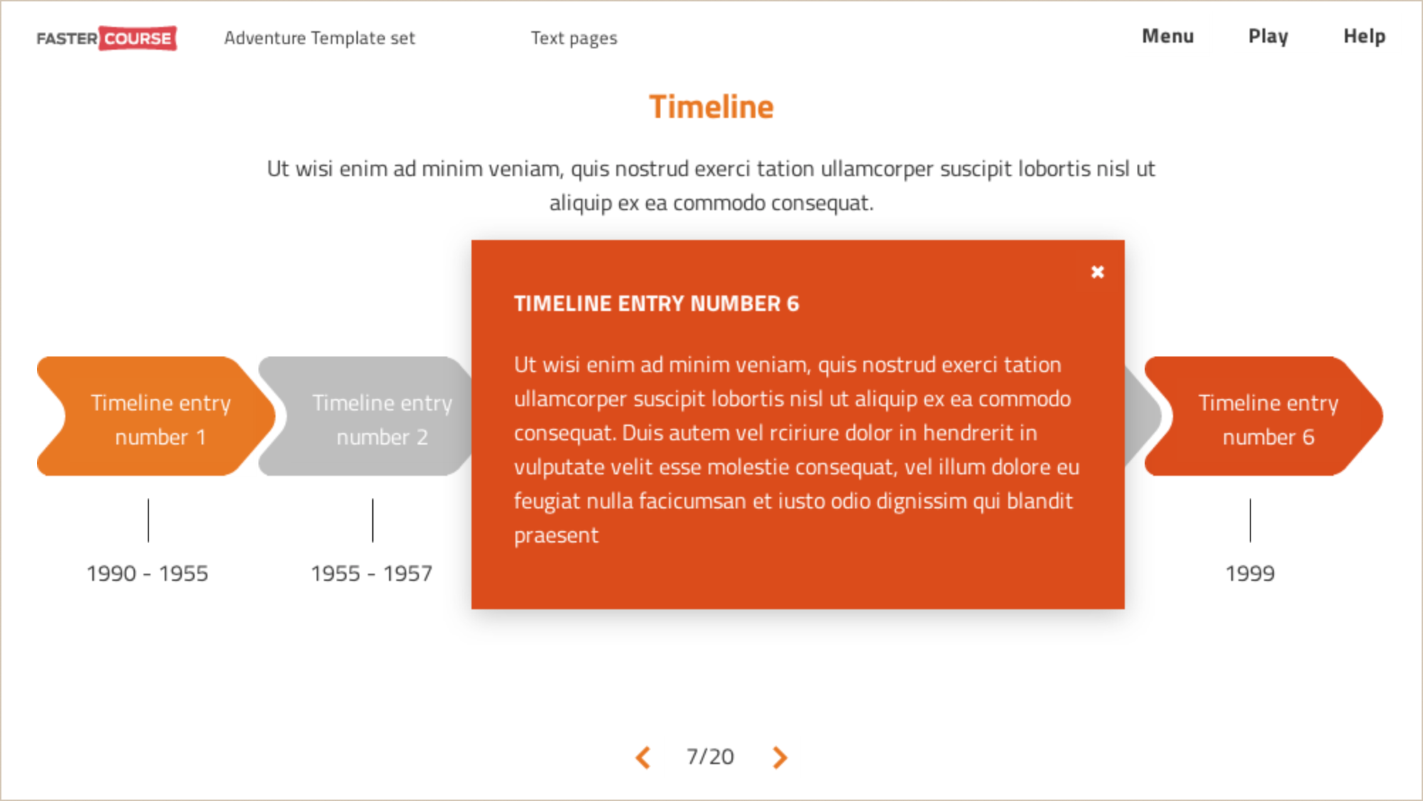
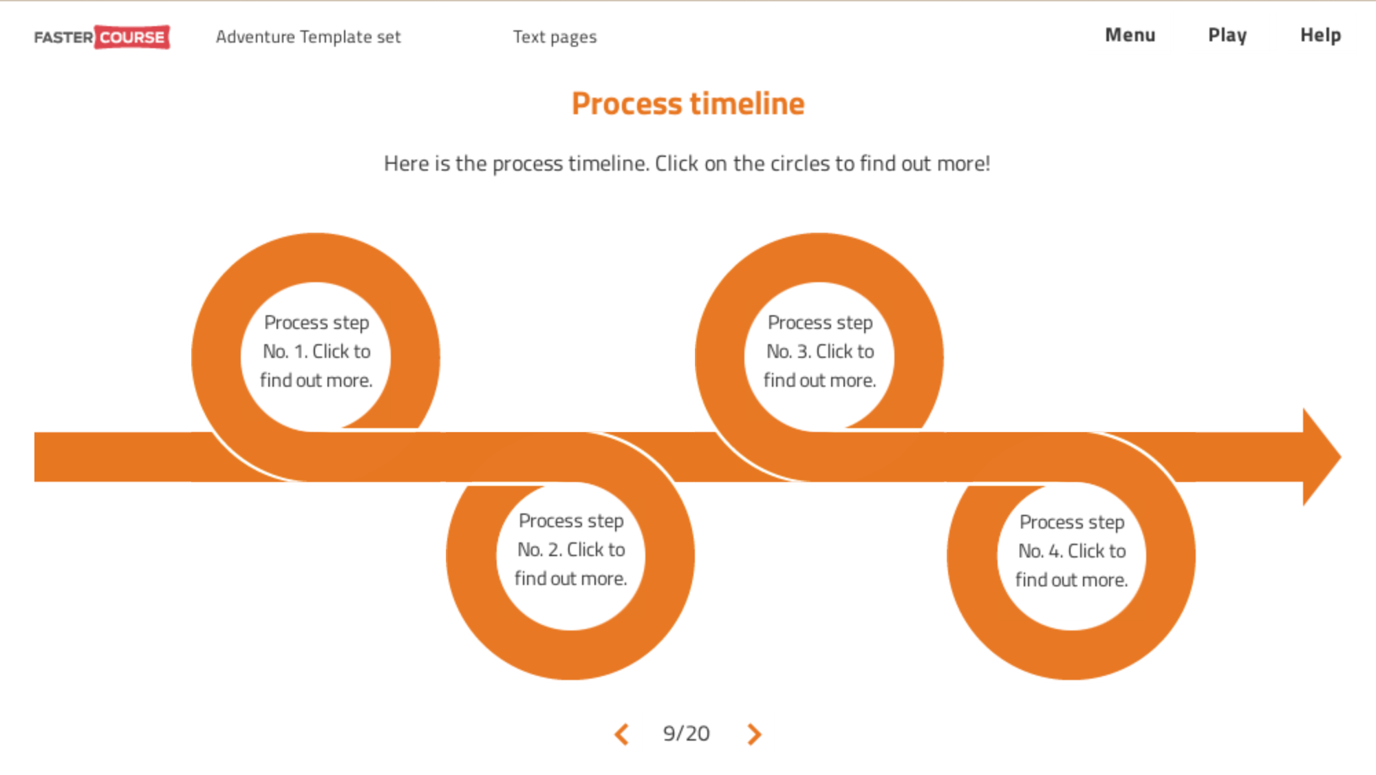
And then comes the most well-known click and reveal template – the timeline. We have created various versions of the timeline as it is so popular template with great use in almost every company and situation. You can use it to accentuate years, numbers or facts. By clicking on each part of the timeline, the learner is presented with a popup, containing additional information or explanation. In our template library, you can find various examples of the timeline template – both vertical or horizontal, even with a circular motion!
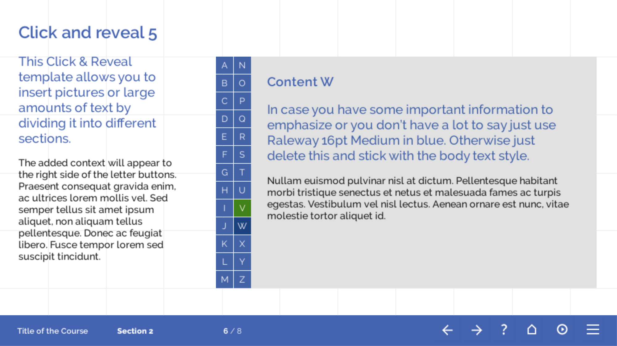
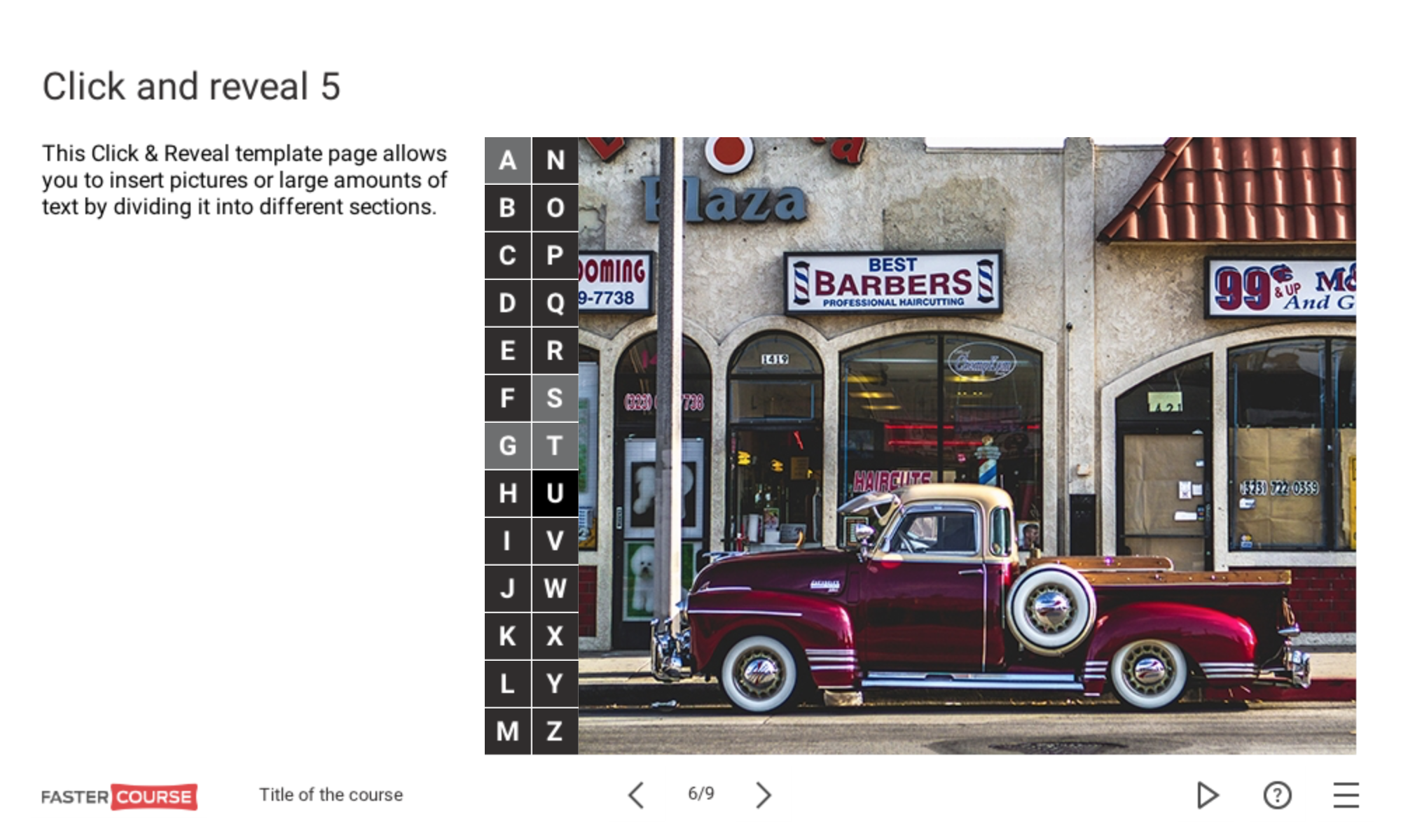
One of our customer’s favourite template is the glossary template. Like with others, we have it in various template sets. This template consists of a page containing 26 letters and each letter opens a layer with additional space to fill up with all the info or terms which starts with that specific letter. The contents of each layer are up to you; if you feel like you need more space, you can easily add a scrollbar or another layer.
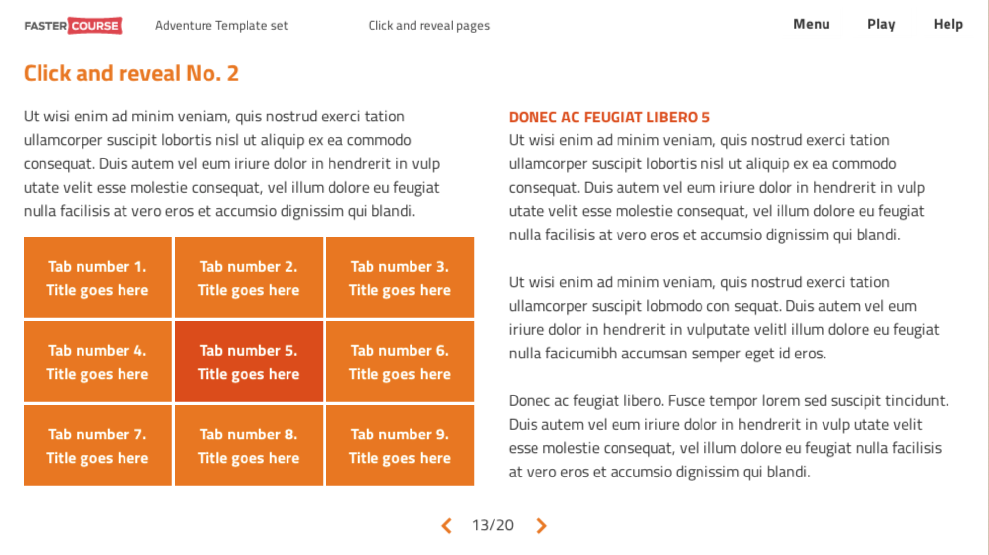
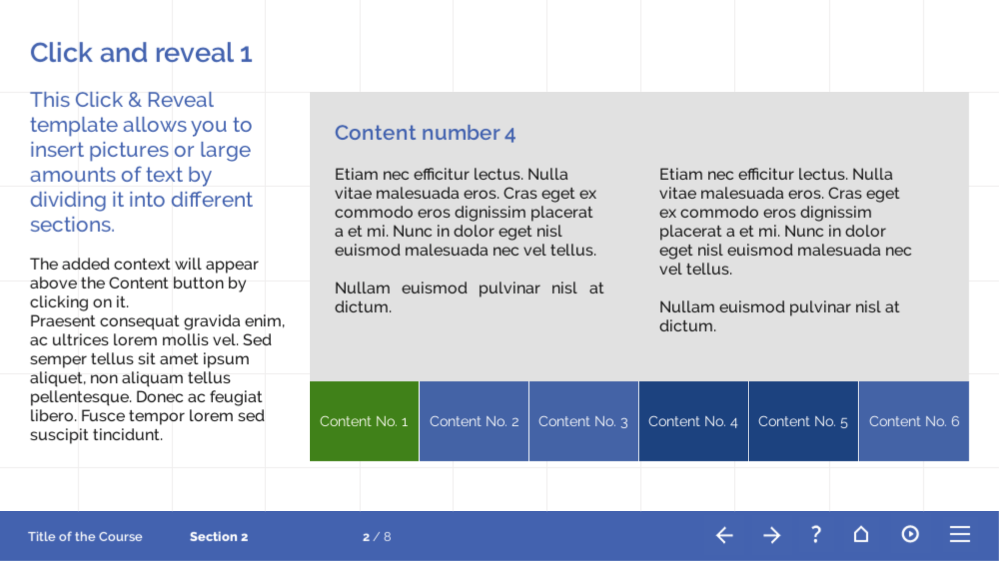
Then we have various layouts which, just like glossary template, has several visible tabs. They can be located either on the side or on top or the bottom section of a page. The tab interaction allows to easily switch between sections. These templates are also quite spacious and there is a room for plenty of text or illustrations.
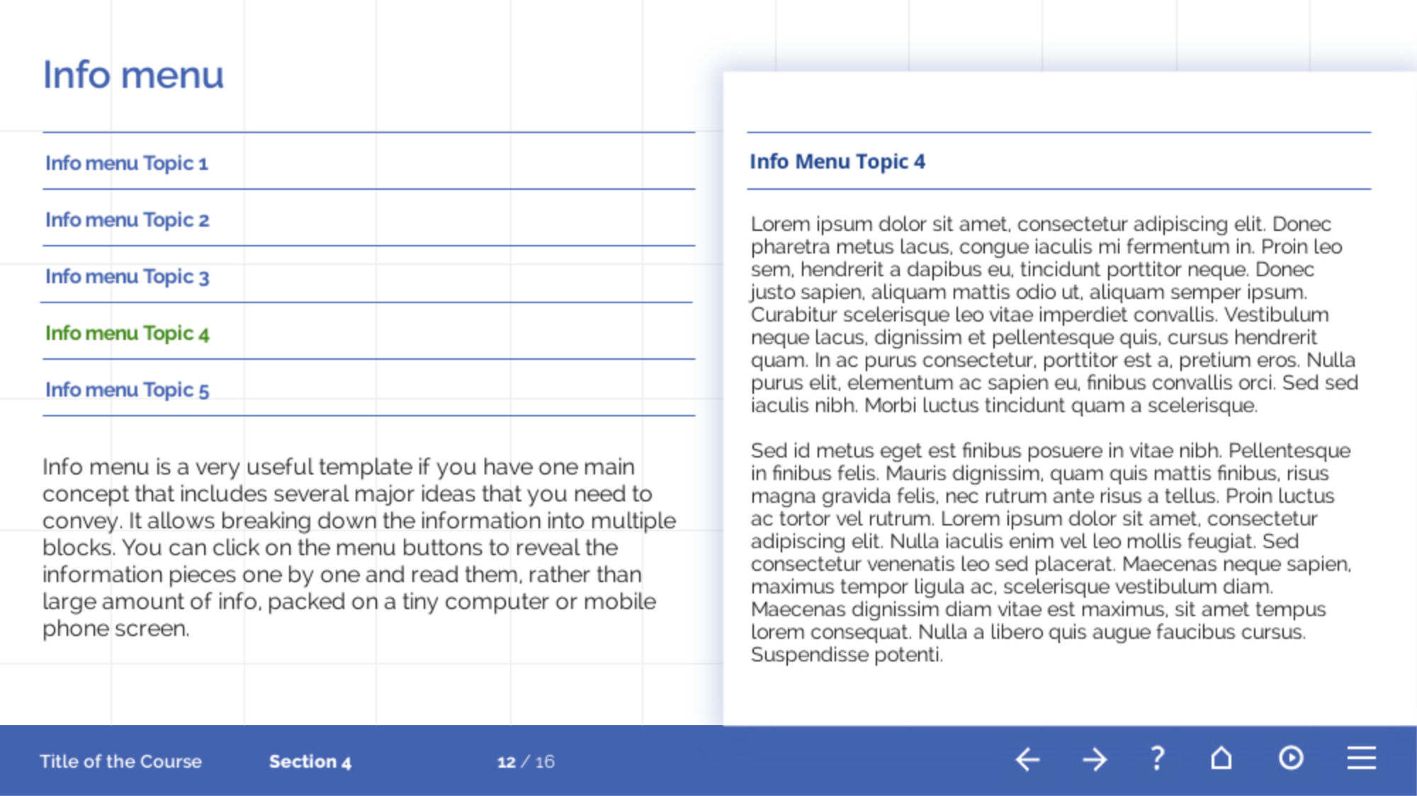
Similar functionality, however different design has the “info menu” templates where you have subtitles for each category written. When you click on each of them, additional layout opens on the side or on the top of them. If you have just a small intro text or no text at all, we suggest using templates with subtitles on one side and contents on other. If you need more space for text, visible on the page the whole time, the other option will fit you better. It has intro text on one side and subtitles on the other. When you click on each subtitle, it covers the other options.
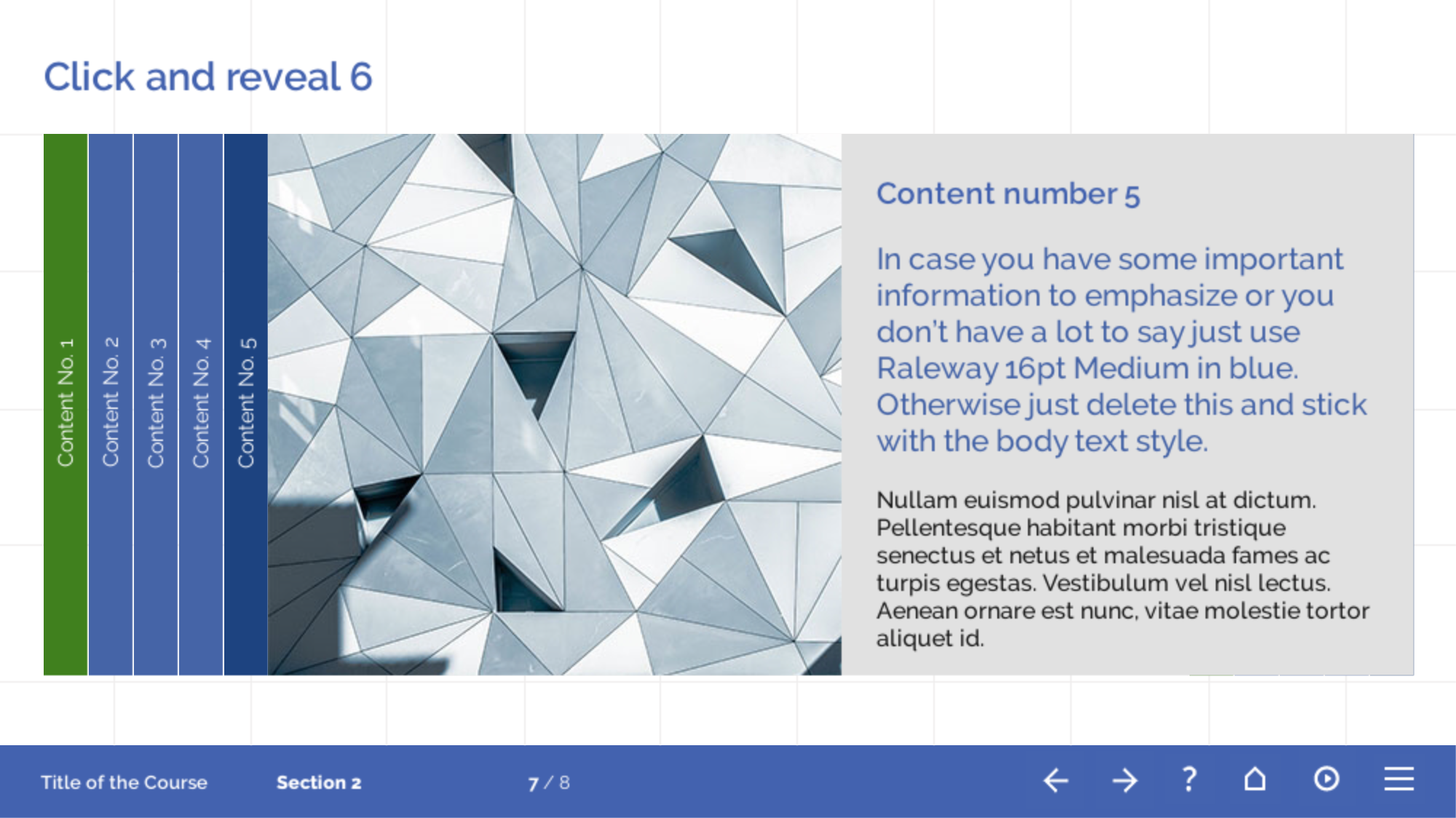
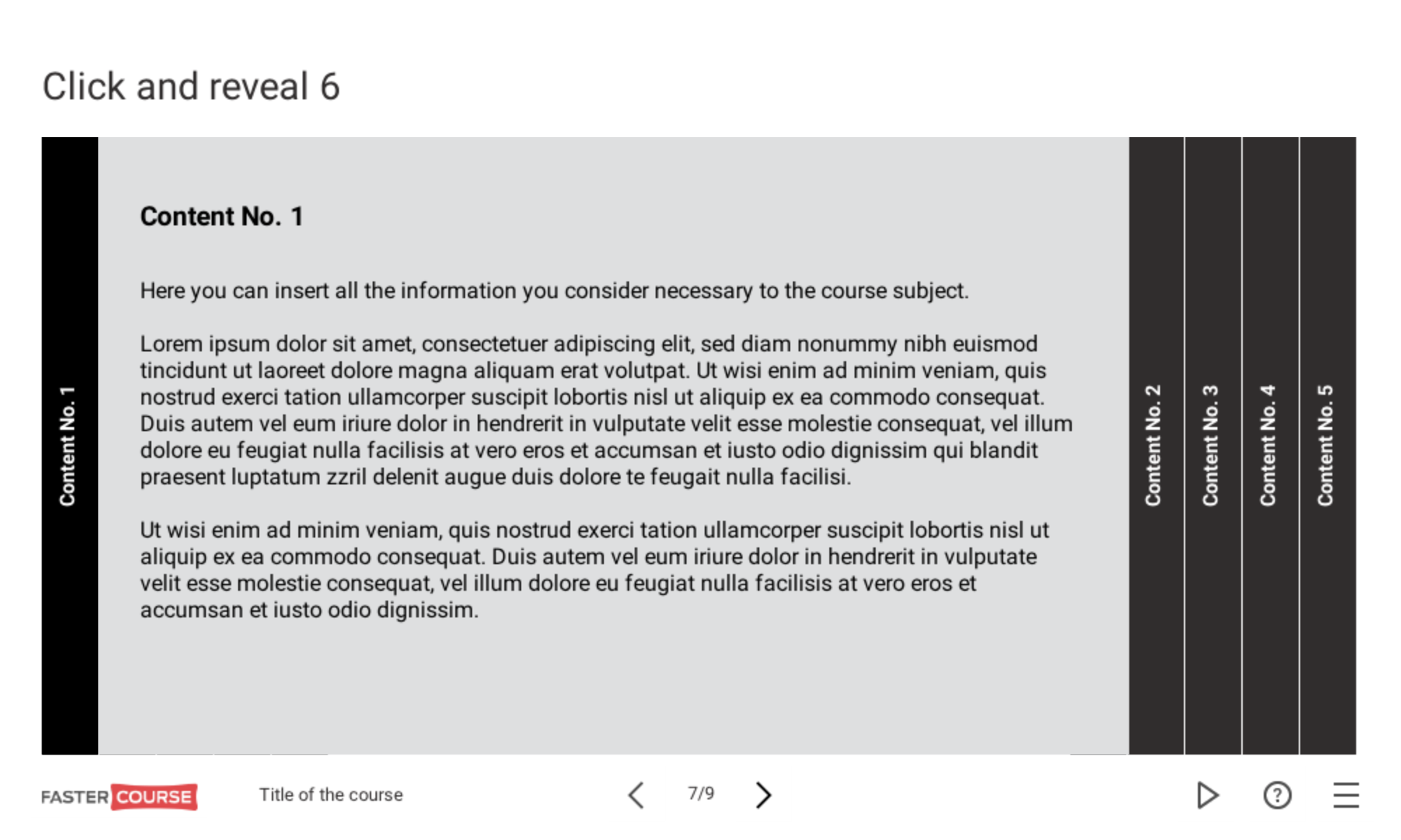
Another highly popular template is the accordion layout. It allows the learner to browse between layers, using the vertical buttons on each side of the visible layout. If we exclude all the “regular” template layouts, this one and the glossary I mentioned before could be two of our most popular ones!
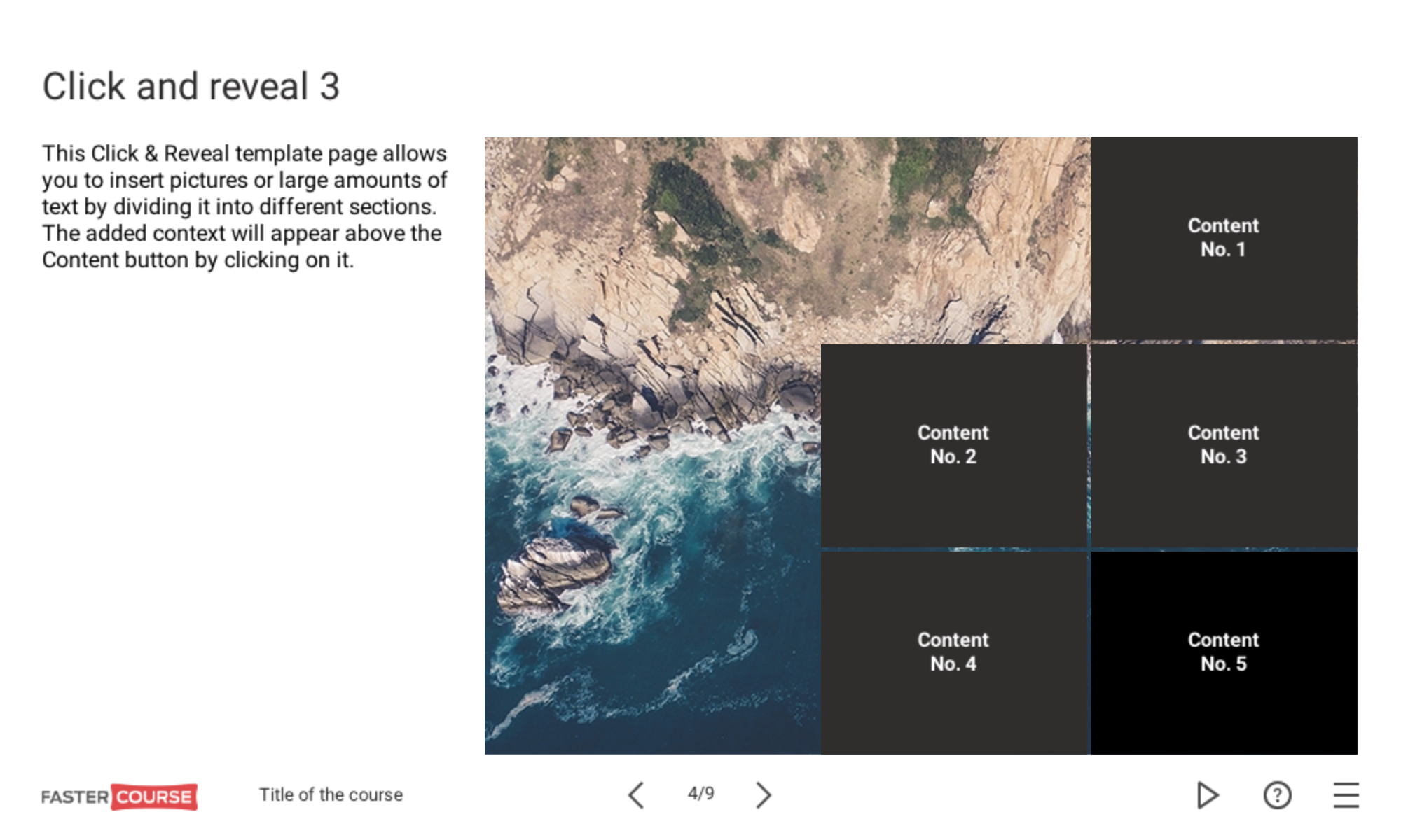
Sometimes these pages can seem too plain and you want to refresh the page with some images? We thought so ourselves! For this purpose, we have created a page with text and image which is covered with several zones of hotspots. Each hotspot opens a layer on top of the main content, similarly like with examples above.
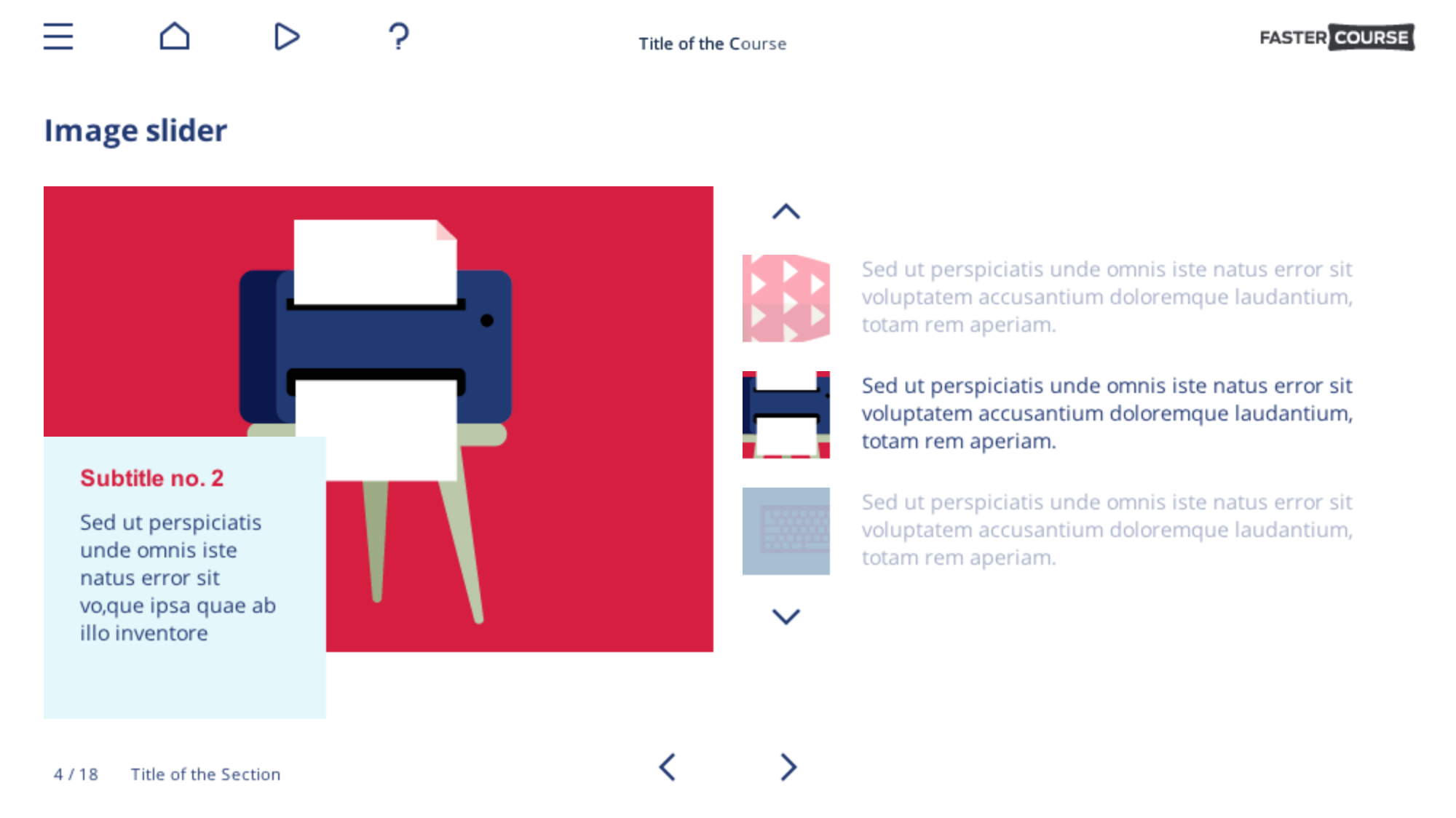
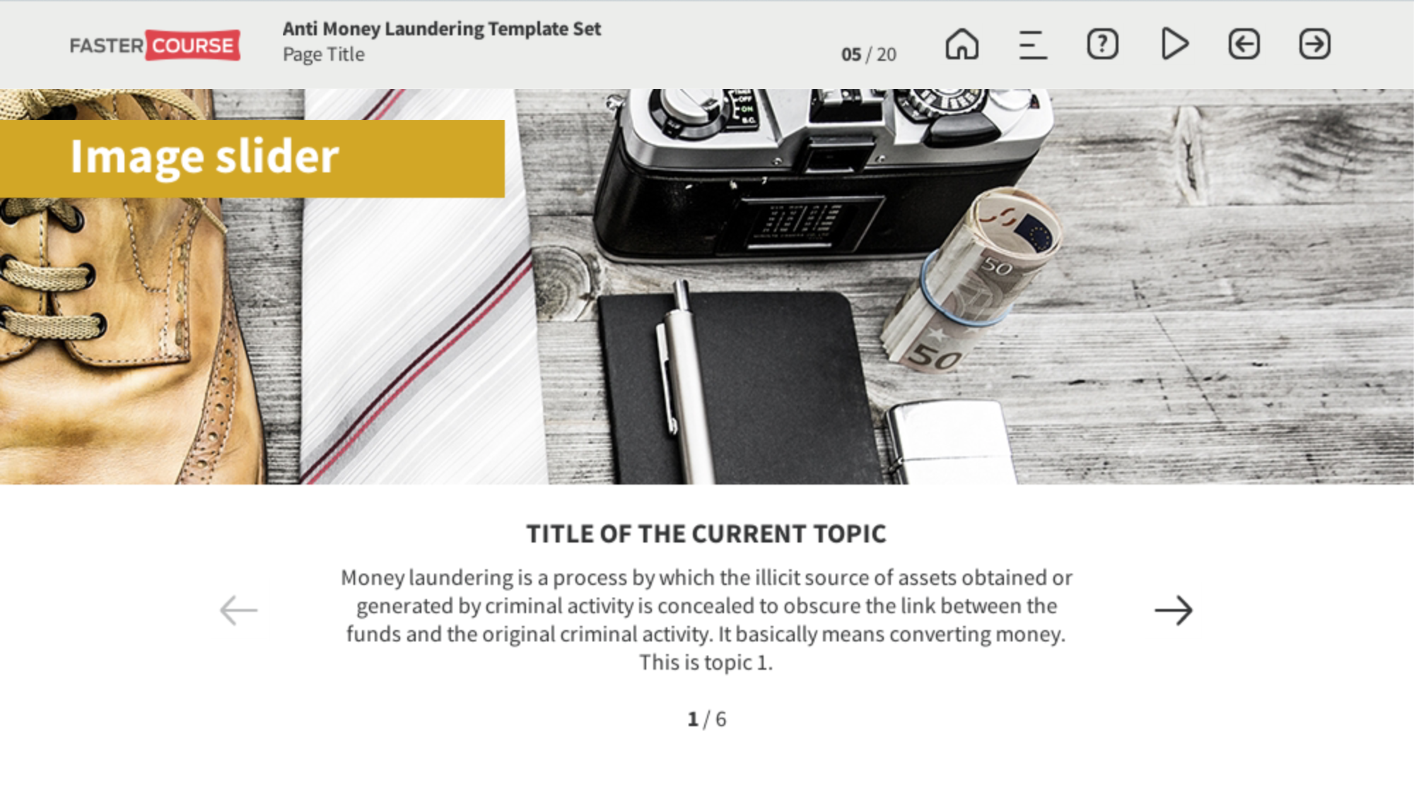
Another way for a more visual look is our image slider template, similar to the carousel. This gorgeous template consists of several images and the corresponding text; you can move through them by using the navigation inside the page. This is a really great template if you already know that you’ll need to use images for every sub-content entry for the page. You just need to keep in mind that all of the images used on this page should have the same size, so they can transit smoothly from one to another.
As mentioned before, most of these Storyline templates are easily customisable. You can simply change the size of each popup layer by selecting the popup element and dragging by its corners. Want to change the colour? Select the element and go to the formatting menu. Most of the elements we use are built using built-in shapes. That makes the adjusting fairly simple and quick. Though some elements are specially designed for the template set, therefore if you want to adjust them, you’ll need to use the Adobe Illustrator file we attach to all of our Storyline templates.
Explore all Storyline templates
This is only a small part of our Articulate Storyline template library. Explore hundreds of course starters, games, click & reveal, info pages and test templates built specifically for Storyline. Click the button below and see all of our Storyline templates!


Comments