I have already written about gamification templates and various click and reveal elearning templates. Looks like I’m starting from the other end and now going to the simpler solutions. This time I’ll tell you more about our basic info pages. Every great elearning course needs also set of simple pages to represent statements, terms and short of amounts of information. And we have a bunch of those available for Adobe Captivate, Articulate Storyline as well as Trivantis Lectora. Just go ahead and check out our library!
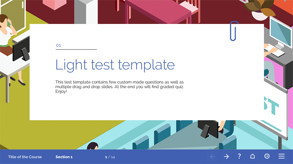
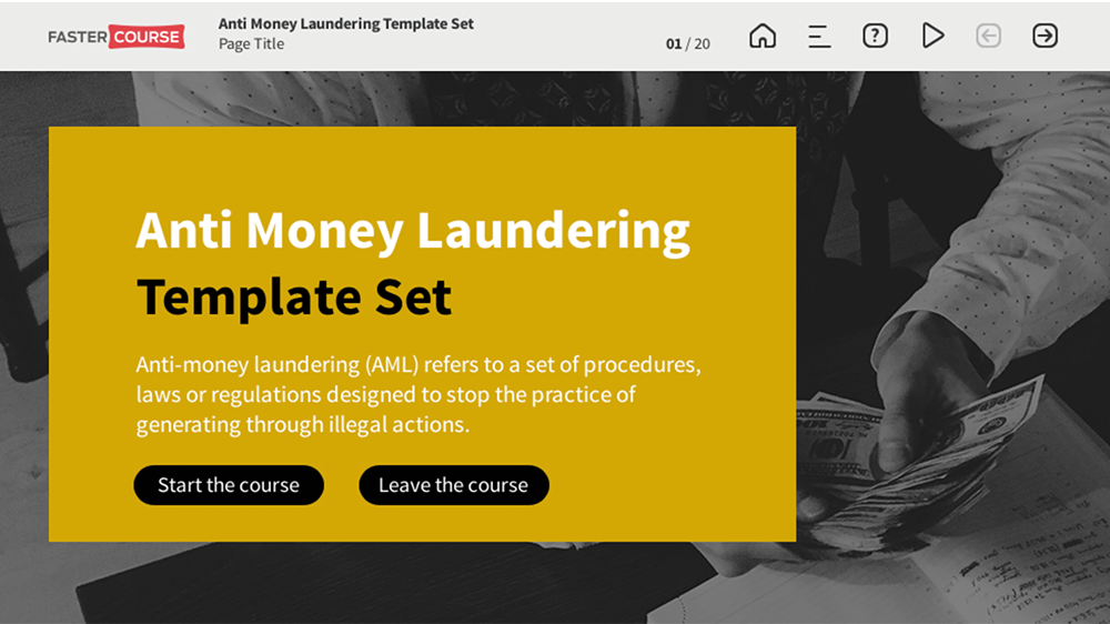
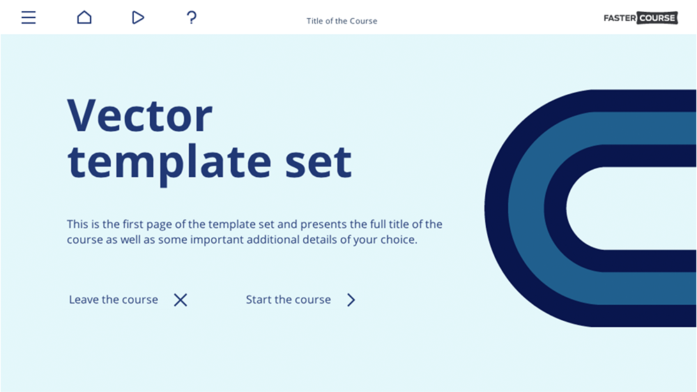
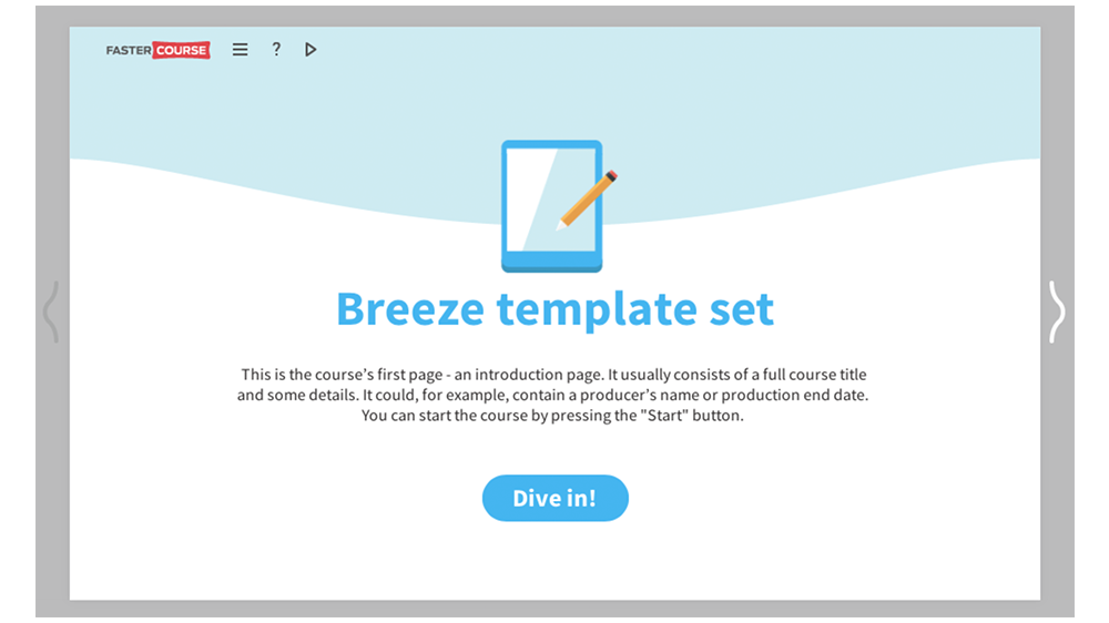
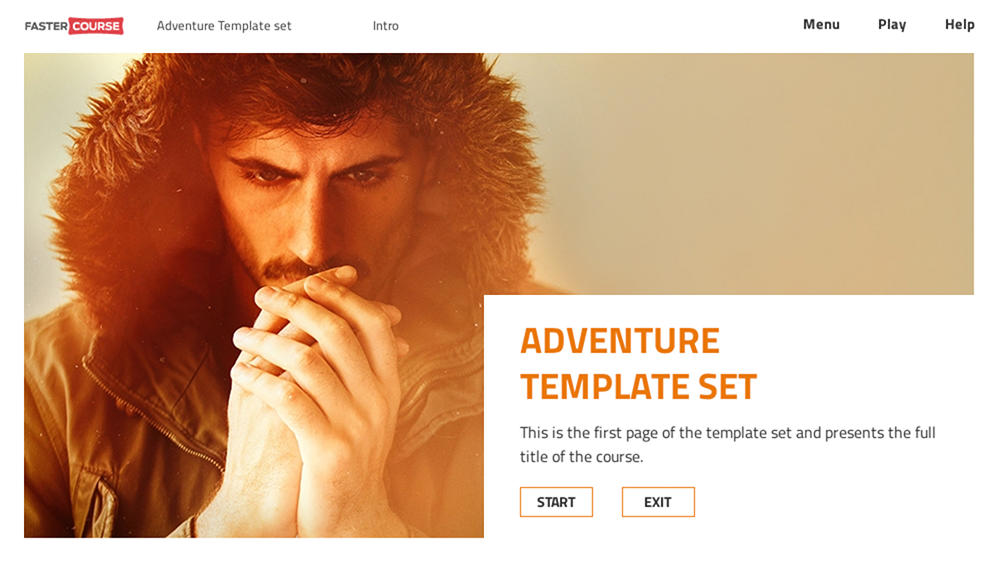
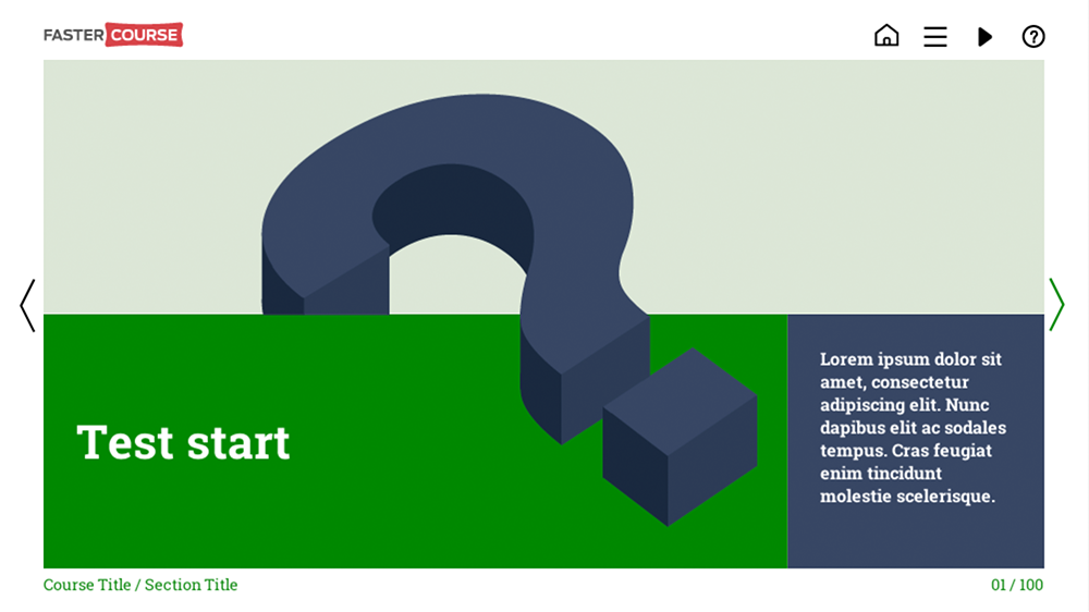
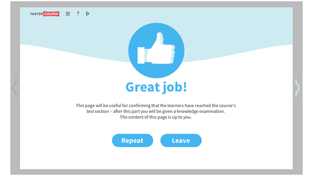
But let’s start with some templates which are the must in every elearning course. Of course, first ones to mention here should be the intro templates. Every course has at least main intro page. Then, depending on the content, it can have various chapters or sections, for example, a separate test section. Most of these templates are very simple and they contain a title and brief explanation of the following content as well as some background graphics to make them stand out from the rest of the course.
As you may have noticed, section intros have a bit more space for additional text than the course intros.
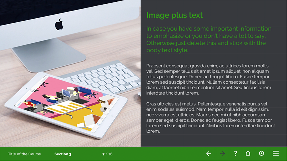
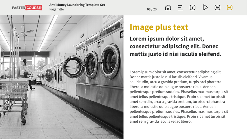
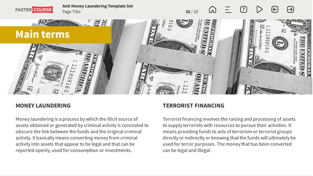
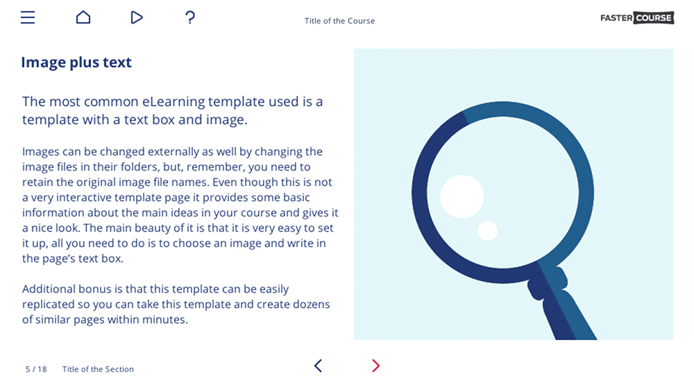
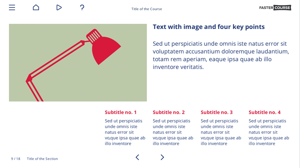
After we have introduced our user to the course, let’s go next with the text plus image template. It may be the most common elearning template of them all! We all use them, we all need them, and they are excellent to focus learners attention to a single statement, fact or just simply a medium amount of information.
The most common layout for this type of elearning template is 50/50 with the image on the side of the text. Of course, as it is the most used layout, we have it in almost every of our template packages.
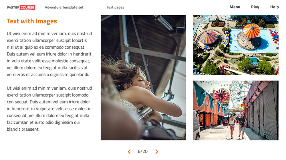
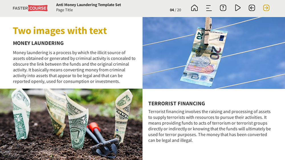
However, to make the course a bit more diverse, we also have created some other layouts. For example, how about 3 different sizes of images on the side?
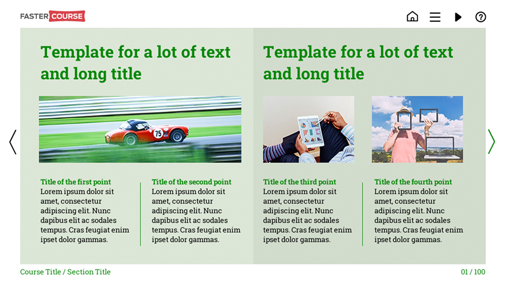
Or maybe couple images and a portion of text, explaining each one of them?
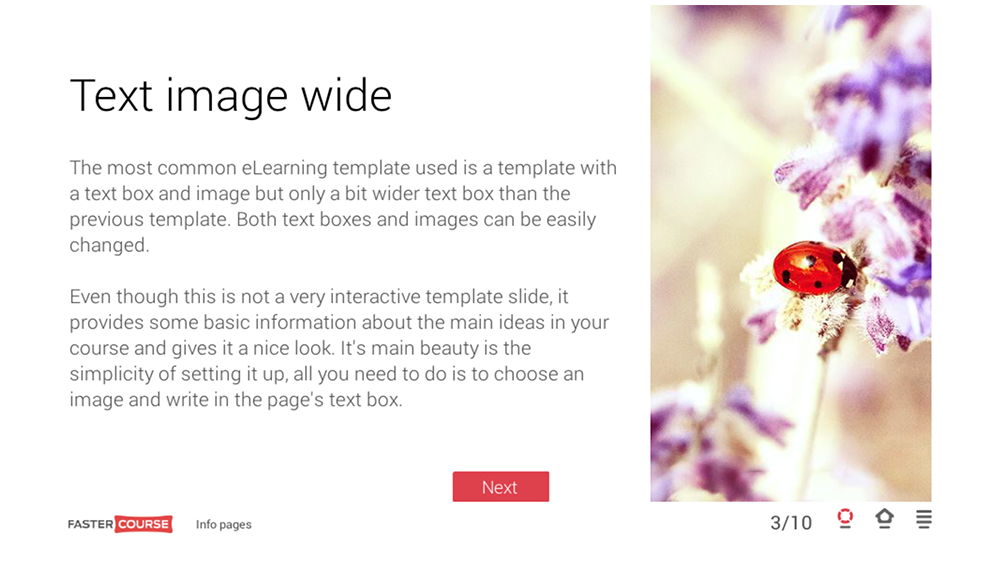
Maybe the standard 50/50 layout has left you with too tight space for text and you need just a tiny bit more room for it? For that, we have wide text + image layout. It allows you to fill about 2/3 of the page with textual information, leaving a narrow place for visual content.
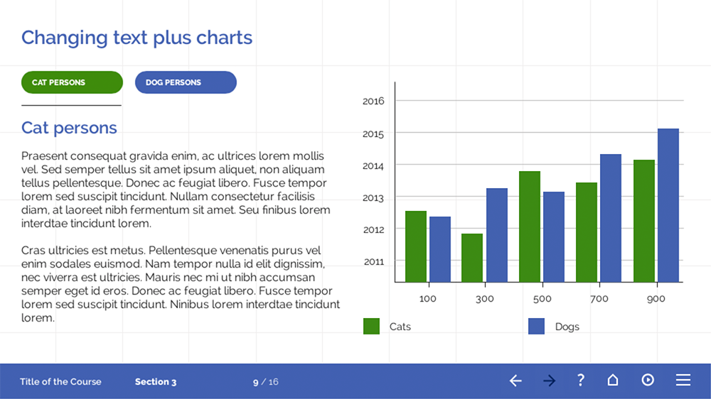
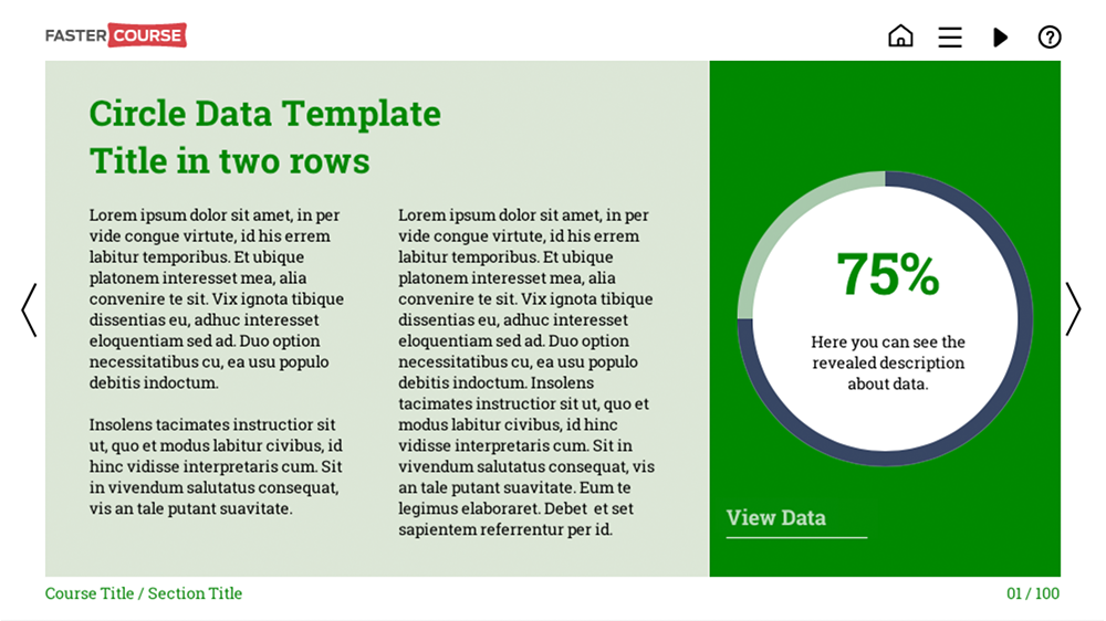
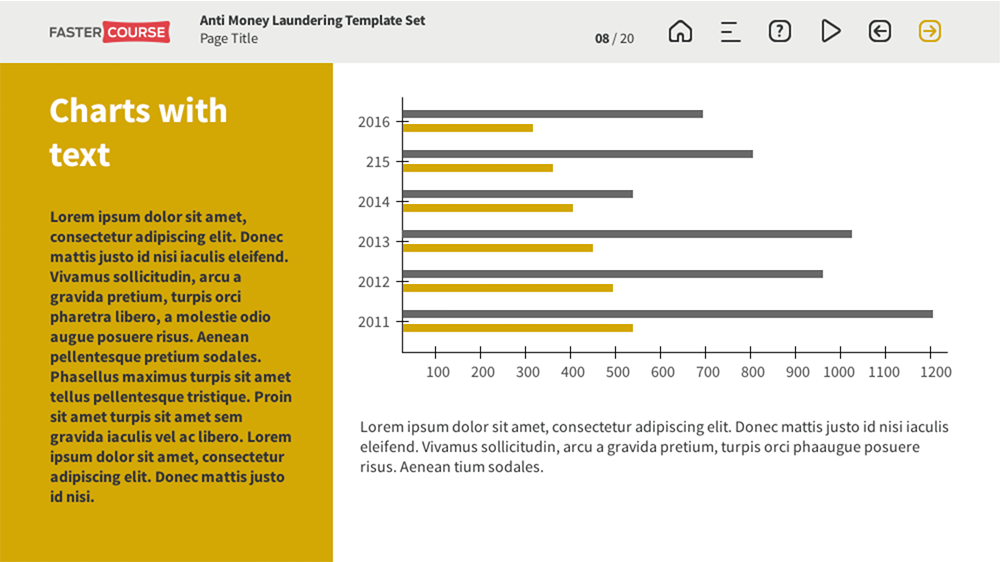
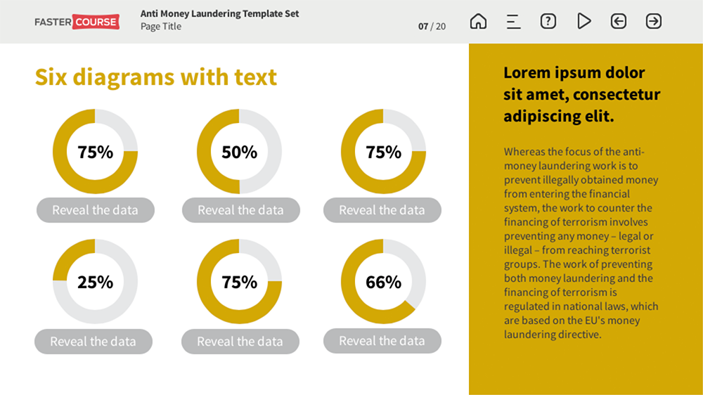
You can use images to emphasize the written content of the text and image templates, but sometimes you also want to use other visual tools. Maybe this information can be shown as graphs or charts or even circular diagrams. We have created a couple of variations of them as you can see below.
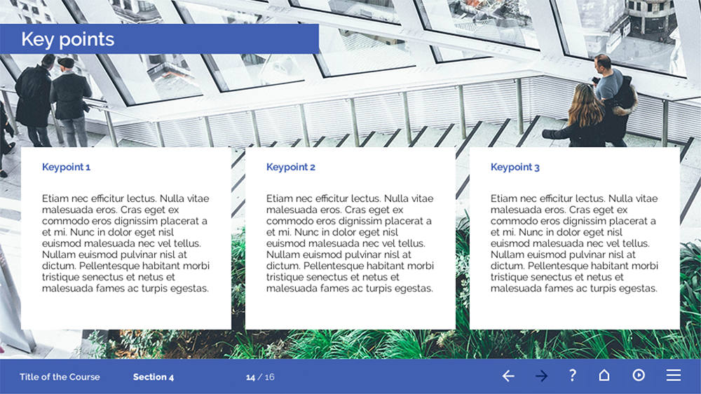
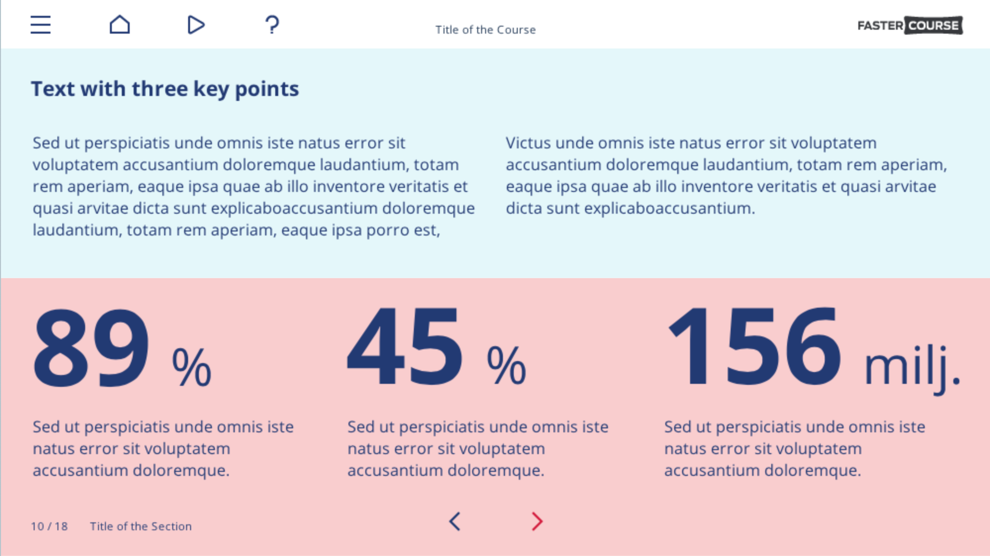
A common way to present information in elearning is using key points, so we created a couple of templates especially for this purpose. I would say that my favourite is this one! Though all of our templates are great, I just love the green and refreshing background of this particular one.
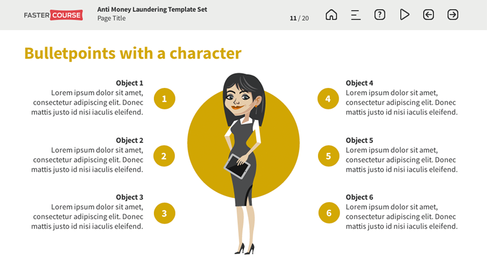
What if you also want each key point represented by a visual element, so this elearning layout is better for you? Or maybe use characters?
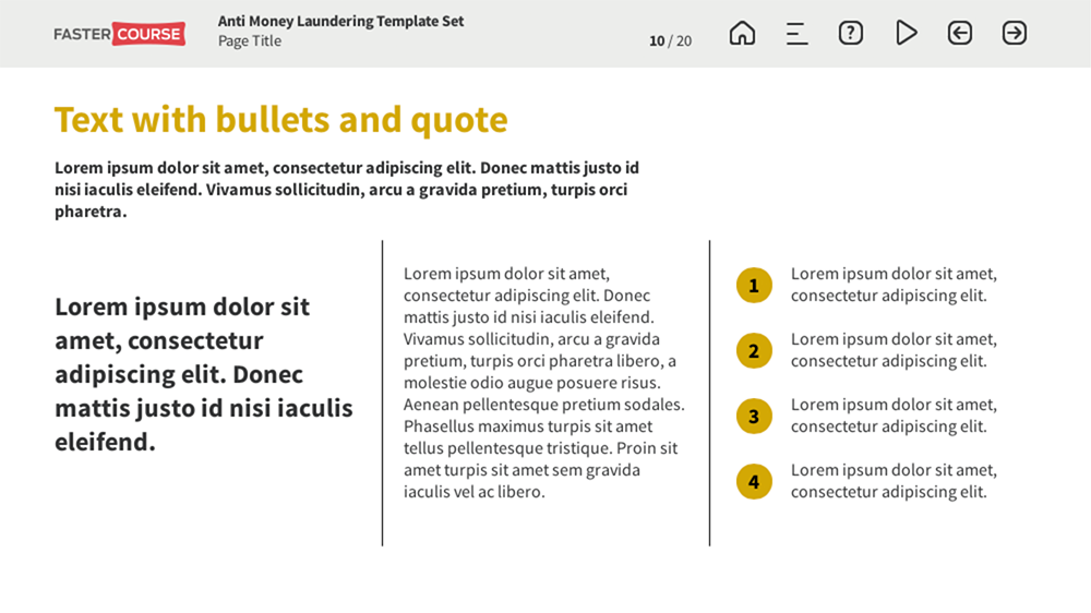
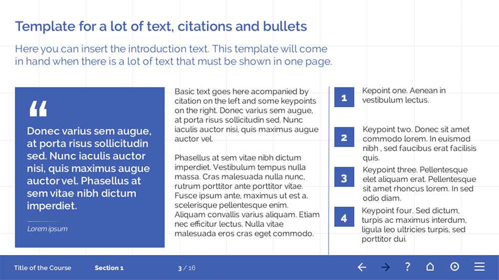
And of course, this layout! We used the placeholder on the left for a quote and then followed by some statements and bullet points. However, this would be also a marvellous page for a definition and further explanation about it, followed by examples on the right side.
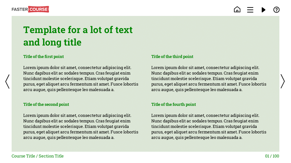
We also have a couple of templates containing just a text. They look pretty great in our opinion, hope you like them too?
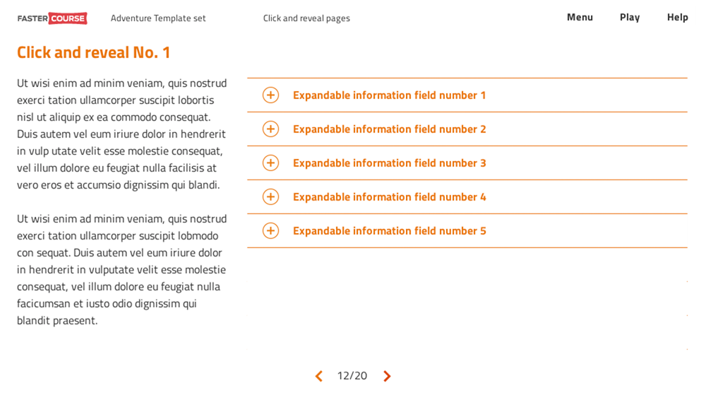
Even the most enthusiastic and inquisitive learner would feel a bit bored in a lengthy course full with non-clickable pages without any kind of user interaction. So all of our info template sets also include various examples of clickable templates. They were mentioned already in the previous blog article, but let’s just talk a bit about them also here.
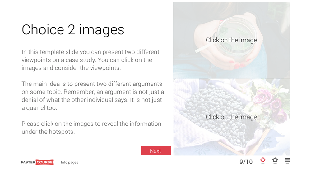
If you have two situations to describe or a comparison and you don’t want to separate them into two different pages, a great tool is this template. It has a place for initial text as well as two large popups to display information in a single page.
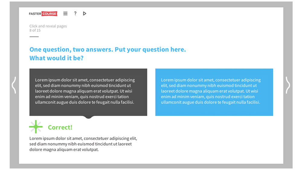
For similar kind of situation, we also have a great tool to test learners attention to a course, by using a question and 2 answers template. This elearning template is a simple visual page (it’s not a part of the graded test!) which allows the user to choose one of two answer options and read the following feedback on each of them.
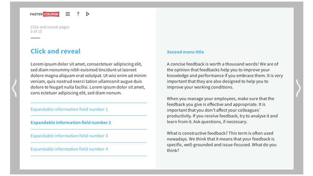
A great and simple way to show a lot of information is to use info menu template – you can have as much as 5 to 10 text and image pages combined in a single page by using this template. Just create as many menu items as you need! Our template mostly consists of simple text in each of the menus, but who said you can’t add a picture, animation, audio or even a video there?
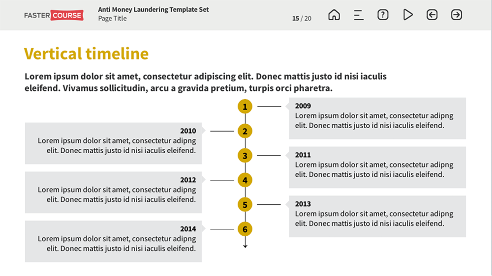
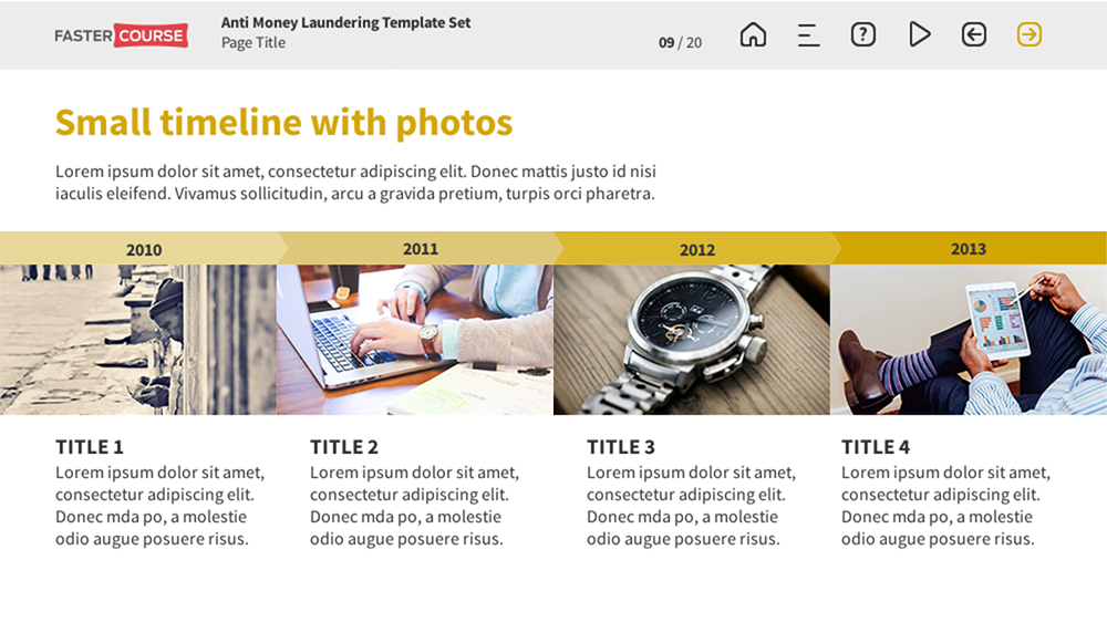
If you have just a few key points to focus on, the previously mentioned key point template layouts are perfect for you. Though if you want to have a bunch of them, we think that some of the timeline layouts would be just perfect for this purpose! No one said that you always need to have years or numbers in them, they can consist of just a text!
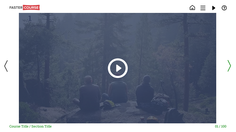
Of course, we also have a few templates for video pages, though that doesn’t mean these are the only pages which are meant to contain videos in our template package. You can easily change and adjust our templates to suit all your needs and wishes.
It looks like I’ve summed up a majority of simple elearning template layouts we provide. Now it is time just for concluding templates, like outro pages and contact info.
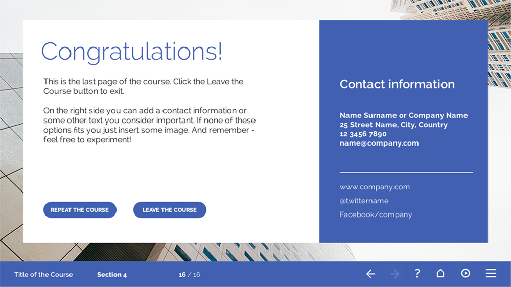
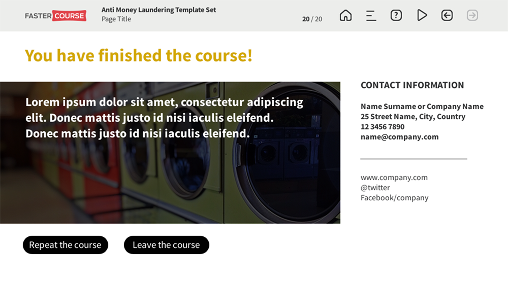
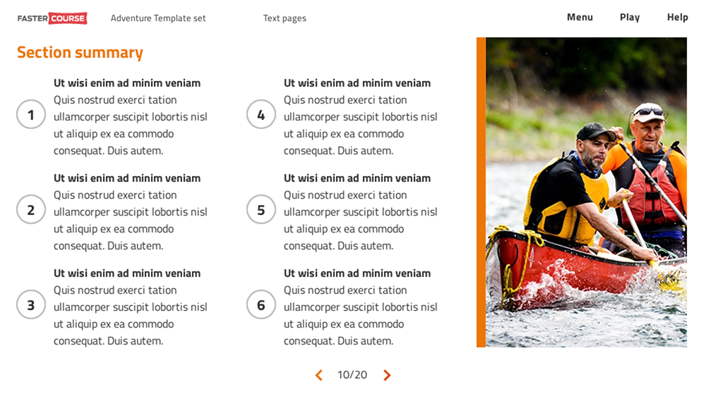
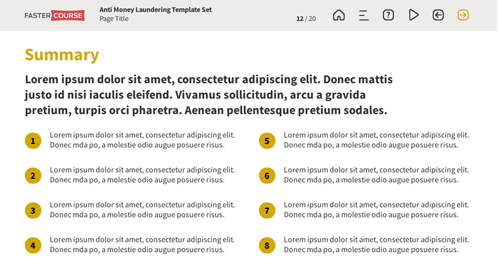
Normally at the end of the elearning course, there is some kind of a summary, so we have created a couple of those templates as well. They are quite similar to key points templates and, of course, you can use whatever template layout you like the best for each kind of information. If you like our intro pages, nobody says that you can’t use them as a summary page or the last page in the course. Though, as said before, we have created some templates just for this purpose. By that I mean they normally contain also a place for additional contact information as well as a couple of buttons, allowing the user to redo the course or exit it.
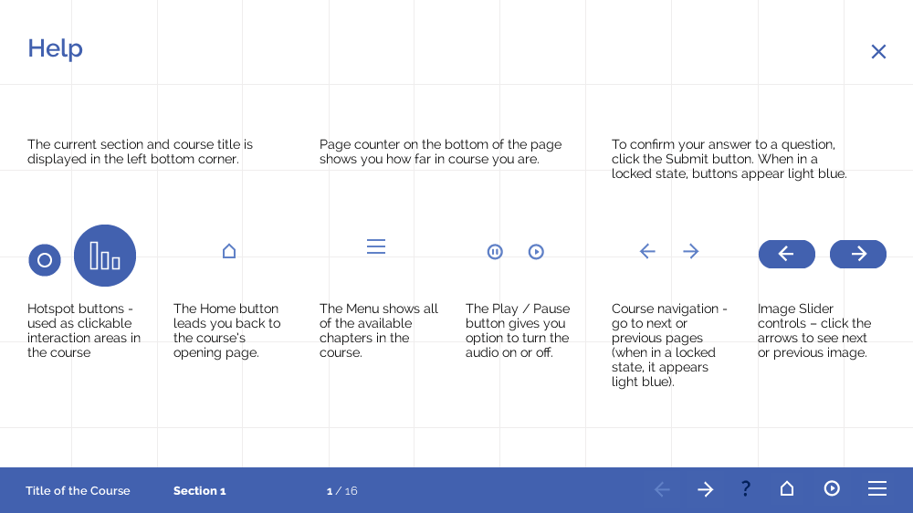
In the end, I just want to mention two more types of our templates – help and menu. They are a part of a global navigation and are kind of self-explanatory. A help page is just a simple page with instructions how to navigate the course. Normally they are simple pages with icons of clickable elements, used in each template set.
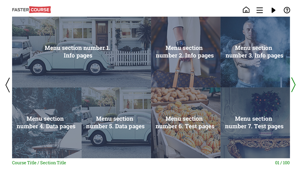
For menu pages we have created a great variety of layouts – basically, every elearning template set we create has its custom menu. They are fully custom menus, separated from built-in items for authoring tools. Why so? We just thought that in this way there are more options for having amazing elearning content! 🙂
Of course, each template contains a help page as well. These pages are very basic and contains just a quick explanation for each of main buttons as well as general buttons used throughout the template.
Explore all e-learning templates
This is only a small part of our E-learning template library. Explore hundreds of course starters, games, click & reveal, info pages and test templates. Click the button below and see all of our e-learning templates!


Comments