If you’ve been a part of the eLearning community for some time, you may have noticed that accessibility has become a must for many establishments. What’s important to understand is that this is not just another obligatory requirement that you greet with a long sigh and hope to avoid as much as possible. There are millions of people worldwide that suffer from visual, motor-skill and other impairments – this is a large number of potential learners that may not be able to benefit from your eLearning, unless you make the necessary adjustments to how you present your content.

The reason I want to talk about accessibility is that, in the last few months, we at FasterCourse have taken on several projects that have had accessibility as one of the requirements. From my experience, creating accessible eLearning content can seem quite daunting at first. However, I find that in practice it’s actually not that complicated if you stick to a few essential rules.
Colors
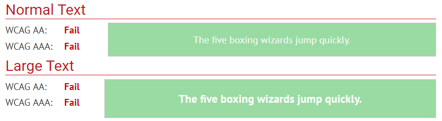
One of the key issues to address is the color scheme that you will use in your eLearning. I want to stress right away that an accessible course doesn’t need to be bland! The main thing you need to look out for is having sufficient contrast between text and background. There are tools out there that can help you determine whether your color scheme meets accessibility requirements. For example, in the WebAIM contrast checker you can enter the color codes of text and background and instantly see what you need to adjust. As you will learn, vibrant colors are not always the most problematic – for example, having light text on a light background can cause a lot more trouble, as you can see below.
Fonts
Another way to improve readability is to make sure that you use appropriate fonts. For accessibility purposes, most sources encourage us to stick to “sans serif” fonts, such as Arial, Helvetica, Verdana and others, especially for body text. The reason is quite simple – the more decorative the font, the more difficult it will be to read for certain groups of people.
If you want to emphasize something, bold may be a better choice than italics or uppercase letters. As to font size, 12-14 pts should be sufficient for body text. However, it’s highly recommended that the text can be zoomed to 200%.
Images and alt text
You should also pay attention to how you use images in your eLearning. If an image adds meaning to the particular page, you should consider ways to convey this meaning to those learners who can’t see the image. A good way to do this is to add the so-called “alt text” (alternative text) – a short and precise description that will be read aloud to learners who use screen reading technology to access your content.
Tab order
One of the more tricky parts of creating accessible content is adjusting tab order. This refers to the way content is presented to learners who use the keyboard to navigate or “tab” through the training. The sequence of items presented should be logical and consistent. The reason I say that tab order is tricky is that it can get quite difficult to deal with more interactive page types – at the end of the day, not all interactions can be used in an accessible course. To get a clearer sense of how your eLearning works when using only a keyboard, you should try it out for yourself. There are several free screen readers, such as NVDA and ChromeVox, that you can use for testing purposes.
Multimedia
Finally, I will briefly touch upon multimedia and accessibility. The general rule is quite simple – if your course includes audio or video material, you should offer an alternative. Usually, this means providing open or closed captions for all audio and video content.
Final words of encouragement
So, as you can see, many of the adjustments you’ll need to make to produce accessible eLearning are not that scary. The main thing is to be aware of these adjustments beforehand and apply them as best you can. It will be a valuable experience for you and your learners will appreciate the effort!
P.S. There are many great resources that will help you in your quest to achieve accessibility, such as WebAIM, W3C , BBC and many others.
Our templates
It takes longer to create an accessible e-learning course and it’s not always easy, but you can always find a way how to make the process more efficient. Start by using our elearning templates and the only thing you will have to worry is the accessibility part as we have covered all the rest. Click the button below and browse through our e-learning templates!

Comments