“Do you have responsive templates?” – this question has filled our company’s mailbox ever since we started working in this field. Our customers are changing and adjusting to the new possibilities and so are we. As you may have notice, the need for responsive e-learning courses has grown in the last years. We expect everything to be accessible everywhere we go, we switch from device to device multiple times a day. E-learning industry is changing as we speak and now it can offer a lot more than it did few years ago.
Adobe Captivate has offered responsive course option for some time now and we are quite familiar with the responsive version that was built in Adobe Captivate 9. But if you have been around for the last year, you might have tried the new fluid boxes that comes within Adobe Captivate 2017.
Two completely different approaches with one goal on their mind – balance between usability and design. And if you have ever created responsive web page or e-learning course, you know that you have to choose between these two in every little detail you want to create.
We want to share our experience with both of these products – Adobe Captivate 9 and Adobe Captivate 2017 and show you how they helped us to create responsive e-learning courses and what struggles we faced.
Adobe Captivate 9 responsive features
With Adobe Captivate 9 you can create one content that can be used across multiple devices. This gives you a lot of opportunities and makes responsive e-learning possible. Let’s go through few of the Adobe Captivate 9 features and see how they may help you with creating responsive e-learning and what can be more time consuming than you thought.
One content across multiple devices
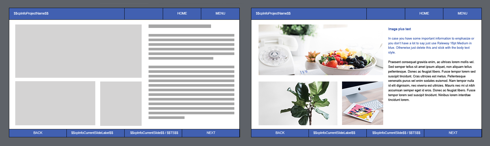
The good part about Adobe Captivate is that you can add your content only once and it will adjust to all devices. This feature is great if there are only few objects on your slide, but it gets challenging once you add more objects than simply text and image. You have to be familiar with all Captivate responsive features to do this, including smart positioning (the ability to position one object relative to another) and object dimensions (you can choose if you want objects to be responsive or static), otherwise you will have to adjust every object in every breakpoint.
You can change the width for every breakpoint you are willing to use
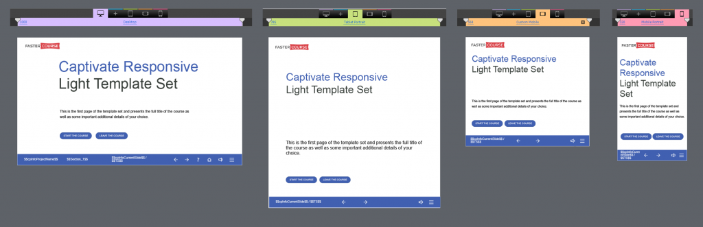
There are maximum 5 breakpoints available, but you can always go with only three – desktop, tablet and mobile. The extra two are for tablet and mobile landscape versions. This feature is very useful if you know on what devices your students will be using the course and you can create breakpoints the exact same size. If you don’t know how wide the screens will be, we would suggest you to take smallest possible mobile screen size, that is around 300-320px wide and set is as the width for the last breakpoint. In between the desktop screen size and the mobile screen size, divide the breakpoints in equal parts.
Different content in different breakpoints
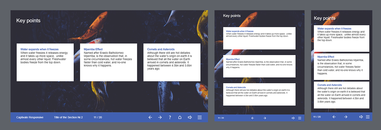
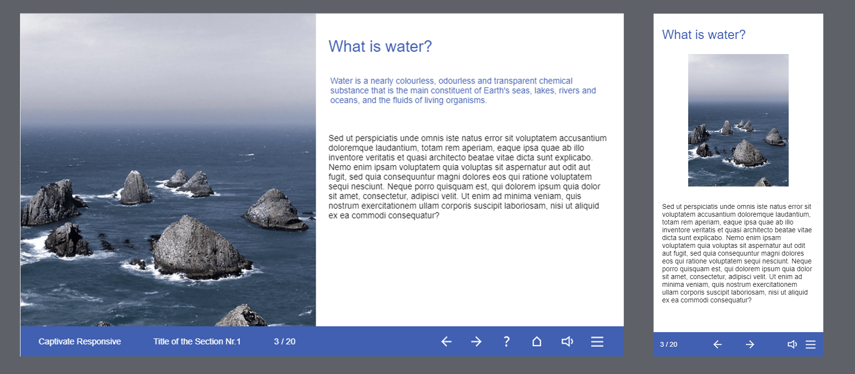
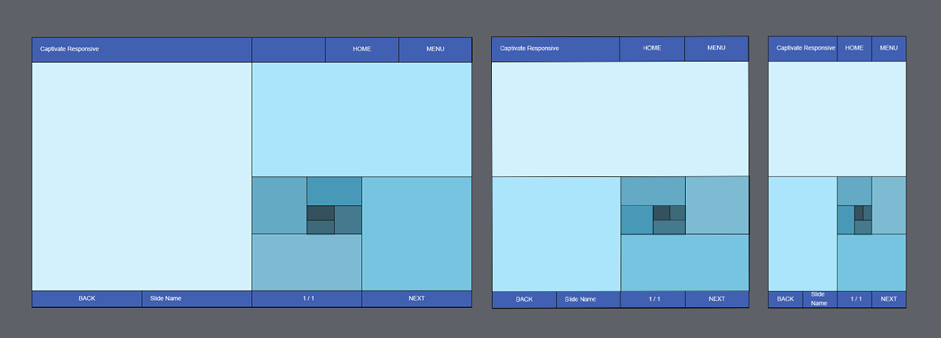
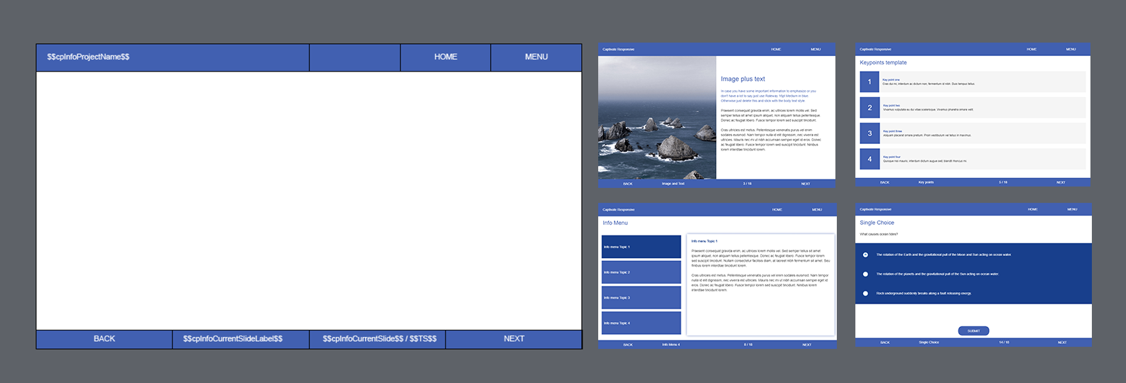
In Adobe Captivate 9 you can add different content in different breakpoints, which is great, because sometimes you want less objects and content to be visible on mobile screen. And the option that you can change the information between devices may come in handy. For example, you probably won’t use the same navigation buttons that you use in desktop in your mobile device, because they may seem small and uncomfortable. With Adobe Captivate 9 you can resize your navigation buttons bigger in mobile mode and leave them small in desktop view. Or even add different buttons that will be visible only in a specific device. With this feature you don’t have to choose between design and usability.
In this example you can see that there are less text on mobile screen and also the bottom navigation bar looks different in both screen sizes.
In between the breakpoints
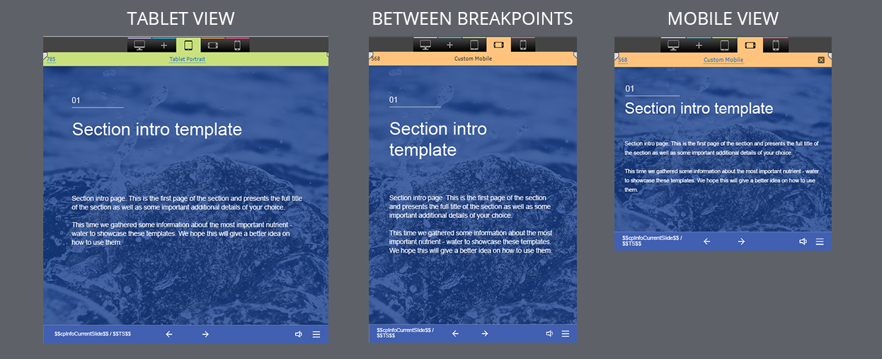
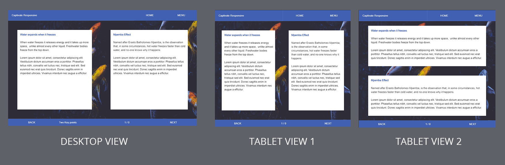
You can’t control everything. This is a common knowledge, but in Captivate this means, that you can design and align all objects within breakpoints, but you have no control over what happens in between the breakpoints. You will have to spend extra time on aligning objects in every breakpoint to make sure, that they are always visible in every screen size that the users will be using. That’s why you can see a lot of white space that seems unnecessary in responsive projects.
Here you can see how the content in slide looks in tablet view on the left side and on mobile landscape on the right side. Image in the middle shows how your slide looks between those two breakpoints.
Altogether Adobe Captivate 9 gives us great range of options that can help us create responsive courses and this feature is necessary nowadays. We can agree that responsive courses takes more time to develop than regular ones, so think it through, if you really need to have your course accessible on mobile devices. And if you do need to build responsive e-learning courses, prepare to be patient and accurate and everything will turn out great.
Adobe Captivate 2017 responsive features
Last year we got this Adobe Captivate product and I cannot lie, we have been waiting for this to happen for a quite some time. Something totally different from what it was before. New approach on creating responsive courses. No more breakpoints, no more adjusting elements three to five times for every screen size. Fluid boxes was created to save your time, to change the opinion that responsive courses are far more time-consuming than basic e-learning course. And now that we have created our first responsive template with Adobe Captivate 2017 using fluid boxes, we can give you our honest opinion.
Let’s go through some of the new features provided by Adobe Captivate 2017.
No more thinking outside the box
With the newest version of Adobe Captivate you can build your course from boxes, almost as playing with Lego. Fluid boxes are the most significant change since Adobe Captivate 9. With them you can divide all of your page content into smaller portions and see how they change their position and appearance while you are changing the width of the screen size.
Clear vision
Getting use to the fluid boxes took us some while, but once you realize you can put boxes into boxes it becomes a bit more comprehensible than it was before. This means that you need to have clear vision about how your slide should look, before you start working on it.
Wrap your content
What we really enjoyed is the new wrapping feature, that allows you to change the way how your content will arrange in smaller devices. You can choose between 4 options that will totally change the appearance of your slide. Switch between them and find the best one!
Here you can see two different slide layouts. With Adobe Captivate 2017 you can turn your slide content from one layout to other with single click!
From non-responsive to responsive in no time
Adobe Captivate 2017 allows you to turn every e-learning course into responsive course any time. This is a great feature, because sometimes you or your client might change their mind during development stage and this might save your time.
Global elements in master slide
If you have global elements that need to be in every slide, we would suggest you to create a basic layout in master slide. Add the global elements there and save some free space that you can later use to add slide content. This way you won’t have to add the same elements in every slide and you won’t have to worry that they might not be in the same size or position throughout the course.
You can find a lot of new possibilities in Adobe Captivate 2017 and you can create simple, responsive e-learning courses without any trouble. Once you will start to create more difficult slides, you may face some challenges that could take up more of your time. Although the new idea of dividing the slide in rectangular shapes might help you figure out how it could look on mobile devices, it limits your design possibilities and lacks some of the options you can access while creating non-responsive courses. Nevertheless, it’s always exciting to learn something new and find ways to improve your skills.
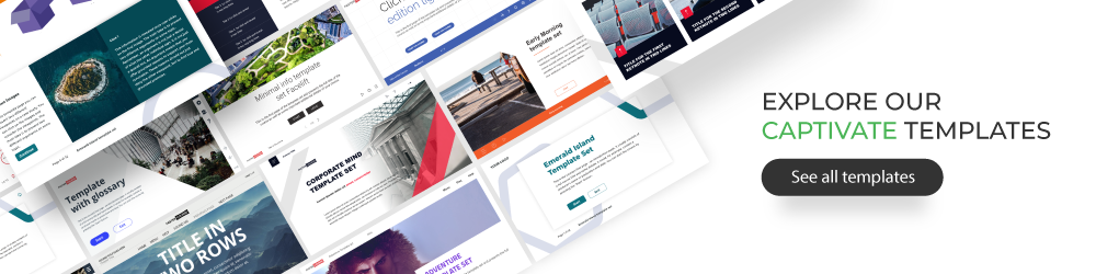
Explore all Captivate responsive templates
Most of our users subscribe only because of our Captivate responsive templates. Explore all of our course starters, games, click & reveal, info pages and test templates built specifically for Adobe Captivate. Click the button below and see all of our Captivate templates including the responsive ones!
Comments