The stars have aligned perfectly and we had a moment to participate in the last Elearning Heroes weekly challenge. As usual, we found the challenge engaging and exciting. You can see the other entries here.
Click and reveal magic
This week’s challenge was the core element of almost every elearning course – click and reveal interaction. I can quite surely say everybody has something in mind when they hear these words. In this particular challenge, the focus was on labeled graphics or as we like to call them – hotspots interaction. It uses an icon (called “marker”) and a popup with information that opens after the user has interacted with the icon. You can learn more about how to add and edit markers in Storyline here.
Our example
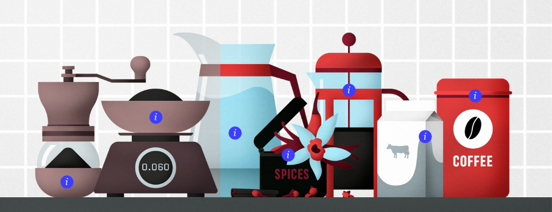
We decided to go for Articulate Storylines built-in functionality for this task and use built-in markers for this challenge. It is a remarkably quick and painless method to create fast and engaging e-learning content with minimal effort. And what a better theme to a peaceful challenge than a cup of coffee! When I’m writing those words, I can practically smell the gorgeous dark roast aroma! I think no doubts about me being a coffee lover! 😀
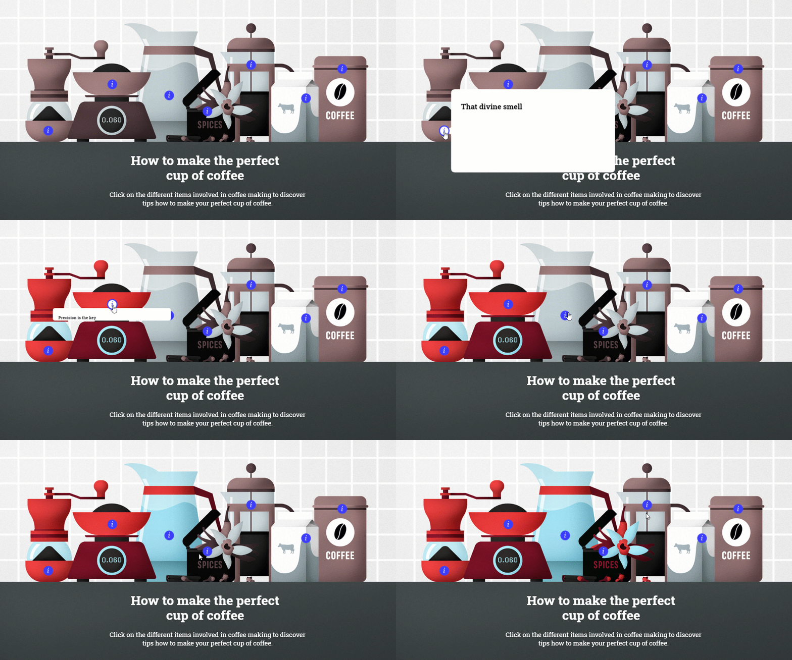
It all begins with a rather dull-looking scene. By hovering over markers, the user discovers the tips to make that perfect cup of coffee. To make the interaction more engaging, whenever the user hovers over the marker, the corresponding object is coloured too. Hence, after reading all the tips, the coffee journey can conclude with a vivid coffee scene.

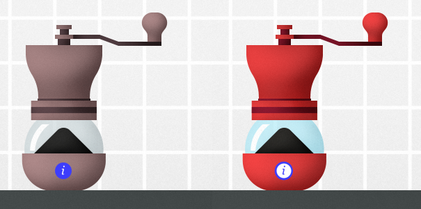
As we used the built-in markers, we did just some minor alterations to them. We adjusted them to fit our desired design by removing outline and border. We also changed the marker icon to one we prefer. Additionally, we added the hover state with a different icon to make it a bit more visually entertaining. Here below you can see how the object looks before it has viewed and how it changes when user hovers over the marker.

The hardest task was to adjust popup text as this built-in element doesn’t follow the regular text positioning options. So we used a bit of creativity and let the text indentation and some extra spaces do the magic.
Download for free
Want to learn more about how we built this example? Feel free to download the source file, explore it and use it for non-commercial purposes. If you would like to use this Storyline template for commercial use, please consider subscribing to the FasterCourse template library.


Comments