If you struggle with text being cut off, wonky-looking images or similar breakpoint issues, this one’s for you!
Working with Captivate daily, our team has developed a few tips and tricks that help to work with breakpoints more effectively.
1. Leave ‘white spaces’ in text areas
If you open any of our responsive Captivate templates, you will quickly notice that most text fields are larger than the actual text in it. And that’s not an accident!
When you don’t leave additional space in text areas and the project is opened on a device with an unconventional screen size (i.e. a screen that is not defined as a breakpoint), the text field will be scaled and some of the text could be cut off.
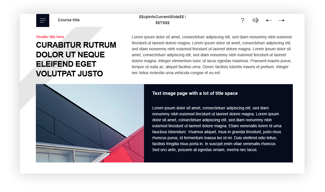
For example, if you would leave a text field like this in a Desktop breakpoint that is 1000px wide:
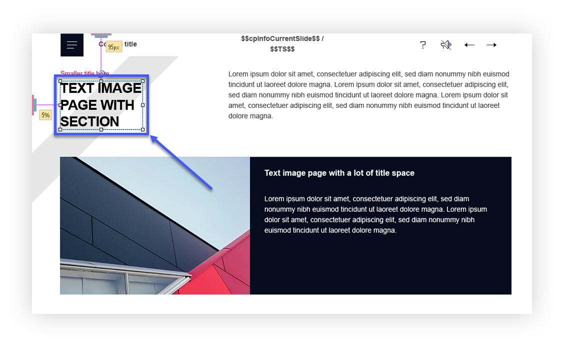
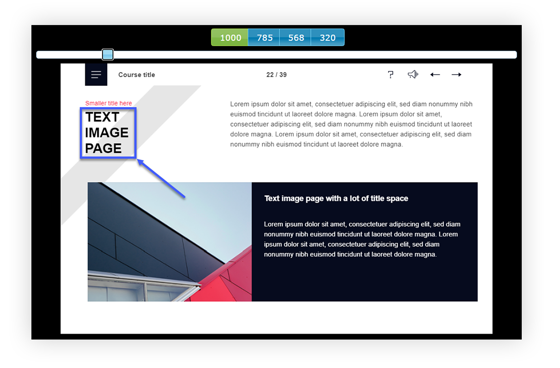
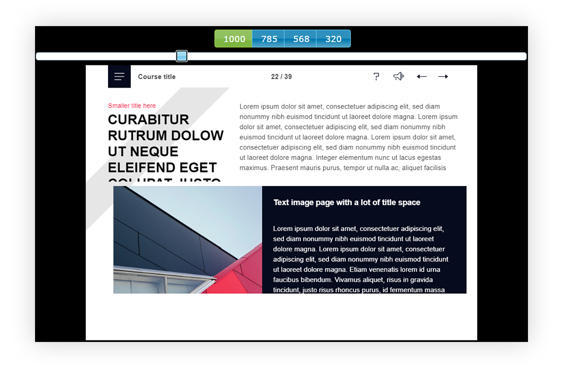
On a screen that is 900px wide, it could turn out looking like this (‘with section’ has gone missing):
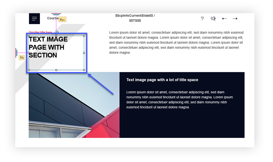
We avoid this by leaving a white space area in the text field.
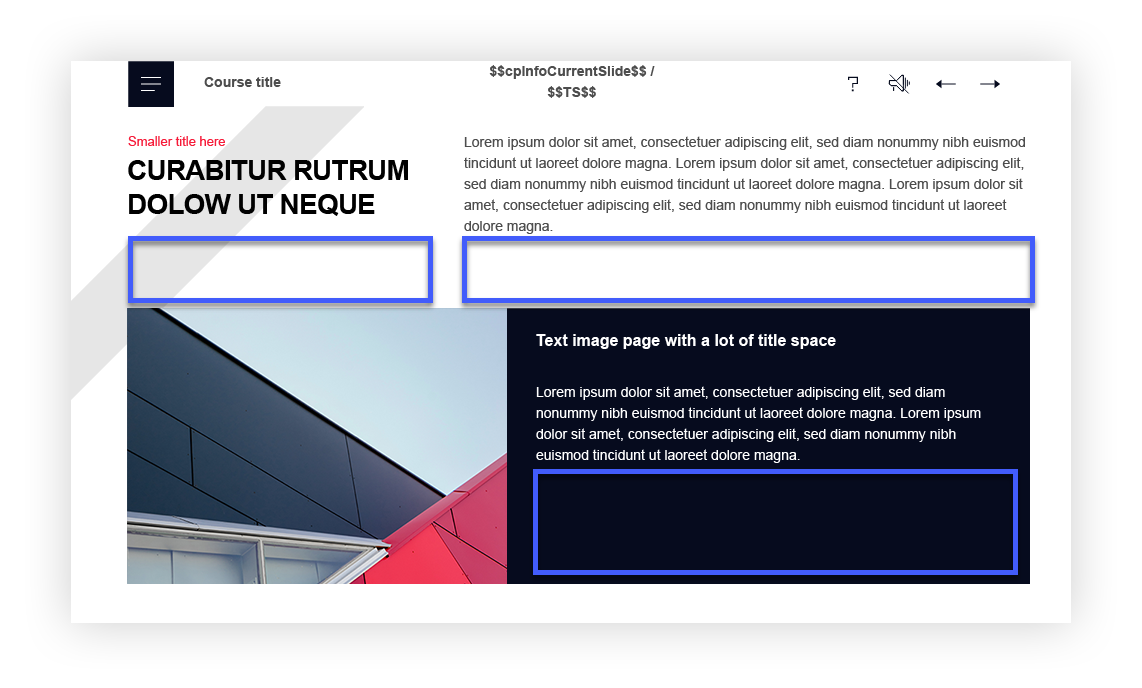
In the source file it looks something like this:
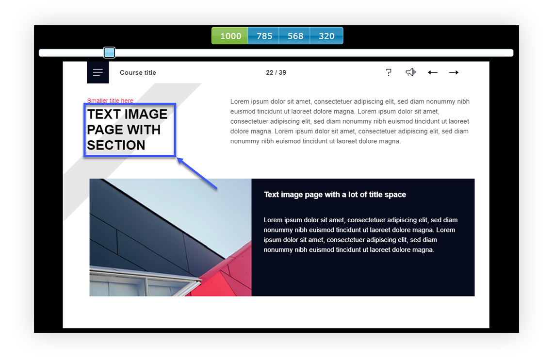
As a result, it’s not cut off on a screen that is 900px wide:
2. Don’t overcrowd the slide
Filling the slide with as much content as possible can cause you to run into issues such as some objects overlapping others when they are scaled. Even if you can fit all of the content on a large screen, it might not be the case on smaller screens. We always make sure to leave enough empty space in the slide canvas.
If we were to fill the slide with a lot of content like this:
On a screen that is 800px wide, it would look like this:
Definitely not the look we want!
Shorten your content or move objects around to make some space.
We highly advise to plan the layout beforehand. Choose a slide template that matches the amount of text/content you plan to add in. If you choose a simple text image slide, yet have loads of text to input in the slide, a simple text & image template might not be what you are looking for!
Consider solutions such as:
- Sliders,
- Hotspots & popups,
- ‘Read more’ or ‘More info’ button,
- Tabs,
- Info menu,
- Flipcards, etc.
Sometimes changing the template can help you avoid these issues altogether!
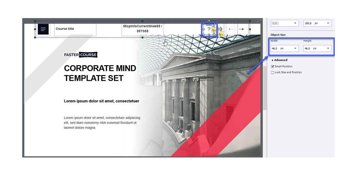
3. Pay attention to object size settings
In non-responsive courses, the object size settings are pretty straightforward – pixels! In the case of breakpoints, Captivate offers 4 options: %, px, Auto and % Relative.
Size settings can be set to something different in each breakpoint. For example, you might want the picture to be scaled according to the screen size in Desktop breakpoint view, but leave the size unscaled in the Custom Mobile and Mobile Portrait breakpoints.
With time, using these settings becomes very intuitive, as you learn what works best for different objects and slide layouts. Here are some practical examples on how to choose size settings to achieve the desired result.
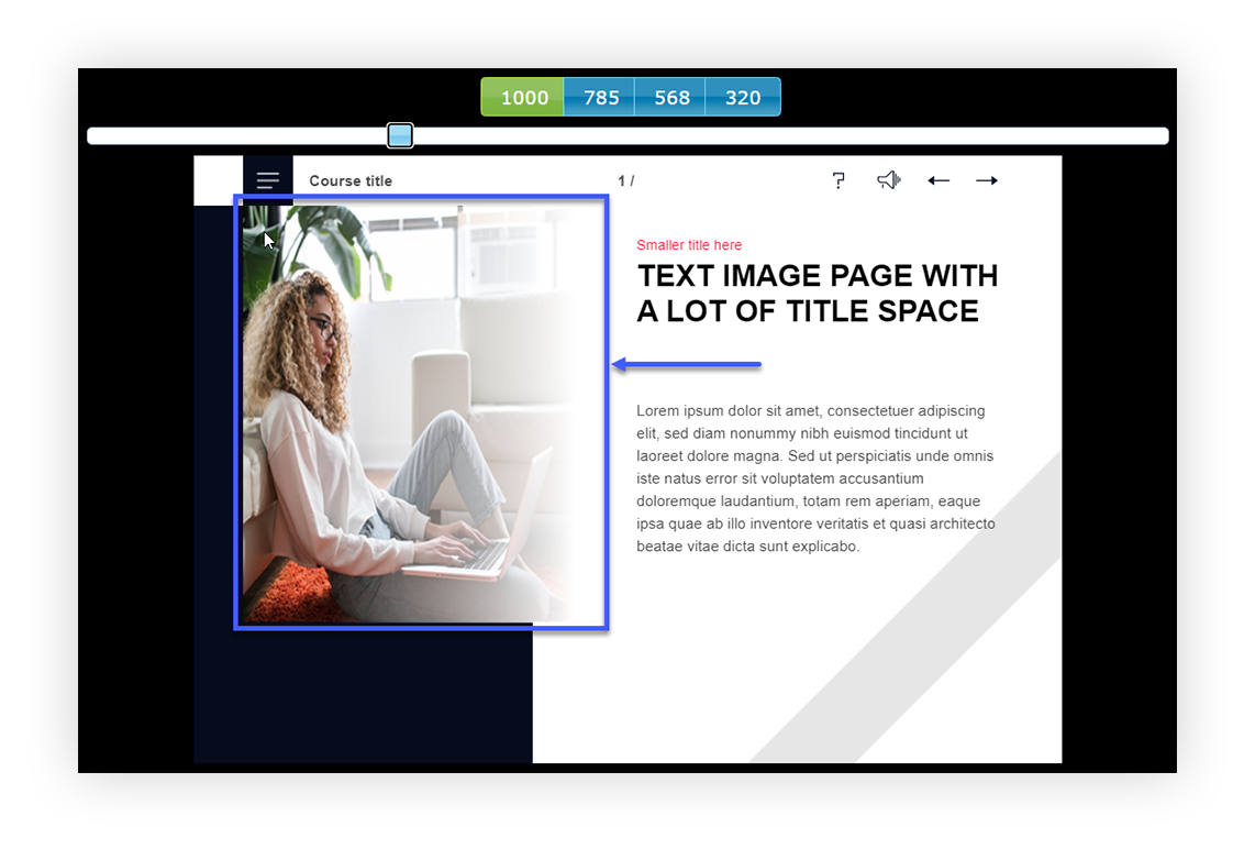
Object is scaled according to screen size
If you’d like the object to be scaled according to the screen size, set width to % and height to Auto.
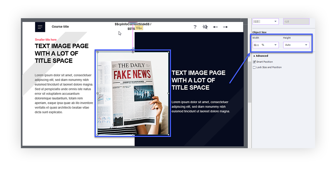
With these settings, the object proportions will remain the same but the size will depend on the screen width. This would be recommended for images and illustrations that must be shown in full on all screens.
Object size remains the same
If you’d like the size to remain unchanged, set both width and height to px.
Both the object proportions and size will remain the same, regardless of the screen width or height. This would be useful for small objects, such as buttons, navigation bar objects, images that are just for aesthetic purposes, such as background images, or small text boxes, such as titles with just a few words. Setting the width to px and height to Auto will achieve the same effect.
Object width changes but height remains the same
If you’d like for the height of an object to remain the same but for the width to change, set the width to % and height to px.
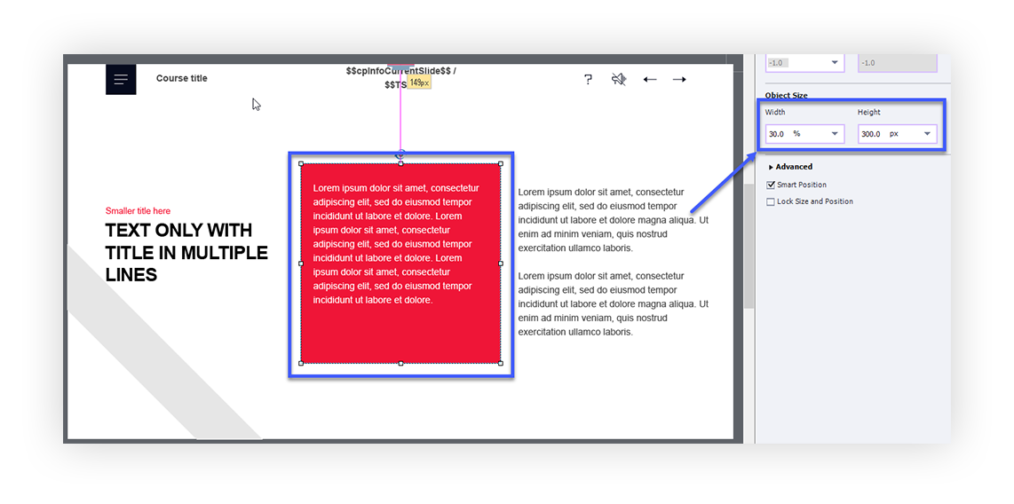
This setting would be recommended for smartshapes that are used as a background (either for text or the entire slide) and most importantly – text boxes. Setting the text box height to px and width to % can often save you from a case of text being cut off (keeping in mind tips Nr. 1 and 2). These size settings would not be recommended for images or icons, as they can look wonky and stretched out as a result:
4. Use Smart Position anchors
In non-responsive courses, you simply set an object to be positioned at X and Y coordinates. Breakpoints make it a little more fun. In the Position tab, you can find a Smart Position checkbox. When it is enabled, you’ll see two anchor points next to each object.
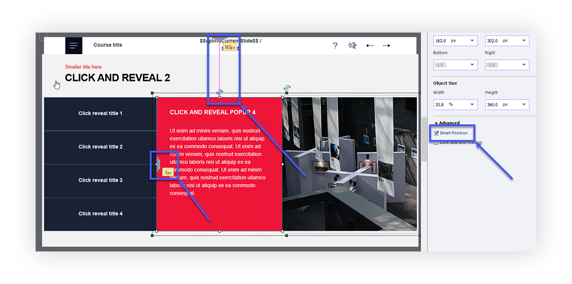
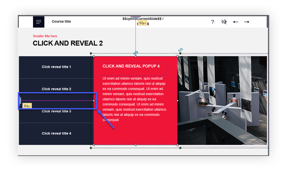
You can either choose to set the anchor points against the sides of the slide or against another object. It might seem that it wouldn’t make a lot of difference but it does! For example, if we set the red box to be positioned against the left side of the slide like so:
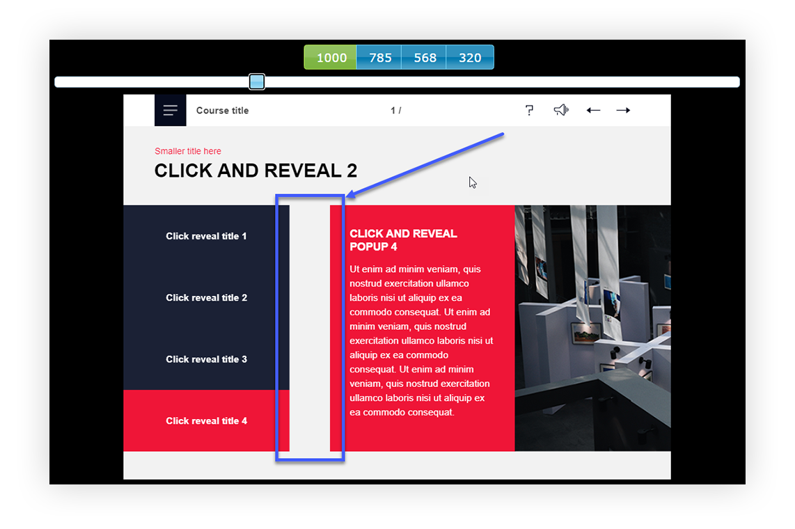
On a screen that is 800px wide, the box will not behave exactly the way we would like:
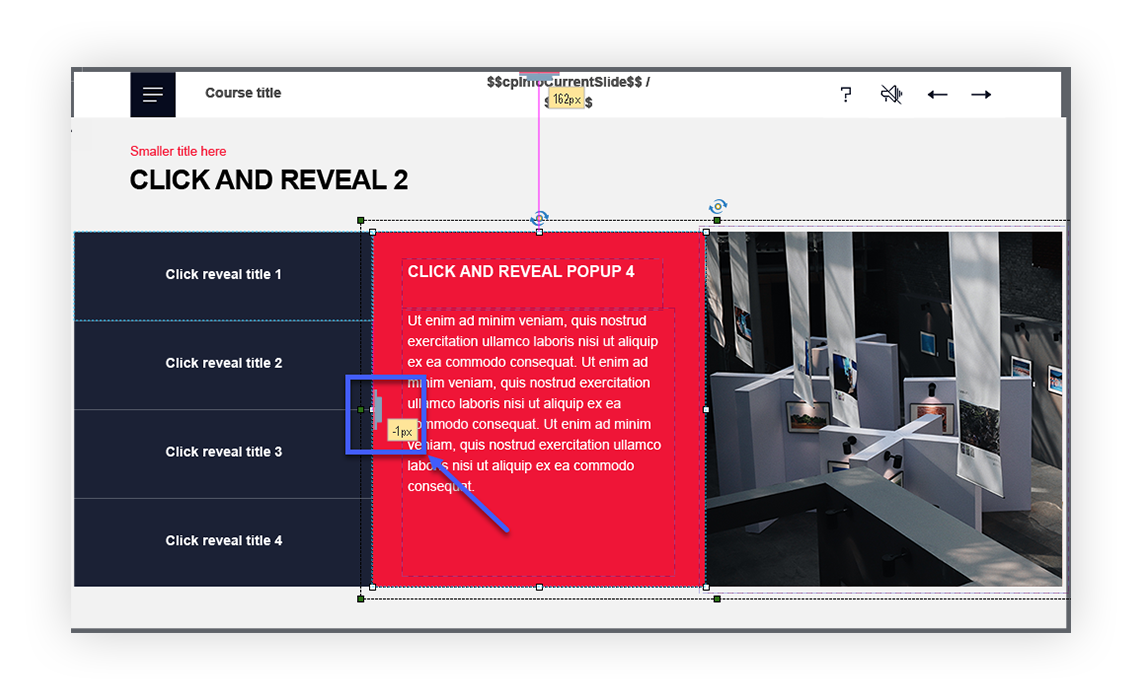
Instead, we should position it against any of the shapes on the left:
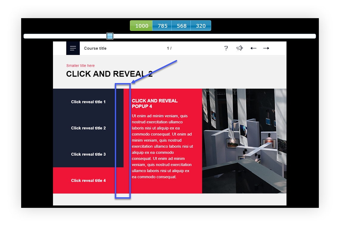
As a result, the position of the smartshape remains correct, regardless of the screen size:
The slightest tweak in positioning can have a significant impact on the end result. With trial and error, you’ll find the correct settings and you’ll find it easier with every new slide!
5. Play around with object placement
Sometimes you might find that the content fits in the slide in the Desktop breakpoint but as the screen size gets smaller, it’s almost impossible to fit it all. That’s where slide height settings and vertical distribution comes in!
While the device height is the same in the entire project, slide height can be changed slide to slide. And it doesn’t have to match the device height.
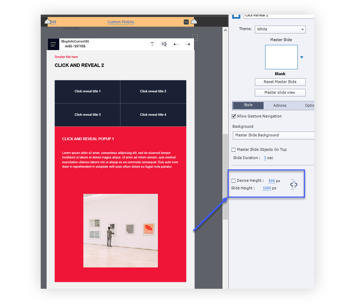
This allows you to vertically distribute the content and insert all of the objects that otherwise would not fit in. The learner will use a vertical scrollbar to access any content that is outside of the defined screen height.
This is only the tip of the iceberg for working with breakpoints but we hope that these practical tips will help you navigate the world of breakpoints a little better. If you find yourself struggling, don’t give up on it! Play around with the objects, layouts and settings until you get the desired result. With breakpoints practice truly makes perfect!
If you are looking for amazing templates for Captivate, look no further, click on the link below!
Comments