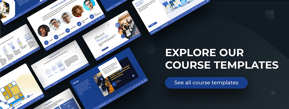
You may already have noticed that we launched a new product earlier this year – Course Templates. These course templates are ready to use – all texts, images and interactions are there, and you can make any adjustments that you wish or present the course templates just as they are. With 7 courses up and running, I thought it might be a good time to reflect on our experience of producing these course templates.
Plans change
I thought that our most recent course templates – Negotiation Process and Negotiation Skills – would make for a good subject for this little case study. The interesting thing about writing content for these two templates was that initially it was intended to be a single course on negotiations. Of course, this is a big topic with many different issues to discuss. So, when the first draft of the content was finished and reviewed by a couple of my colleagues (always a good idea by the way!), the verdict was clear – this thing was just way too long. How long, you ask? It was around 80 pages and would take more than an hour to complete!
However, we did not despair (not for very long, anyway). After reviewing the material, it became clear that almost all of it was interesting and relevant, but there was just too much information to absorb in a single session. So, what we ended up doing was sorting the content into two logical batches – one describing the negotiation process and the other addressing skills that are important for a good negotiator. All it took was some time, a wall and a lot of sticky notes.
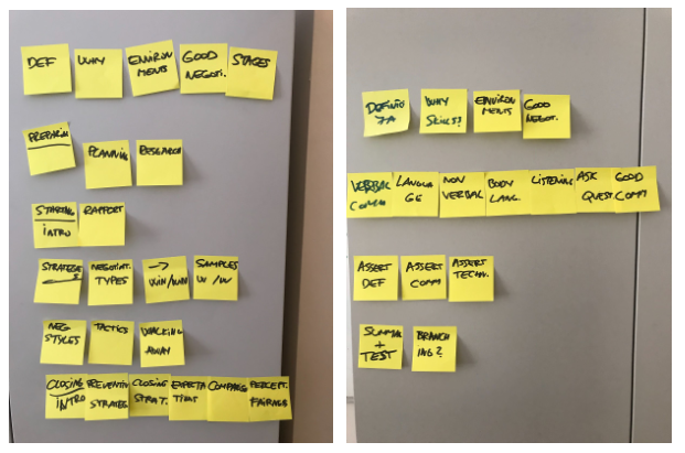
Once we had done that, we felt very relieved – the two course templates were much more digestible and the content flow improved significantly. This just goes to show that sometimes you have to change your initial plans for the benefit of the learners – and that’s okay!
Storyboarding
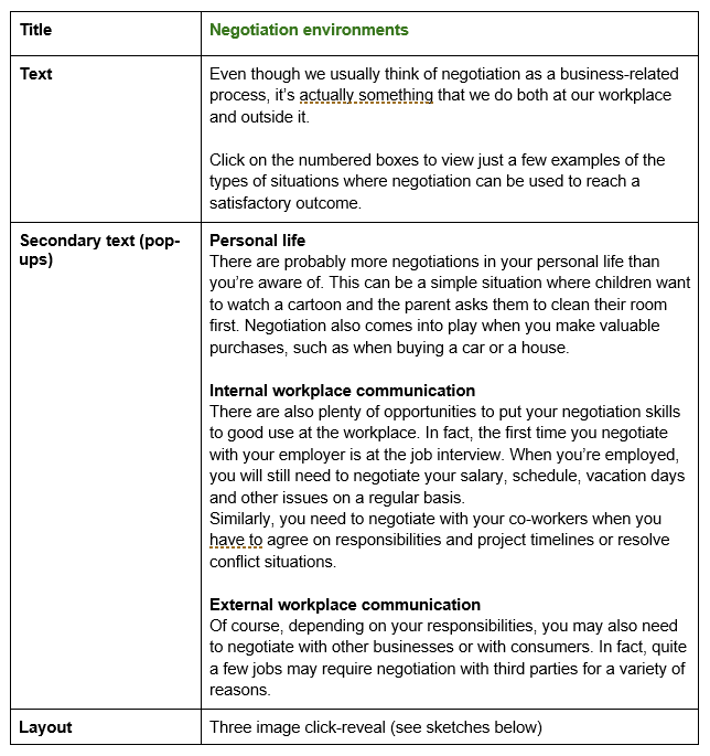
Once the content issues where sorted, we could move on to working on a detailed storyboard. Of course, storyboards can come in many different formats, but we usually use a simple template that you can download for free by clicking below.
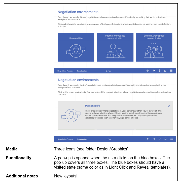
At this point, our instructional designers had to figure out what layouts would best suit the content, what interactions we wanted to have and so on. So, they would first structure the text into blocks as required by the template (titles, base text, pop-ups etc.). They would then add instructions for the developers, so that they would have a clearer idea of what the end result should be (object placement, interactions, button states). This is especially important to do in cases of modified or new layouts.
Templates
In general, we strongly rely on our Light template set for our course templates because it’s clean and modern and can lend itself to a variety of topics. Furthermore, it’s also one of the richest in terms of different layouts, starting with simple info pages and ending with a wide selection of interactive pages.
There are many templates that we used just as they are. One type of content that we had to deal with on multiple occasions was bulleted lists, collections of short tips or characteristics etc. For this, we were happy to make use of such layouts as hotspots, timelines and sliders.
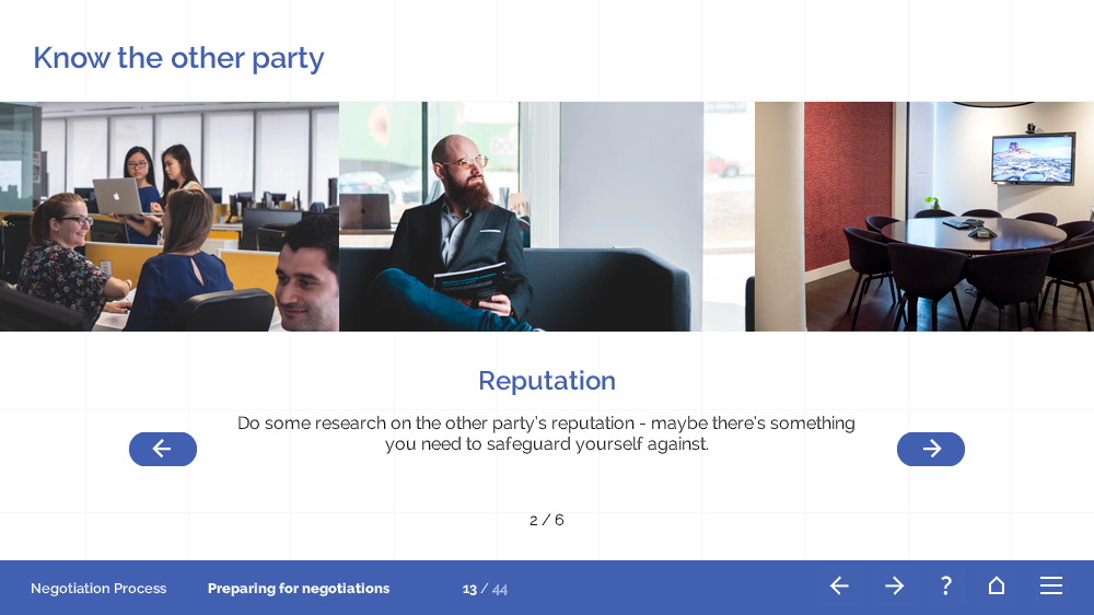
Another challenging case was handling content-heavy pages. Luckily, we had some good choices in our Click-reveal set, which offers a variety of tabbed interactions.
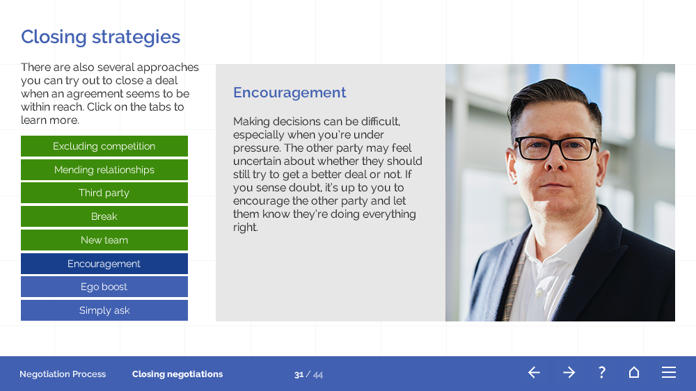
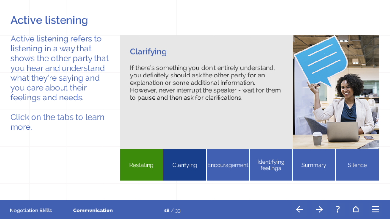
The content also inspired us to adjust some existing layouts to our specific needs.
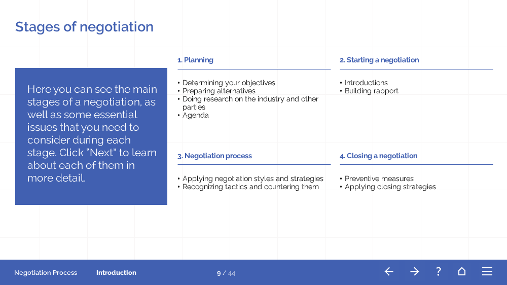
Finally, we even came up with a few new layouts just for these course templates, such as a Case 3 page (inspired by our Corporate Mind template set), a Summary page and a Scenario intro page.
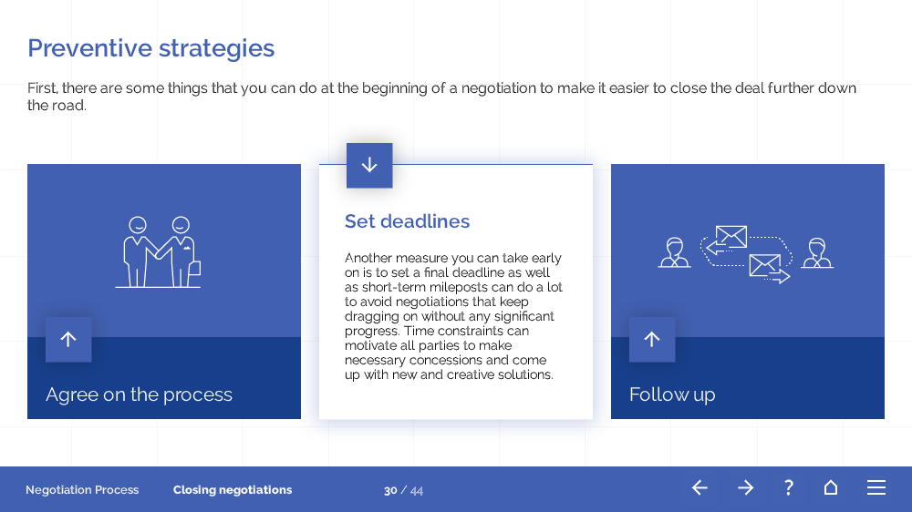
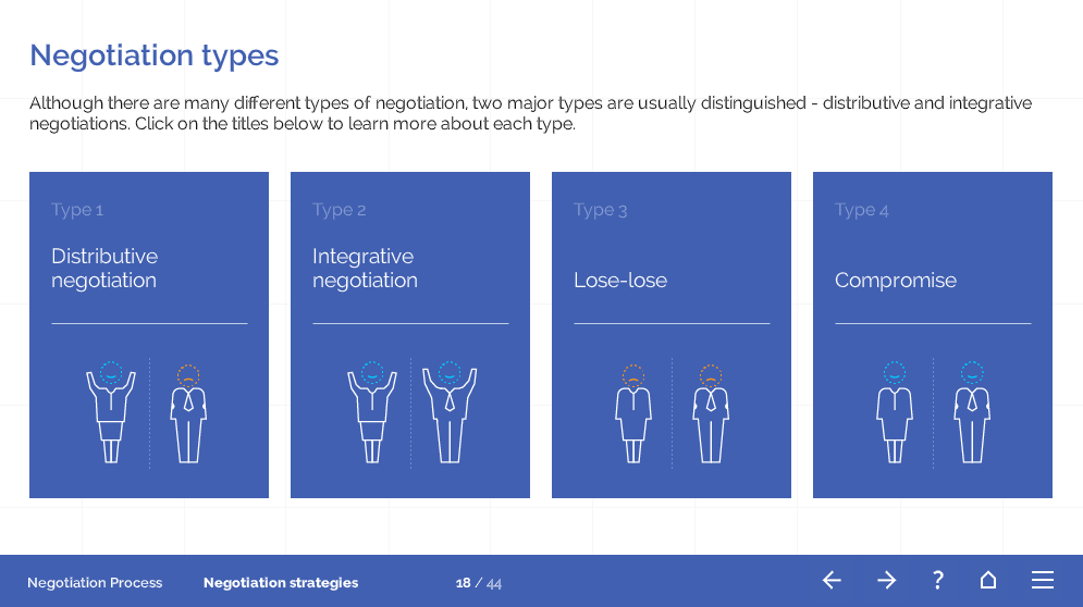
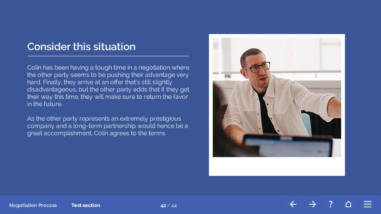
In general, we found that the templates offered us many great options and even helped us figure out what the best way to structure the content would be. However, sometimes a layout just isn’t a perfect fit, but a small adjustment can make all the difference. Of course, very specific content can also call for a custom layout, and that’s OK – after all, you already have a solid design that you can refer to when creating something new.
Images
Once the layouts are agreed on, our designer is tasked with finding images for the training. This means that he has to go through the course slide by slide and come up with images that would complement the content. Of course, if there are some tricky cases, we help him out with ideas!
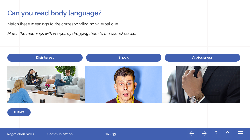
We often select images for our templates and courses from online libraries that allow people to use their photos for free, both for noncommercial and commercial purposes. For the Negotiation course templates, our designer found everything we needed on Unsplash and Burst. These and many other sites really offer some great high-quality images that will make your E-learning look beautiful and professional. If you want to learn more about this, take a look at this little blog that I wrote a while back.
Final thoughts
Looking back at the process, it’s fair to say that we had our struggles. However, I find that, if you look at what you’ve done and you have a feeling that it’s just not turning into the great learning experience that you want, don’t be afraid to make changes and good things will happen. There are always new things you can try and many helpful resources that will inspire you and help you along the way!
Sounds interesting?
Do you feel like course templates might come in handy when building your next e-learning course? We have course templates about popular topics like Sale skills, Customer Service, Workplace Harassment, Data Protection, Negotiations, Business Ethics, Fire Safety, etc.
Click below to take a closer look at all course templates we’ve produced so far, and don’t hesitate to contact us if you have any questions!

Thank you, Ilze, for posting this. I’ve already bought your templates. What I’d really like to see is either a post or a video – maybe even a brainstorming session – about the thought process that goes into creating a new course from scratch, given a set of learning objectives.
I’m faced with “Great, now where do I start?” I want to be able to think like you guys think. Because if I can do that, then I can produce some really great things like you guys do.
Can you do something like that for us?
Thank you, Eric, for your wonderful feedback, that’s actually a great idea! I think we could definitely write a blog post about how we create one of our own course templates from start to finish – how we gather the information, how we come up with the structure and storyboard, how we come up with tasks and interactions, what are the methods that we use in our meetings, etc. I hope you had something similar in mind 🙂 And feel free to give us more ideas and feedback, we are always happy to hear from our users!
Thank you, Ilze, for this post. I use FasterCourse templates and I love them. I view them over and over to see which template will work. Sometimes I use different layouts from a variety of templates because I feel they suit my purpose.
You’ve also helped me when I had an issue and you were extremely helpful. I’m going to view these images site – I’m always looking for fresh and exciting images.
Hello Norma,
Ilze is on holiday now, but I will let her know :). Thank you for the kind words. Really happy to have you on our side and glad we could help :).