While we are still getting used to the new possibilities that Adobe Captivate 2017 provides, we want to give you some insights on how this tool can create responsive e-learning courses and what other new features you can find in this Adobe Captivate version.
Responsive features
Fluidboxes
This new feature gives you a different perspective on responsive e-learning. With Fluid boxes you can create content that can be viewed on multiple devices. I know, this isn’t anything new, but unlike in the previous version – Adobe Captivate 9, where you had to build the course in 5 different breakpoint views, you will have to add your content only once and the design will adapt to every device from desktop to mobile. We were writing about responsive features in Adobe Captivate products in our previous blog post, you can read it here. In this post we want to take a closer look on Adobe Captivate 2017 newest features and the ability to create responsive courses with fluid boxes.
There are lot of options to choose from when working with Fluid boxes. We will take a look on layout, wrapping and padding options and see how fluid box selector can help you navigate through your content.
Layout
First of all, you can choose the layout of the fluid boxes – if they are going to be stacked vertically or horizontally. This may sound easy, but once you start dividing each fluid box into smaller containers, you will have to think two steps ahead on how you want them to be arranged in smaller devices. The good part is that you can change your mind later and switch any fluid box from horizontal to vertical flow.

Wrapping
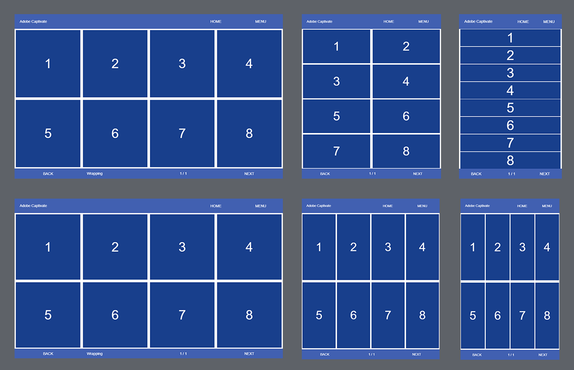
The next styling option is wrapping – you can choose different ways how you want your content to be placed in slide. This gives you a variety of choices on how your slide can look on different devices. You can change the look with one click and try every option to see which wrapping alternative suits you the best. Choose from 4 options – wrap to next column, squeeze in one column, wrap in one column/row or choose symmetrical wrapping. Here in this example we changed the wrapping option from one to another with only few clicks.
Padding
Besides the fact that you can align the content in each fluidbox, you can also set padding to all content. This is a simple feature that can give your slide more confident look, because all white space between objects will be in the same size. Here we changed the padding from 5px to 50px and gave our slide a fresh new look.

Fluid Box Selector
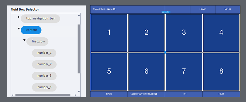
Now, try to imagine packing all your stuff in boxes. Then pack those boxes into bigger ones. At one point it’s almost impossible to find what you need. After couple of times you would probably start writing what you put in each box and where can you find them. That is exactly what Adobe Captivate developers created – a list of all fluid boxes, that shows how many boxes are within each box. You can name them to make it even easier to find the exact fluid box you want to work with.
Time saver
Fluid boxes might save you a lot of time, considering that you won’t have to create design for every breakpoint and you don’t have to align all objects differently, so that they would look good in different screen sizes. But this also includes a lot of planning beforehand, because once you start creating your content with fluid boxes, it will be hard to reorganize the whole slide if you missed some important aspect.
Optional fluid boxes
This option allows you to have slightly different content between devices. For example if you want less information to be visible on your mobile device, simply select the extra fluidbox and check the “Optional” checkbox in your Properties panel. Now when you will resize the screen, you will see that at one point the fluid box will disappear with all the information it contained.

Save as responsive project
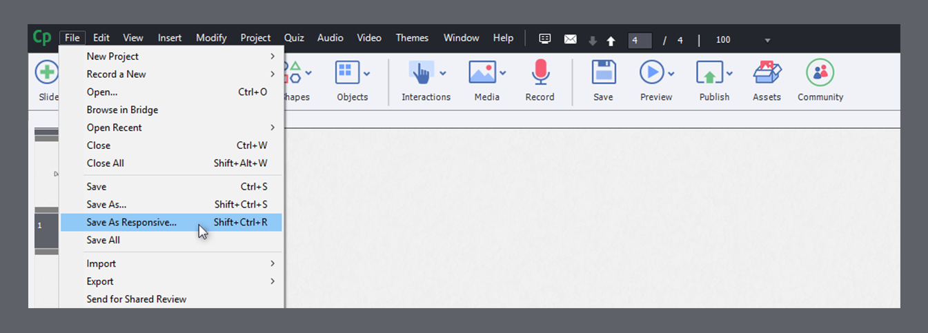
Great feature they have added in this version of Adobe Captivate is the possibility to turn non-responsive course into responsive one with one click. It will sure take some time to put all objects into fluid boxes, but at least now you have ability to change your mind in the middle of developing process.
Expand Icon
Remember when we had to fit the same amount of text in different devices? In this Adobe Captivate version you don’t need to worry about that anymore. Now if your text exceeds the available space limit, you will see a small icon that allows you to read all text. This feature is useful, but sadly there is no easy way how to change the icon to something that would go well with your design.

New Preview Option
There are no more breakpoints as it was in the previous Adobe Captivate version, so now there is a simple slider that changes the width of the screen. You can also choose from few mobile screen sizes that are available in preview mode and see how your course would look on iPhone and other popular mobile devices.

Other features
Fluid boxes are great for responsive projects, but Adobe Captivate 2017 has got some new improvements that can help you with both responsive and non-responsive projects.
Object States
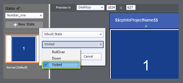
Usually buttons and smart shapes that you turned into buttons had 3 inbuilt states – normal, down and roll over. Now we have the fourth inbuilt state – visited. This is great addition to existing states, because it gives you more options to create interactive slides without using advanced actions.
Another feature that we are really happy for is that now smart shape buttons can have states in master slides. In previous version you could place smart shapes in master slides and they worked great, but you couldn’t add any states. Now if you create button from smart shape in your slide with different states, you can simply copy it to the master slide and the states will be showing.
Advanced actions with condition
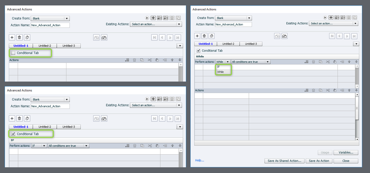
This feature may not seem so essential, but for a developer, I can say that this put a smile on my face. Now you don’t have to create silly conditions to all advanced actions just so you could change your mind later and turn them into an advanced action with condition. Now you can do this with a single click any time you want.
Another addition to the advanced actions is second condition – “while”. Previous we could only create advanced action with “if…else” condition, but now we can choose between “if…else” and “while” conditions.
Typekit integration
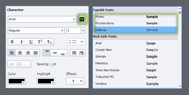
Usually with Adobe Captivate you would choose “web safe” fonts. With Typekit integration in Adobe Captivate 2017 you can choose all kinds of different fonts that are synchronized in your Typekit account. You can find the integrated Typekit fonts at the top of your font list, right above the web safe fonts. If you use some of the Typekit fonts in your course, you will have to set the domain of this Typekit font when you publish your course.
Closed Captions
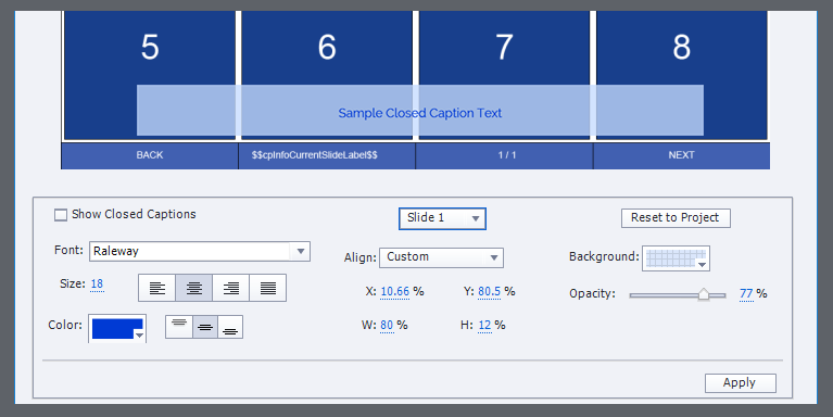
Closed Captions had limited options before, but now you can change the position, colour, text alignment and you can choose to have the same style in the whole project or each slide can have their own closed caption style. This way you can create modern closed captions that suits your design.
Summary
Overall, Adobe Captivate 2017 has some great features that can help you create e-learning courses faster, but you might have to spend some time to get used to the new additions in this Adobe Captivate version. Fluid boxes have some great characteristics, but your design might suffer from the fact, that now you have to divide your content in boxes. Other features have some nice touches, that makes your work with Adobe Captivate more pleasant than before. Try the new features for yourself and see how they could improve your e-learning courses.
Explore all Captivate templates
All of our templates can be used in Adobe Captivate 2017 and Adobe Captivate 2019. Explore hundreds of course starters, games, click & reveal, info pages and test templates. Click the button below and see all of our Adobe Captivate templates!


Comments