One of the reasons why designing e-learning is so exciting is that there are so many different ways you can present content to your learners. E-learning authoring tools keep improving and adding new features, allowing instructional designers all over the world to come up with countless creative solutions every day.
If you’re new to e-learning, it may be difficult for you to grasp all the different options and how you can use them to bring your e-learning course to life. That’s where we come in! We’ve compiled a list of all the various template types that we use in our e-learning projects. We hope that this will be just what you need to get your creative juices flowing, so that you can create amazing e-learning!
Info pages
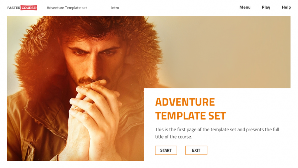
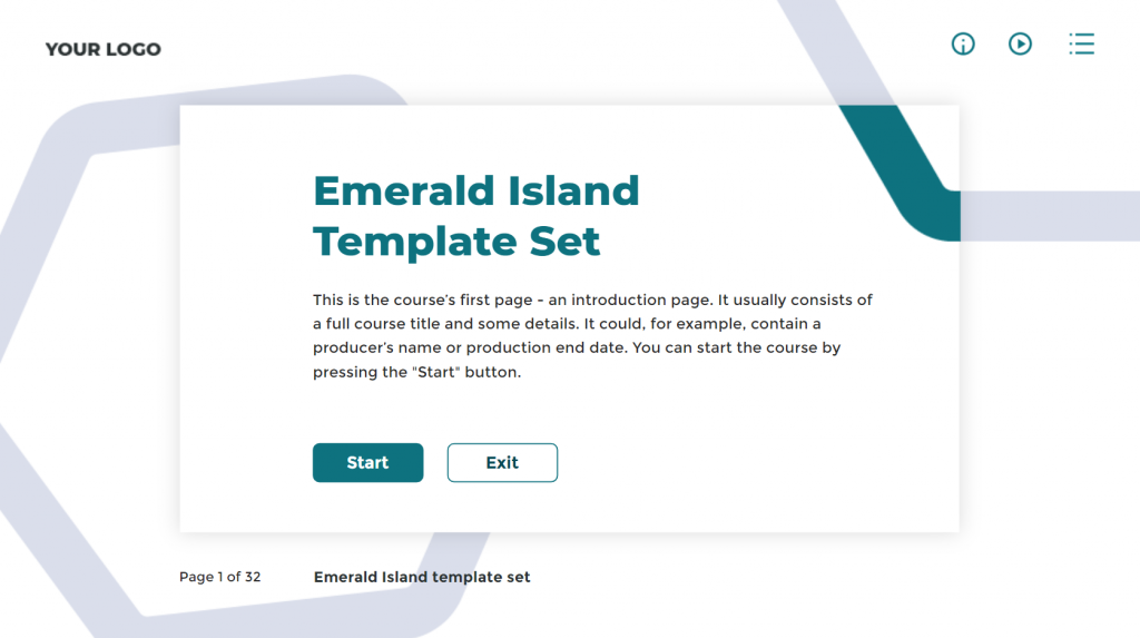
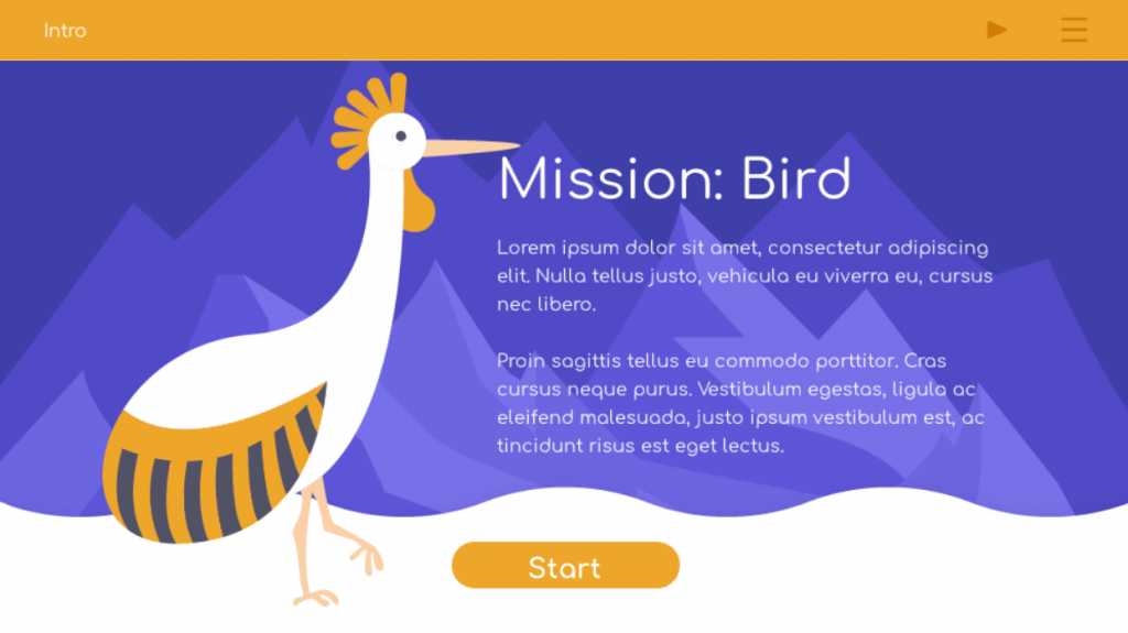
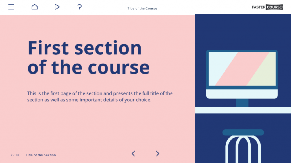
Course title page
Of course, everything starts with a title. The course title page layout usually contains the title as well as brief information about the training. As you know, first impression matters, so this is also your chance to grab the learner’s attention with some eye-catching visuals.
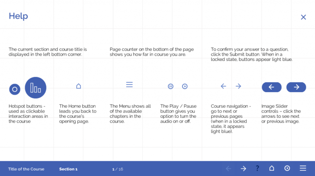
Help
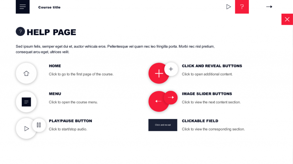
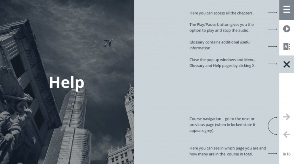
One of the first things that‘s available to the learner is the Help page. The purpose of this page is to show the learner how to navigate and interact with the course content. Usually, this page features essential interactive elements and their explanations.
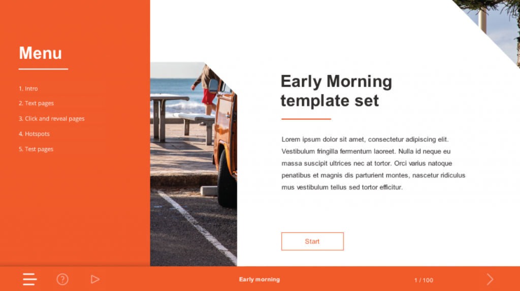
Menu
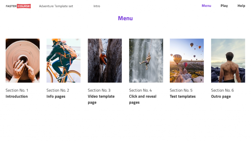
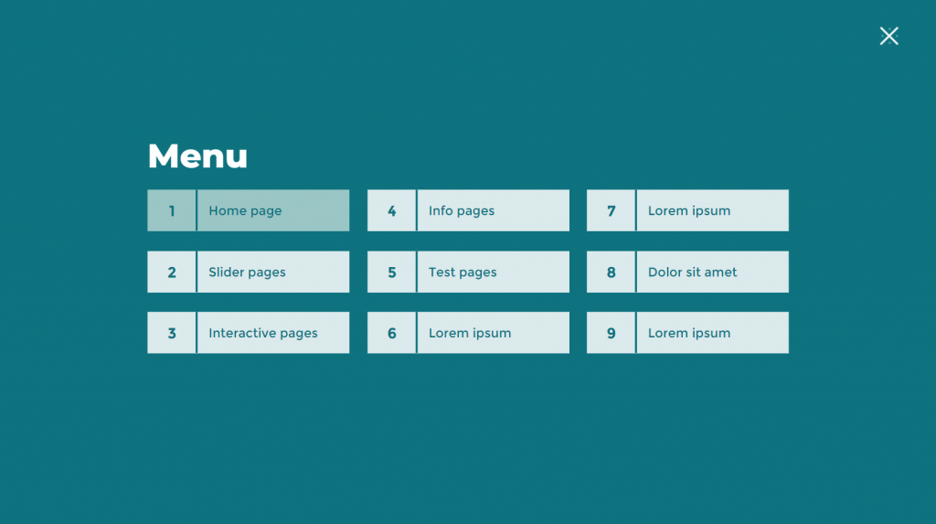
Another important feature is the Menu that allows the learner to see what chapters the course contains. The Menu can come in all shapes and sizes, starting with a minimalistic dropdown menu and ending with an elaborate Menu page that may feature icons or even images.
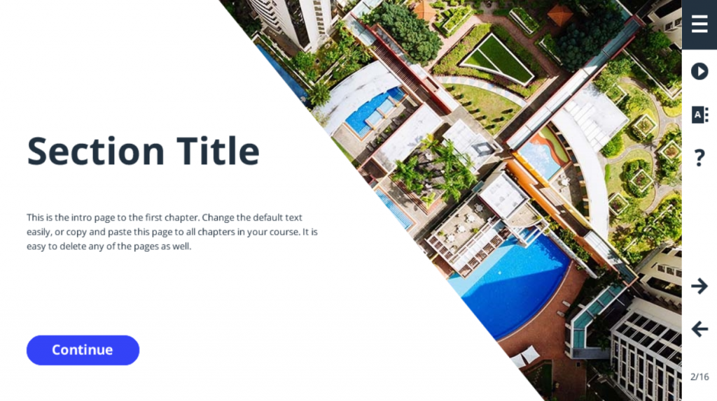
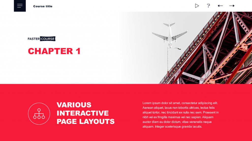
Chapter intro
The chapter intro page is used to introduce the topic and explain the overall purpose of the chapter.
Text only
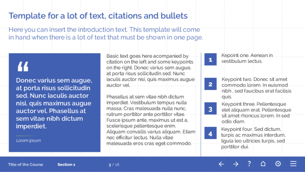
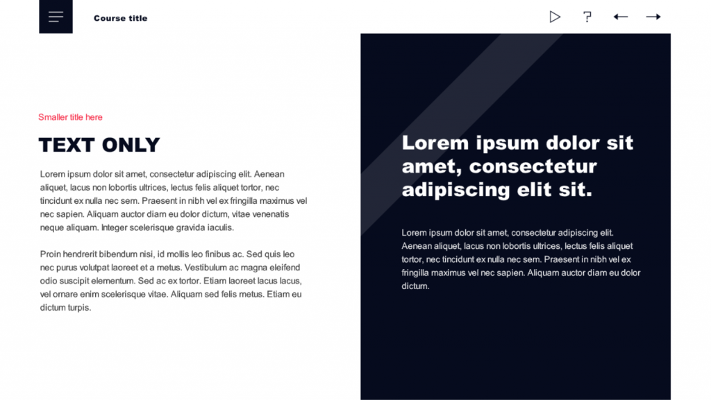
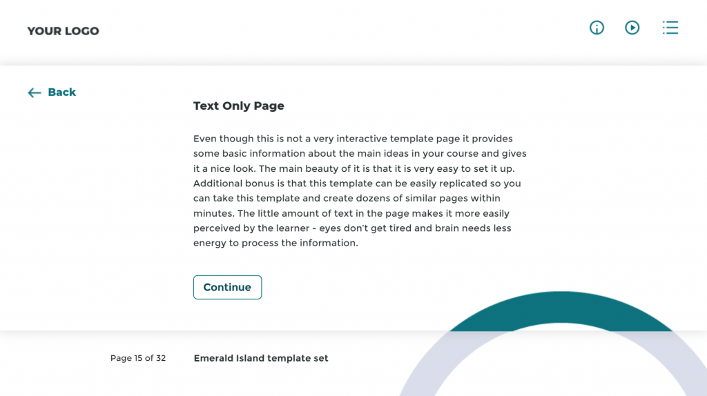
Pages that feature only text can be useful if you just need to present the information and it can’t (or shouldn’t) be enhanced by visuals. However, this doesn’t mean that the page needs to be boring – it can still be arranged in ways that make it pleasant-looking and easy to perceive.
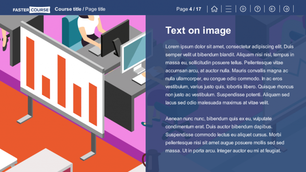
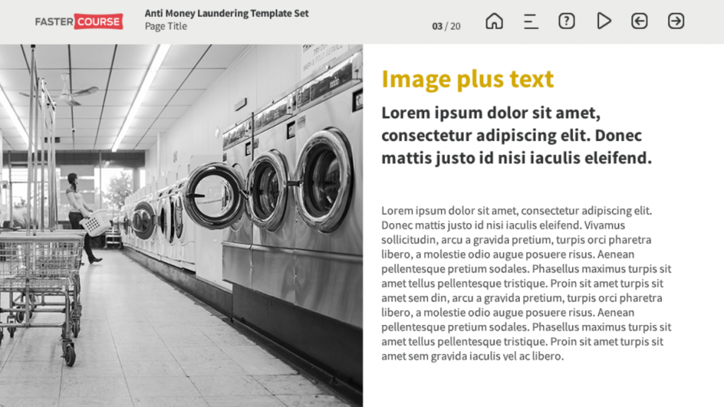
Text and image
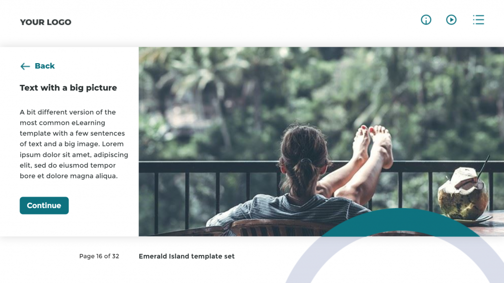
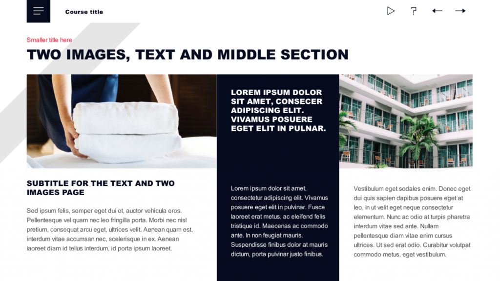
A classic layout that features text and a complementing image. Although the concept is very simple, there are still ways you can play with this layout, for example, by adjusting the formatting of the text and the size or placement of the image.
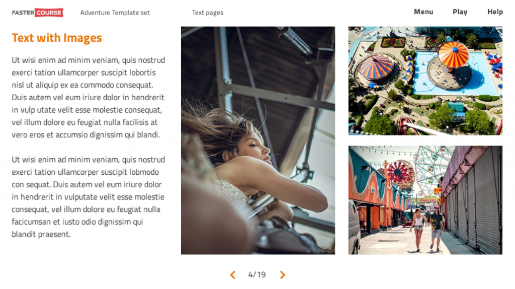
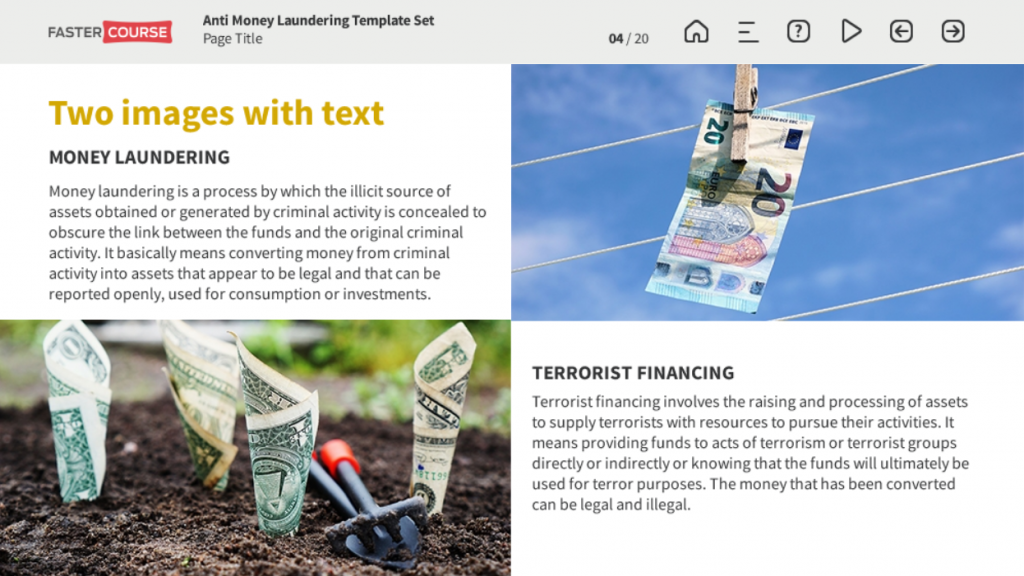
Text and image – variations
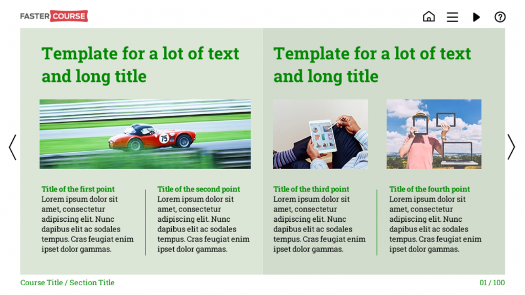
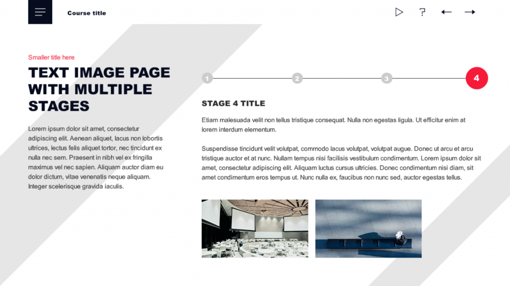
There are also many other ways you can update the text-image layout, for example, by adding several images.
Key points
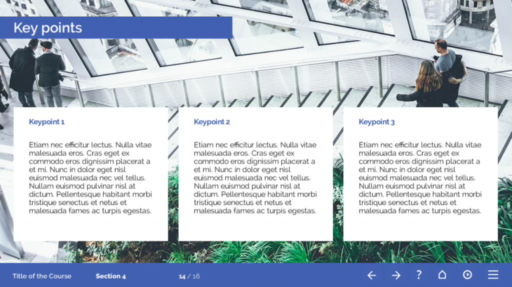
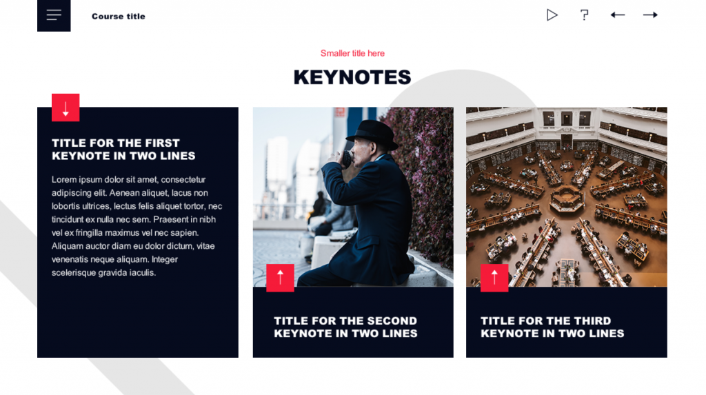
If you need to highlight just a few (usually 3-4) important points, this layout is just what you need. The key points can be separated from one another by using text formatting, text box formatting or other visual elements.
Timeline
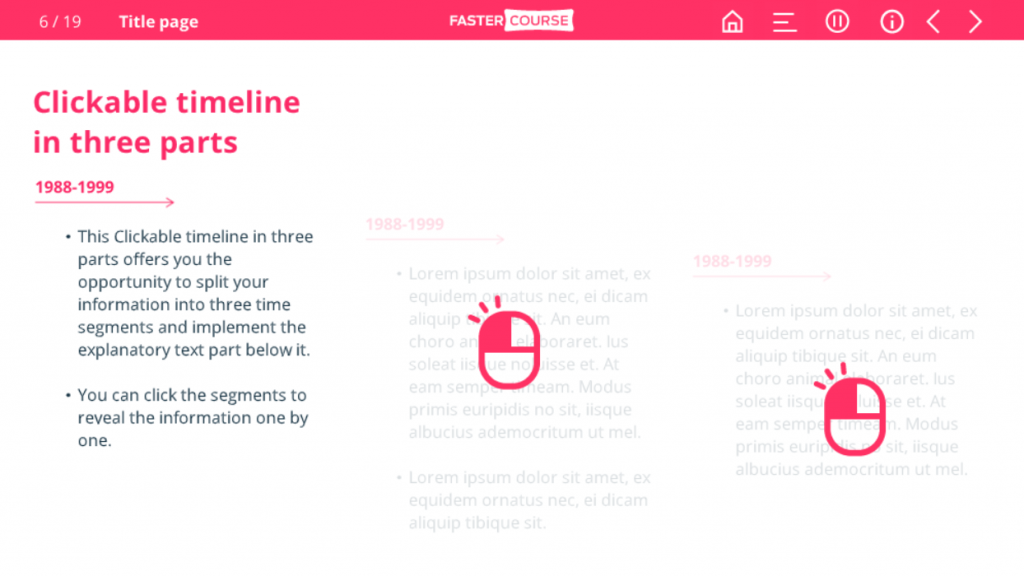
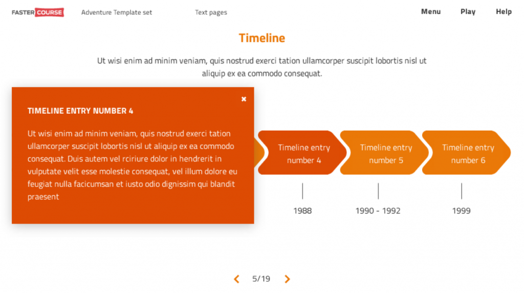
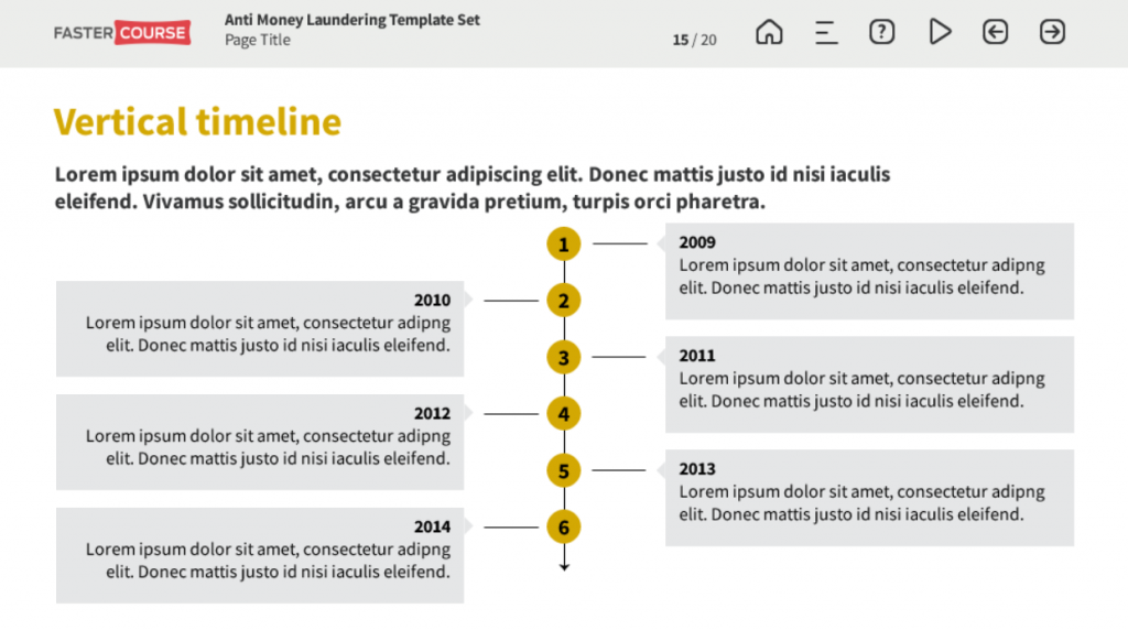
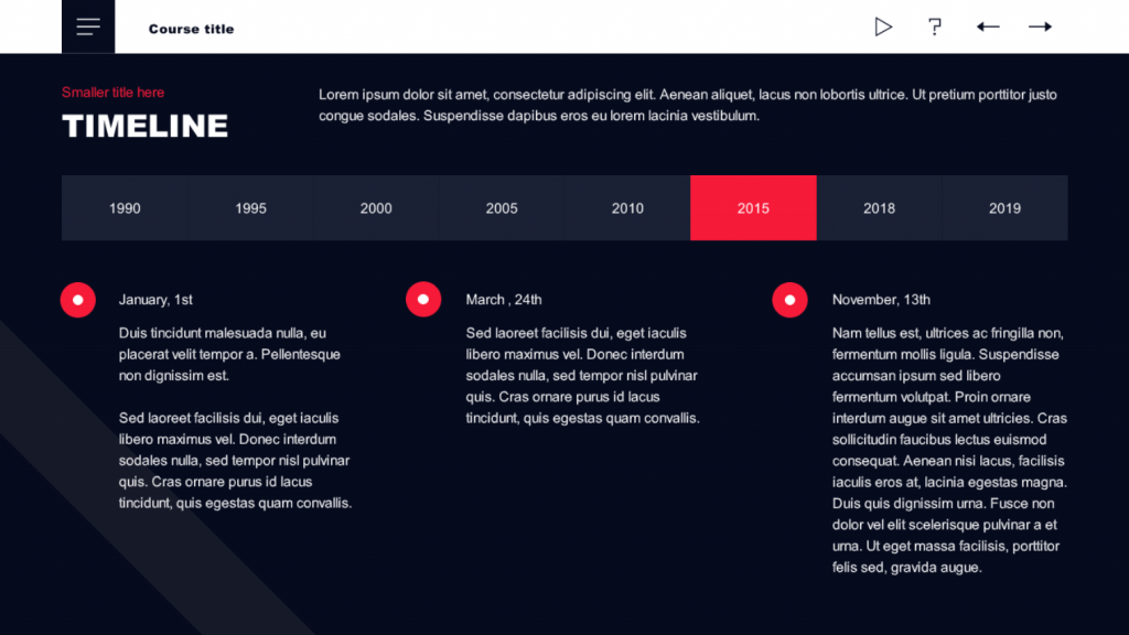
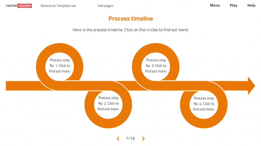
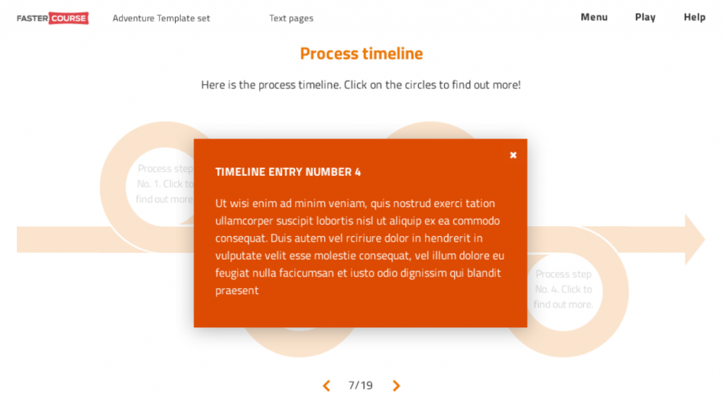
Timeline layouts are perfect for showing the sequence of events as well as providing information about each of them. These pages are very diverse, and they can be static or feature exciting click-reveal interactions.
Process
Somewhat similar to timeline, you can also present the stages of a process in a nice way that’s easy to understand.
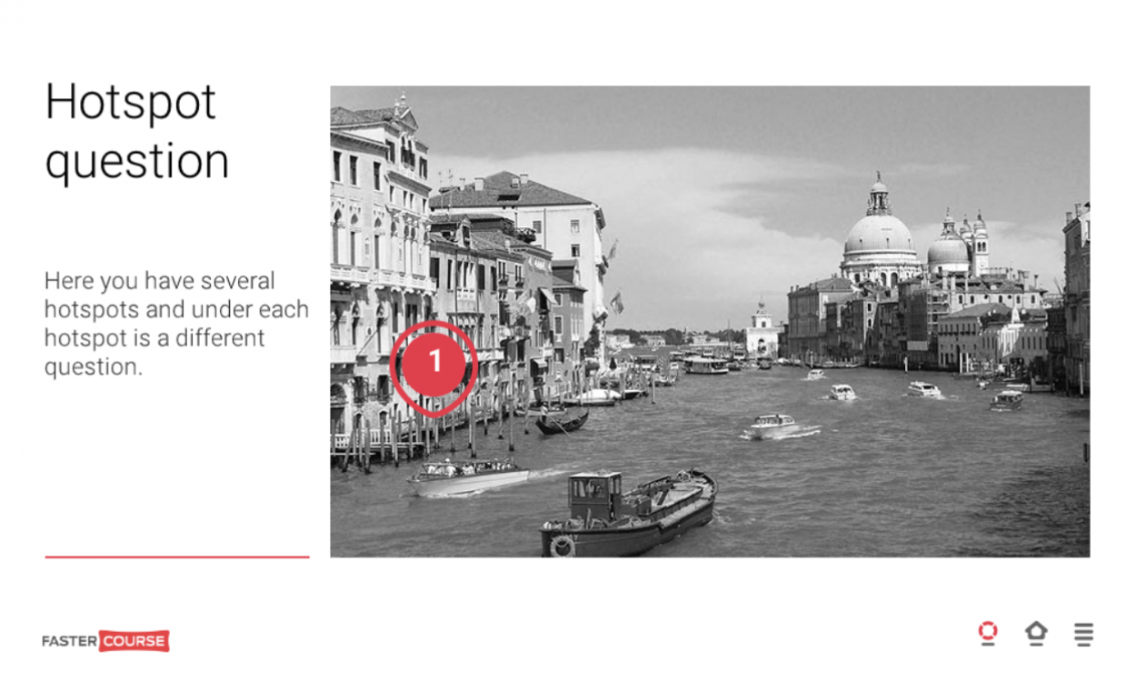
Hotspots
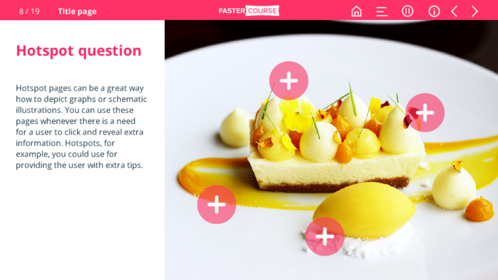
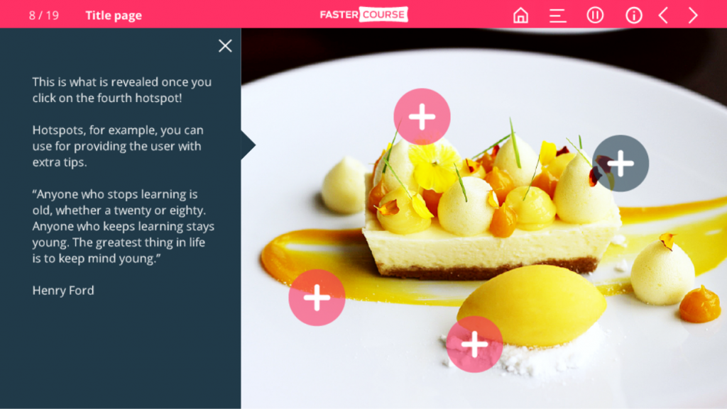
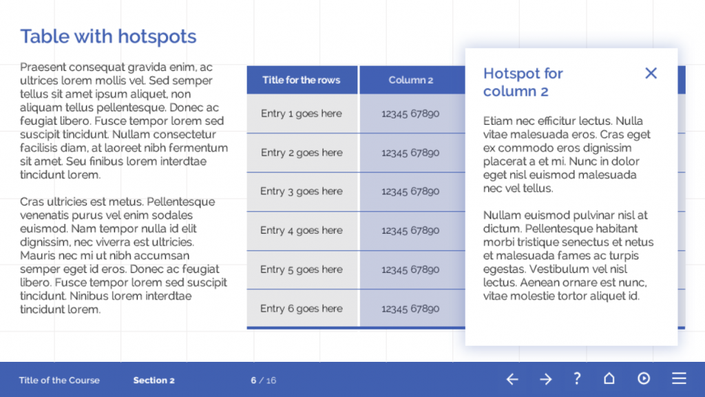
Hotspot interactions are great for providing several brief chunks of information on one topic. They’re also very useful for pointing out and providing explanations for areas on an image. The pop-ups can be of various sizes and can even include images or videos.
Case study
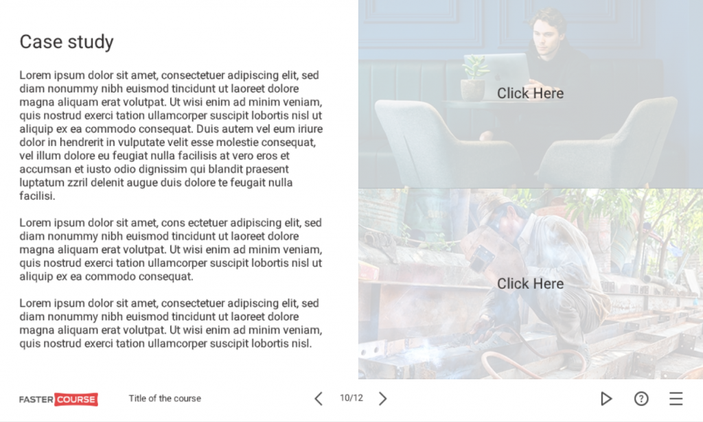
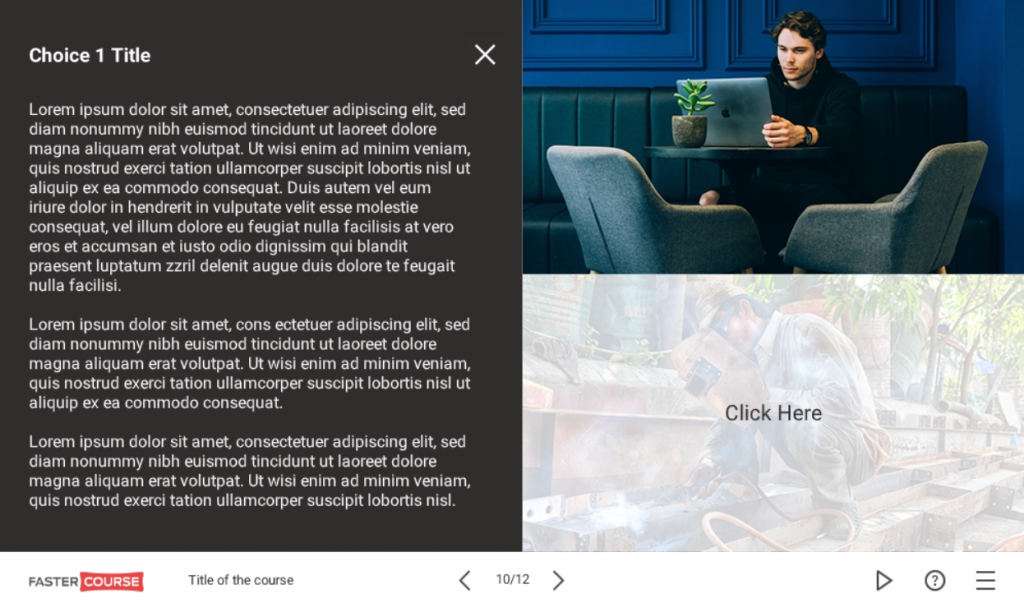
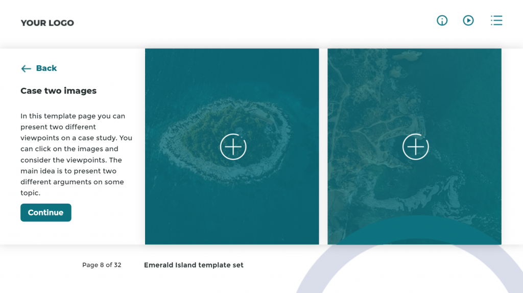
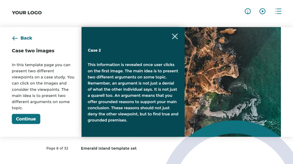
In these pages, you can present some general information as well as a case study or two contrasting studies/opinions.
Slider
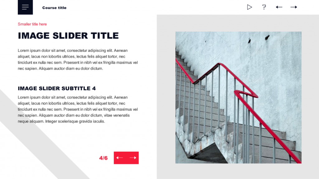
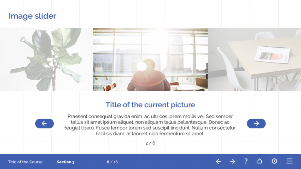
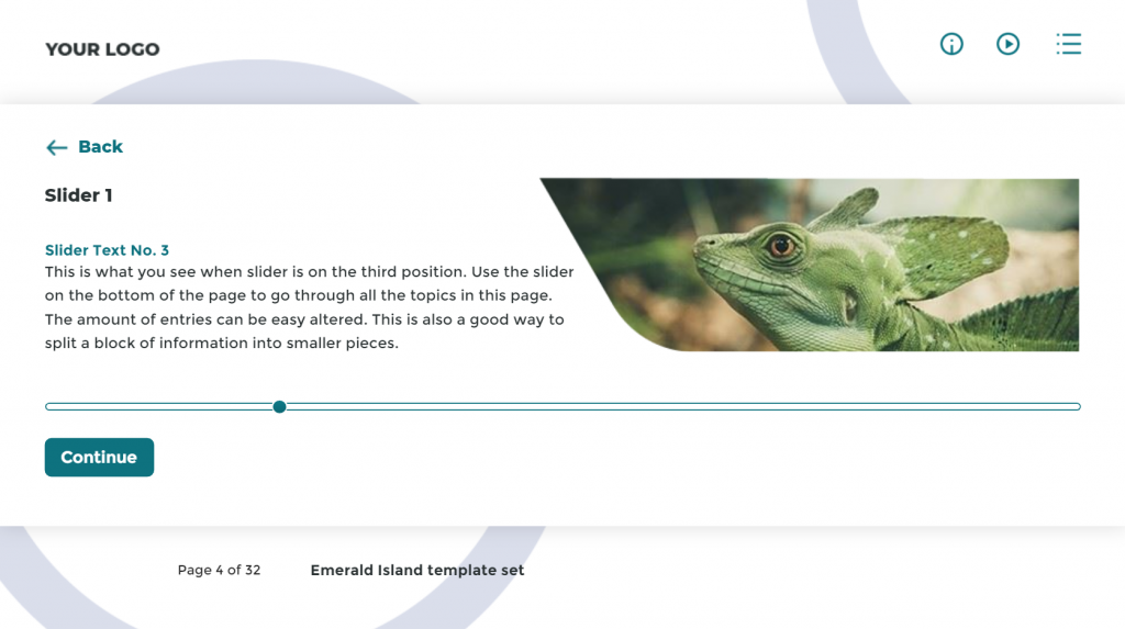
Slider interactions are a bit more complex, but they are great for displaying a series of text chunks and, if necessary, accompanying images. If done right, it’s a wonderful interaction that the learners are sure to enjoy.
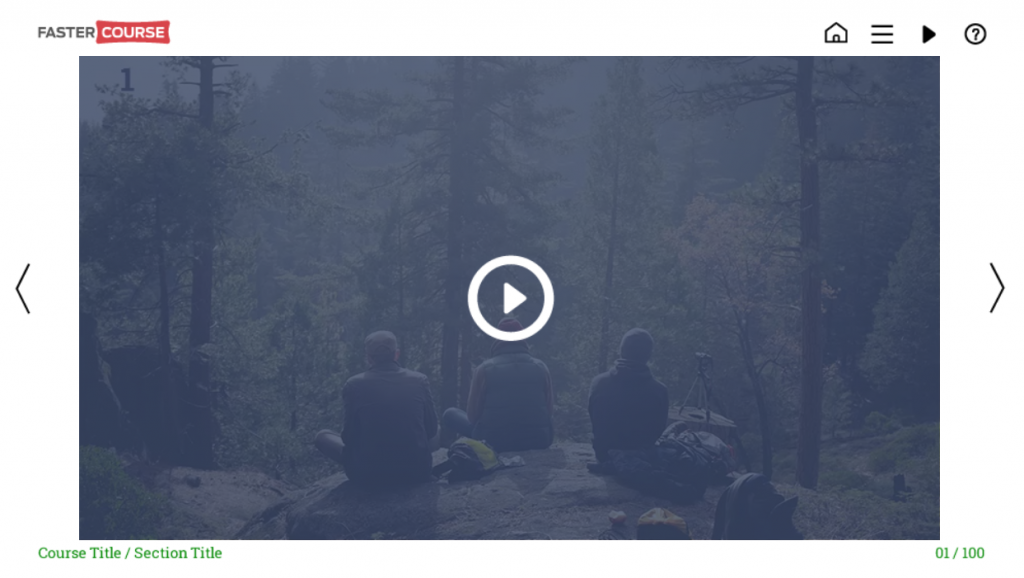
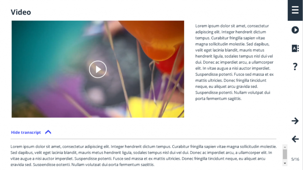
Video page
A video is a great way to engage learners, as you can communicate your message or show something in a way that text and images just can’t. Apart from the actual video, a video page can also feature some introductory text.
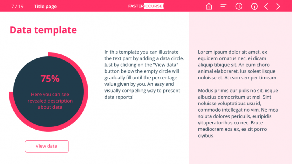
Simple data pages
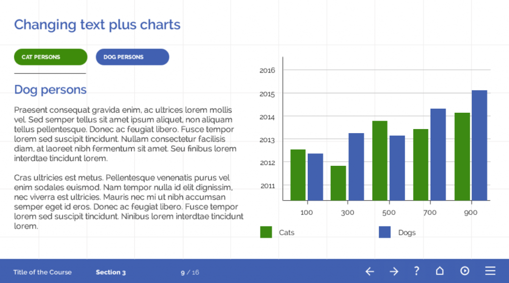
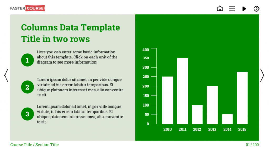
If you need to present some data, it’s much better to show it visually instead of just describing it in the text. This is where a variety of simple, yet effective data page layouts come in.
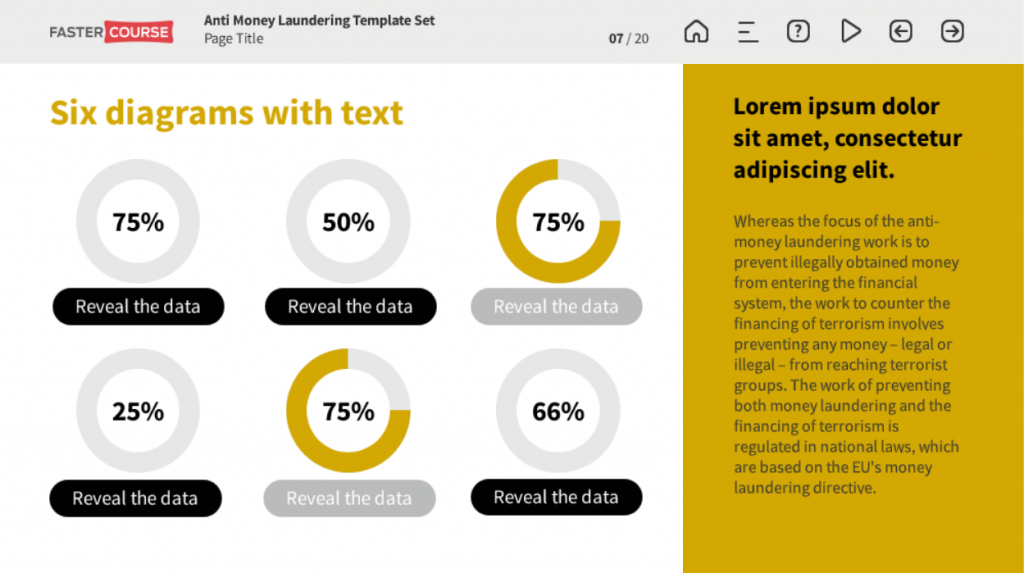
Complex data pages
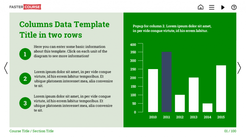
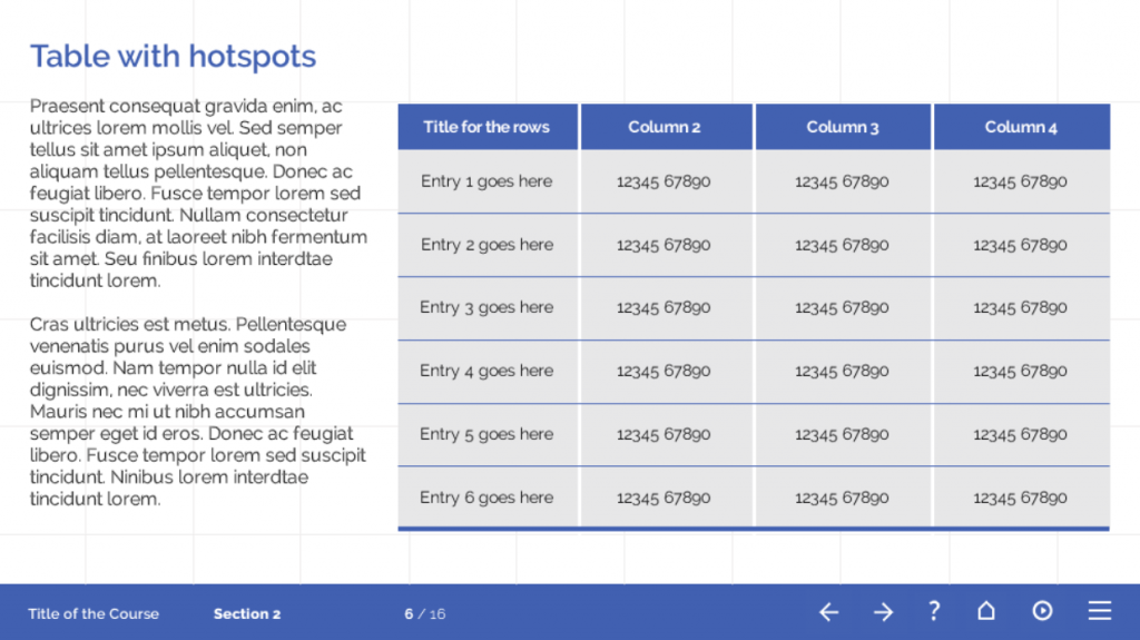
You can also add various click and reveal interactions to charts and tables, allowing the learner to explore the data in more detail.
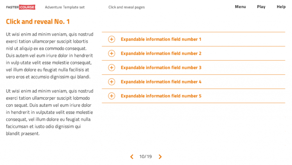
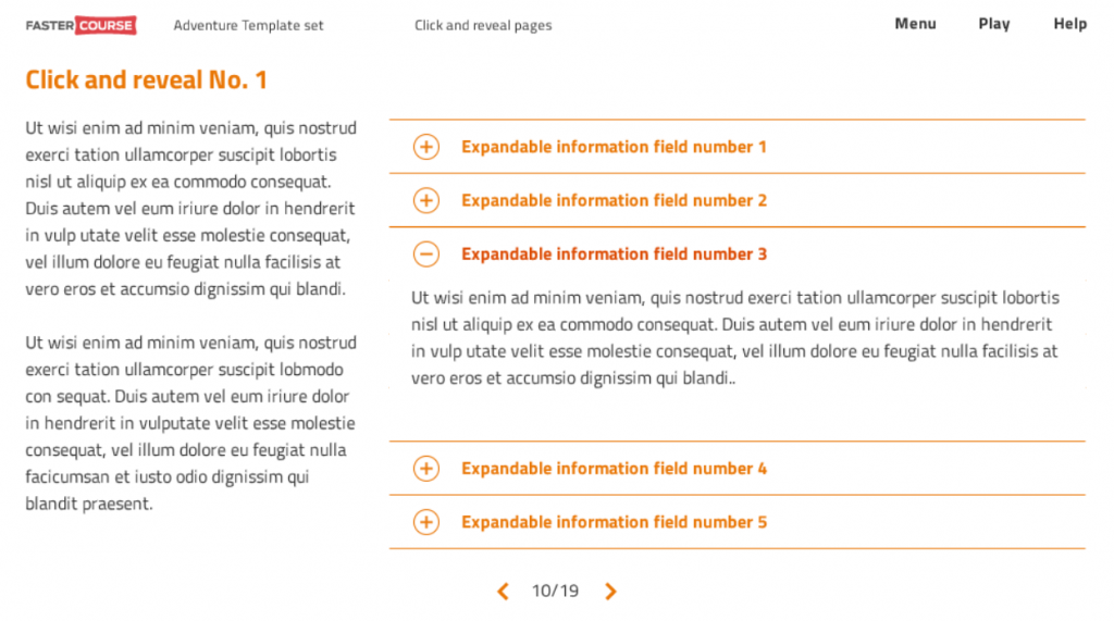
Click and reveal – info menu
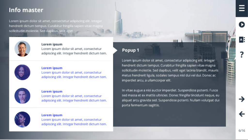
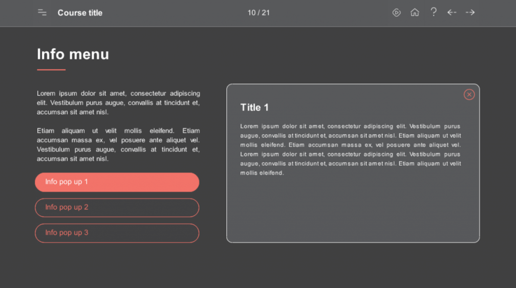
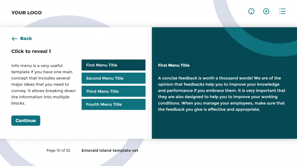
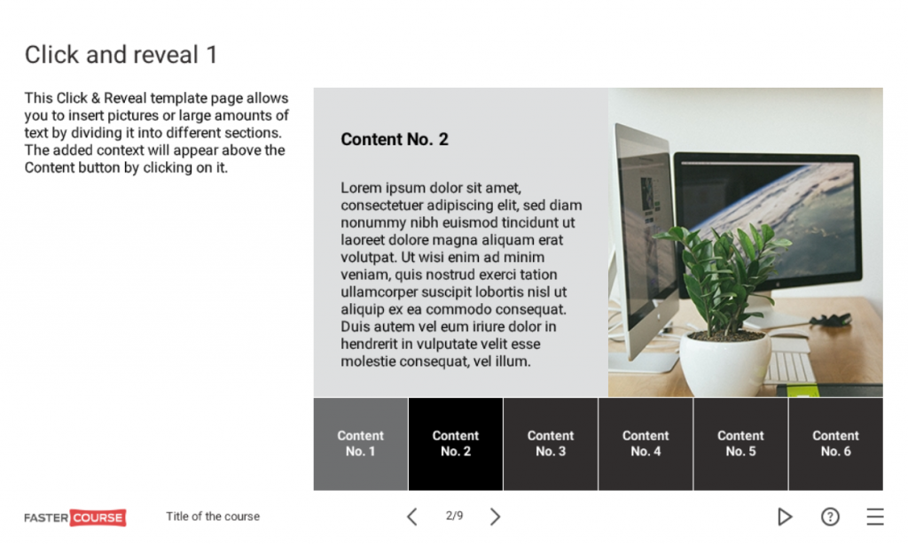
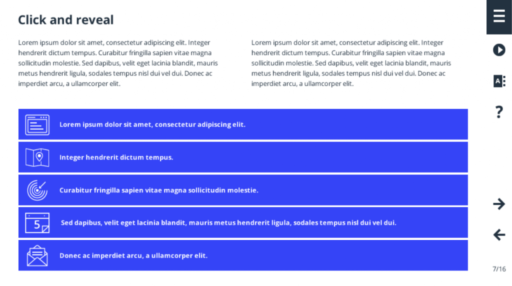
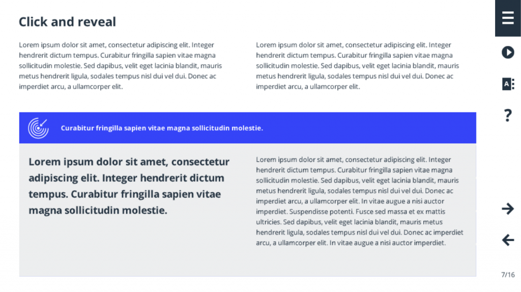
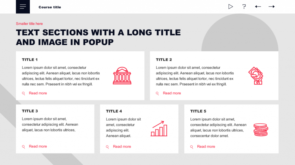
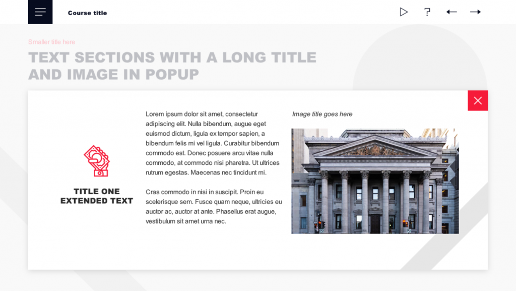
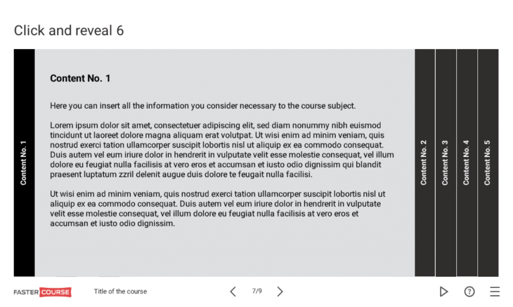
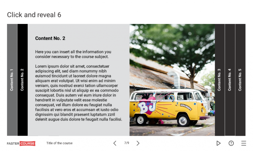
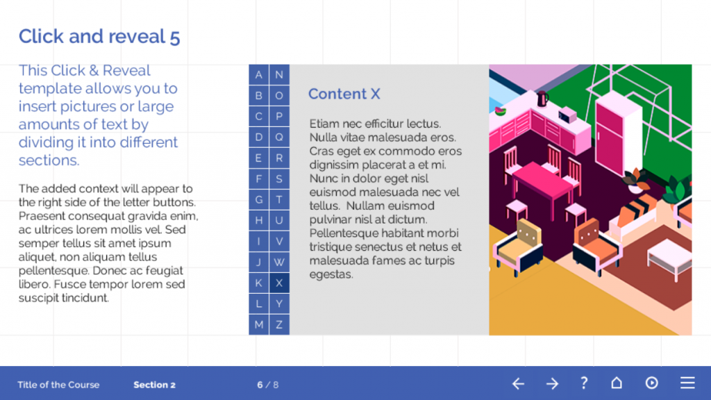
The so-called info menu layout allows you to split up a lot of content into smaller chunks. These layouts are extremely useful, as they enable you to present big amounts of text and images on one page, without overwhelming the learner.
Click and reveal – tabs
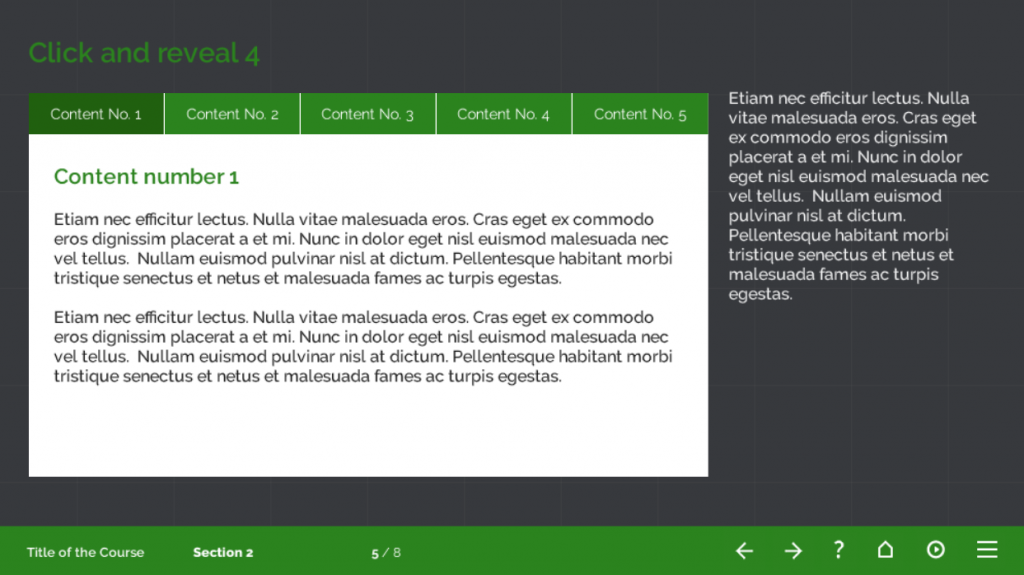
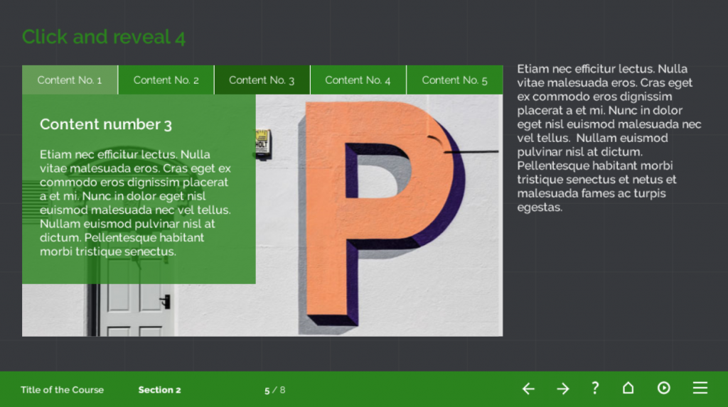
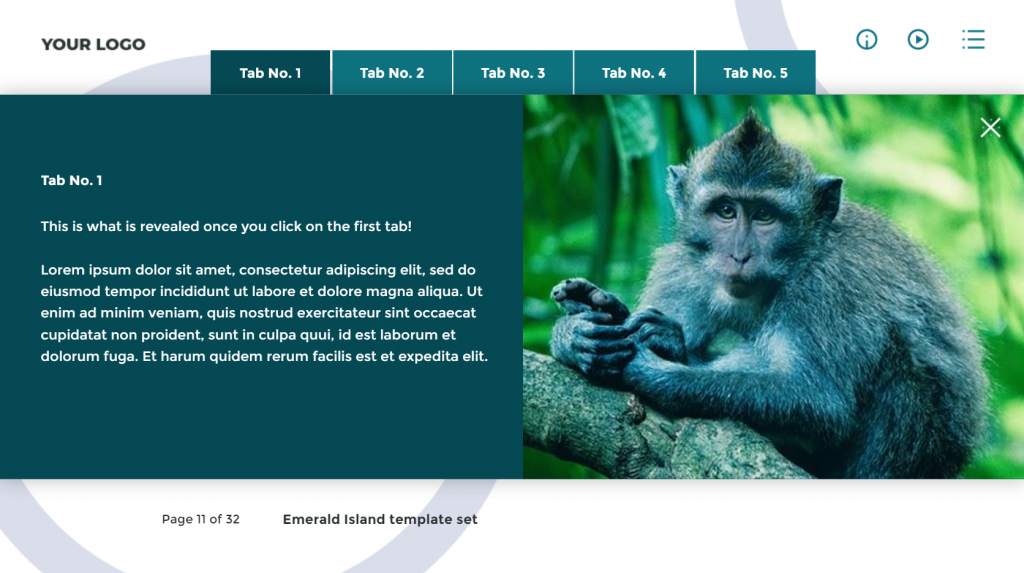
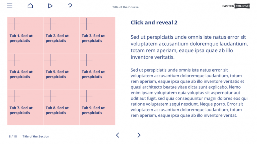
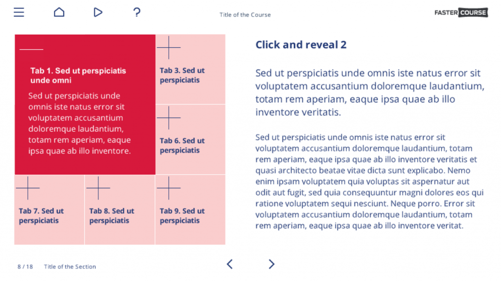
Another great way to split up text into subsections is by creating an interaction with tabs. You can experiment with the placement of the tabs as well as the size of the pop-ups to create a layout that works best for your content.
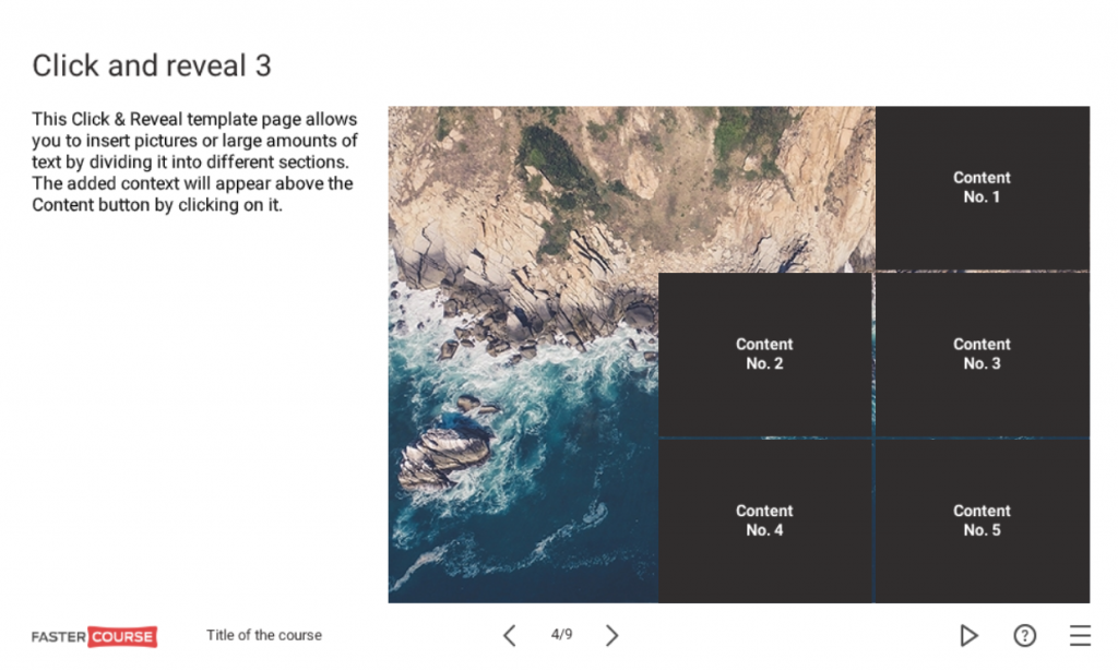
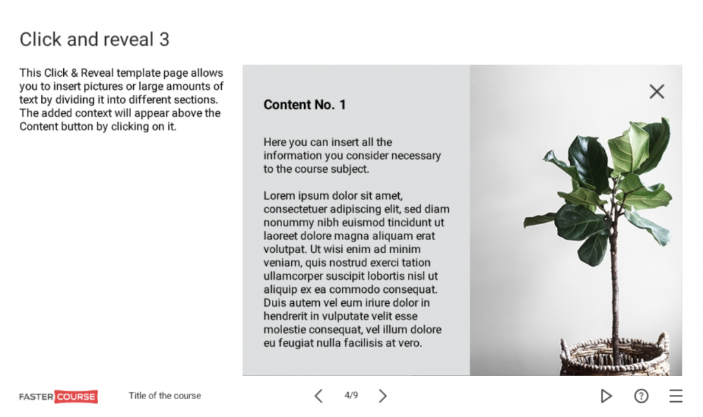
Click and reveal – other layouts
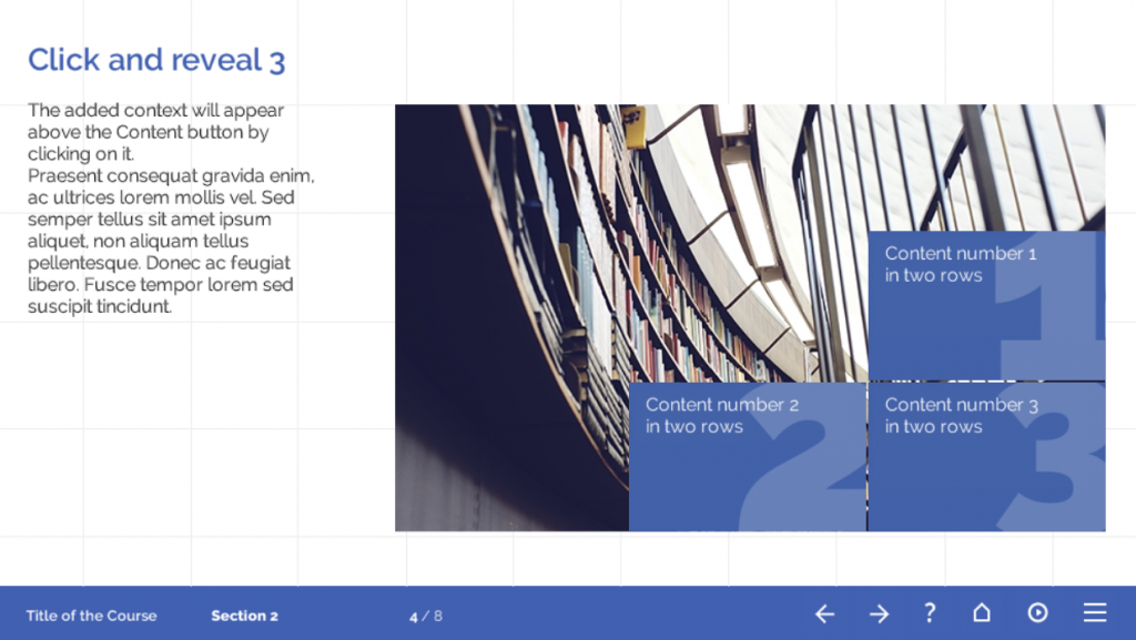
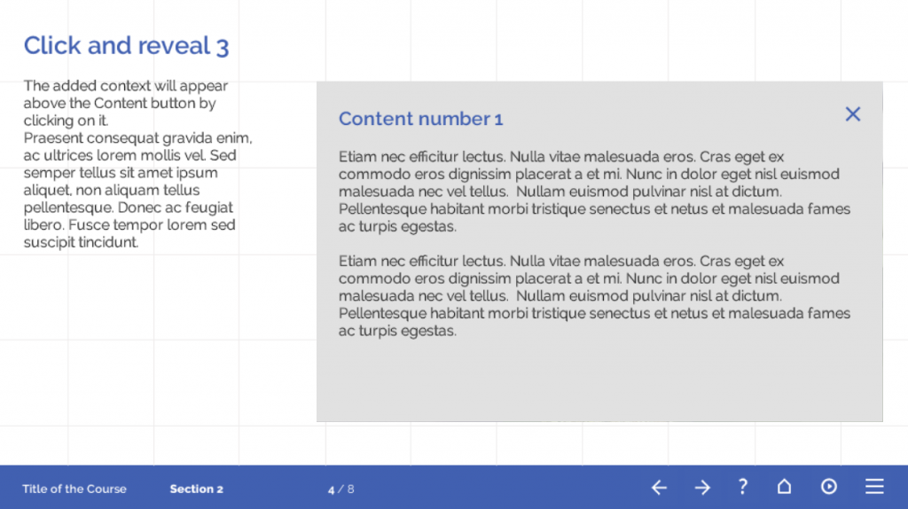
Apart from tabs, there are many other ways you can arrange clickable elements and reveal additional content. The options really are endless and will enable you to organize your content in a neat and logical way.
Glossary
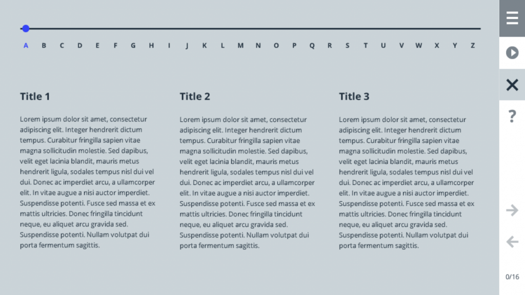
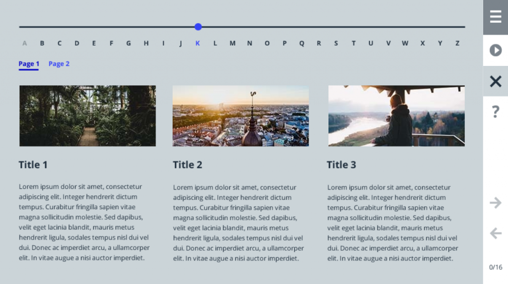
If your e-learning contains a lot of terms that need to be explained, it’s very convenient to use a glossary layout where you can arrange all terms alphabetically and add explanations or even images to clarify their meanings.
Summary
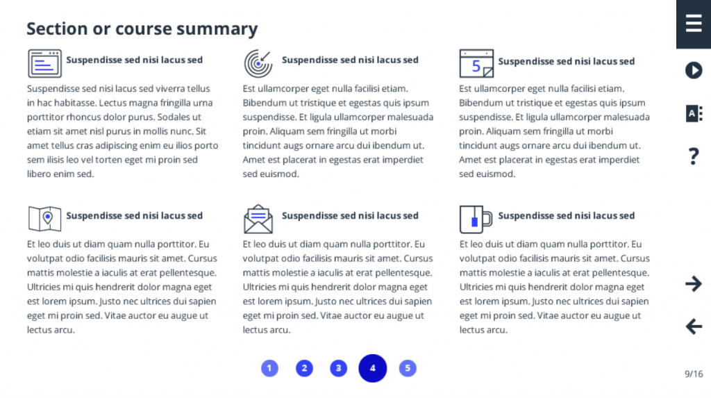
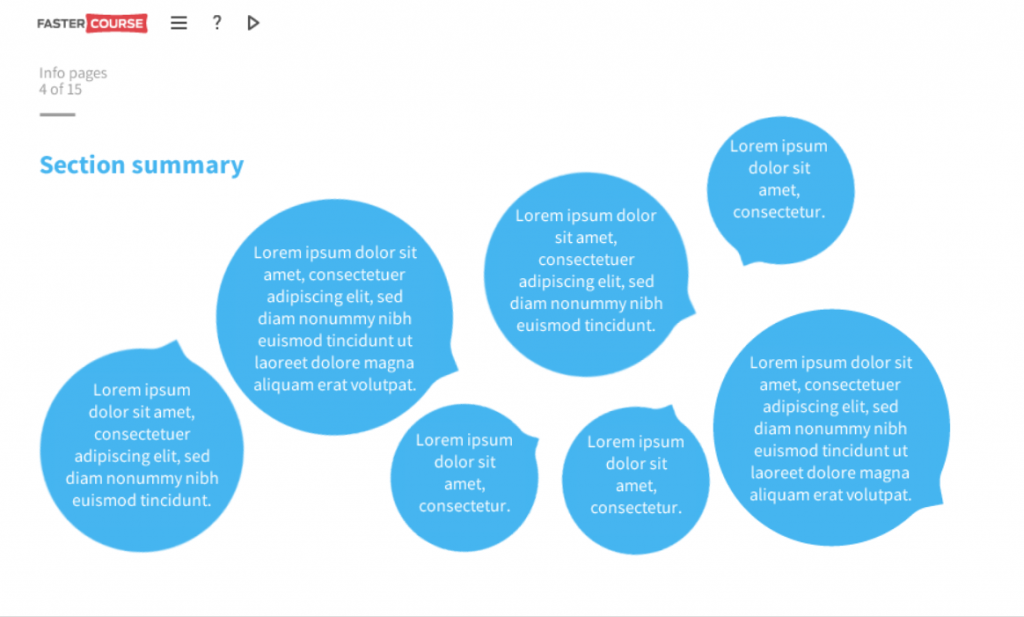
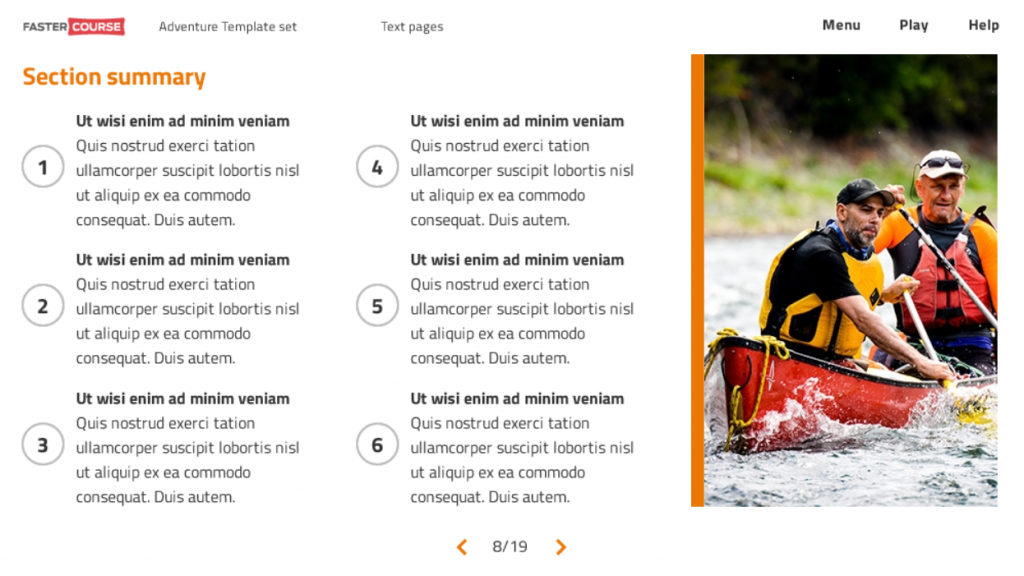
If your e-learning exposes the learner to a lot of new information, you can help them process it by adding a summary page after every chapter or at the end of the theoretical part of the course.
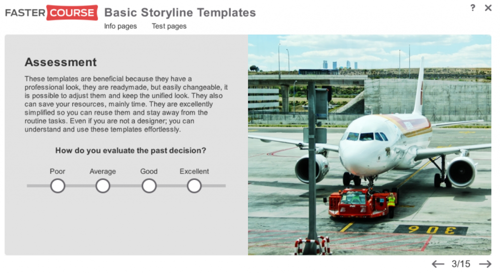
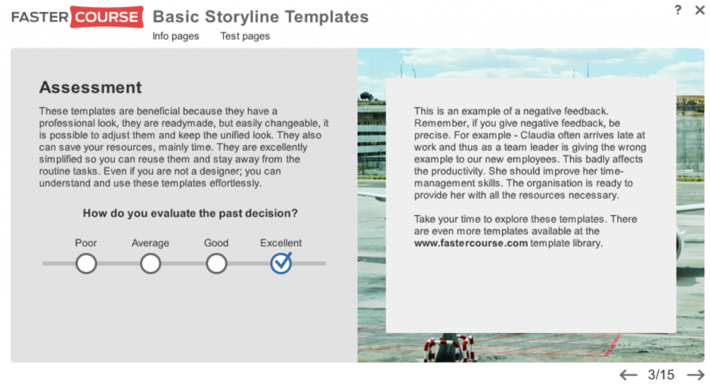
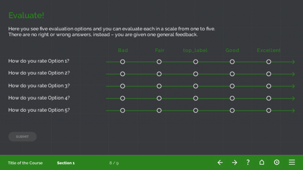
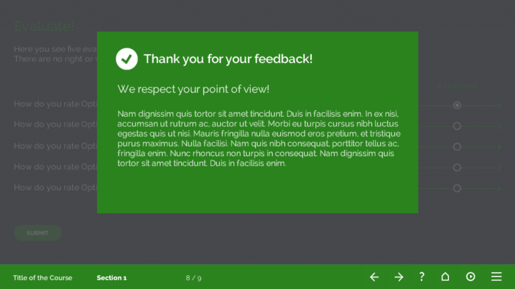
Assessment page
Assessment pages allow the learner to reflect on certain issues or opinions.
Test pages
Test intro page
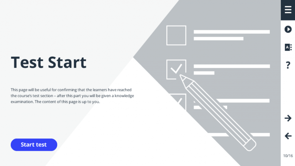
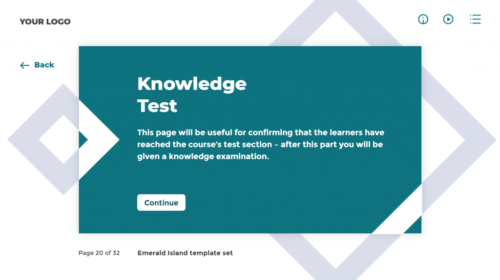
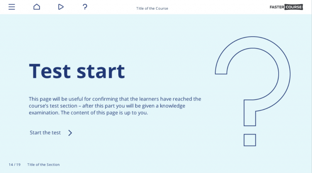
Test intro pages are usually variations of chapter intro pages that signal that the learner is about to start the practical part of the training. This is your chance to let the learner know what type and number of tasks they will need to complete, and what are the conditions for successfully passing the test.
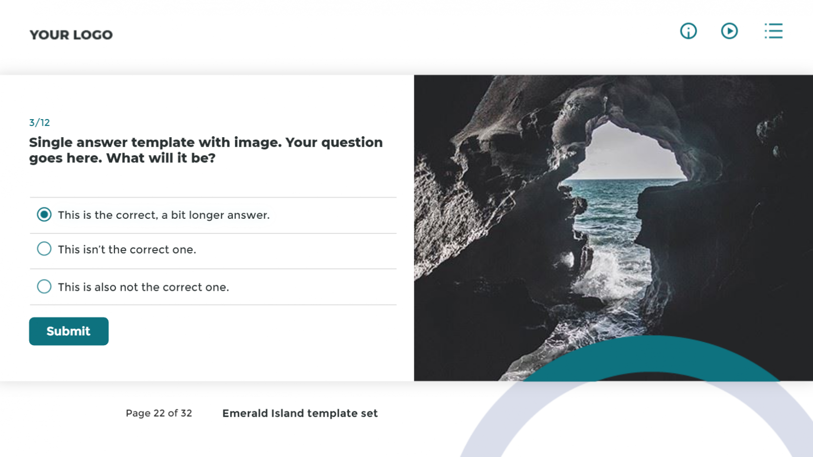
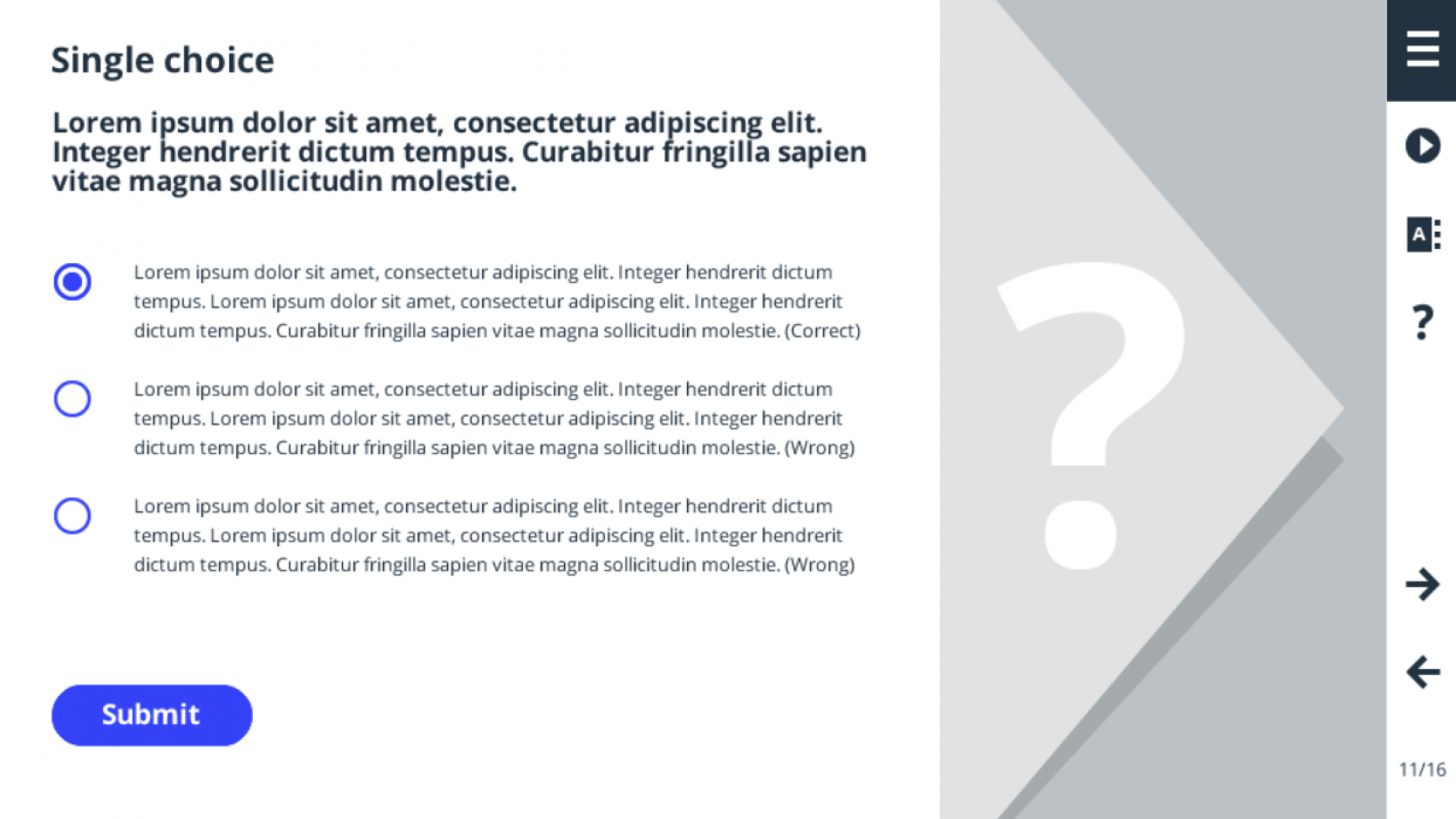
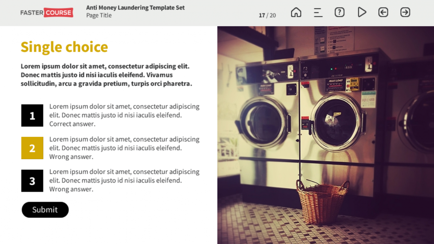
Single choice questions
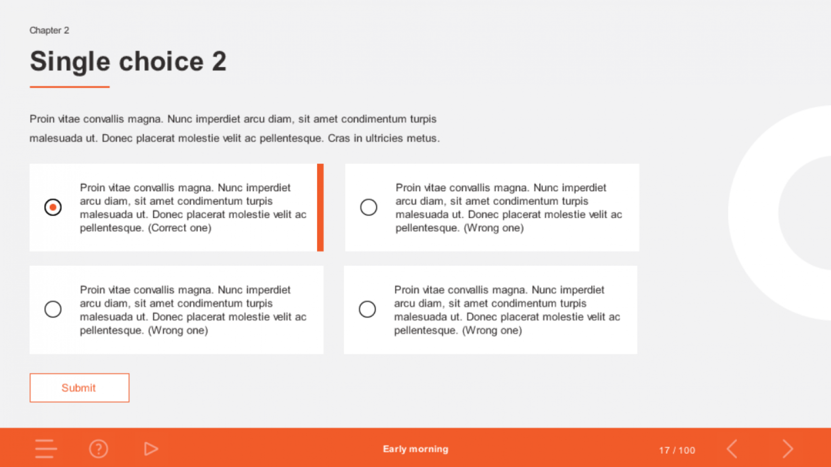
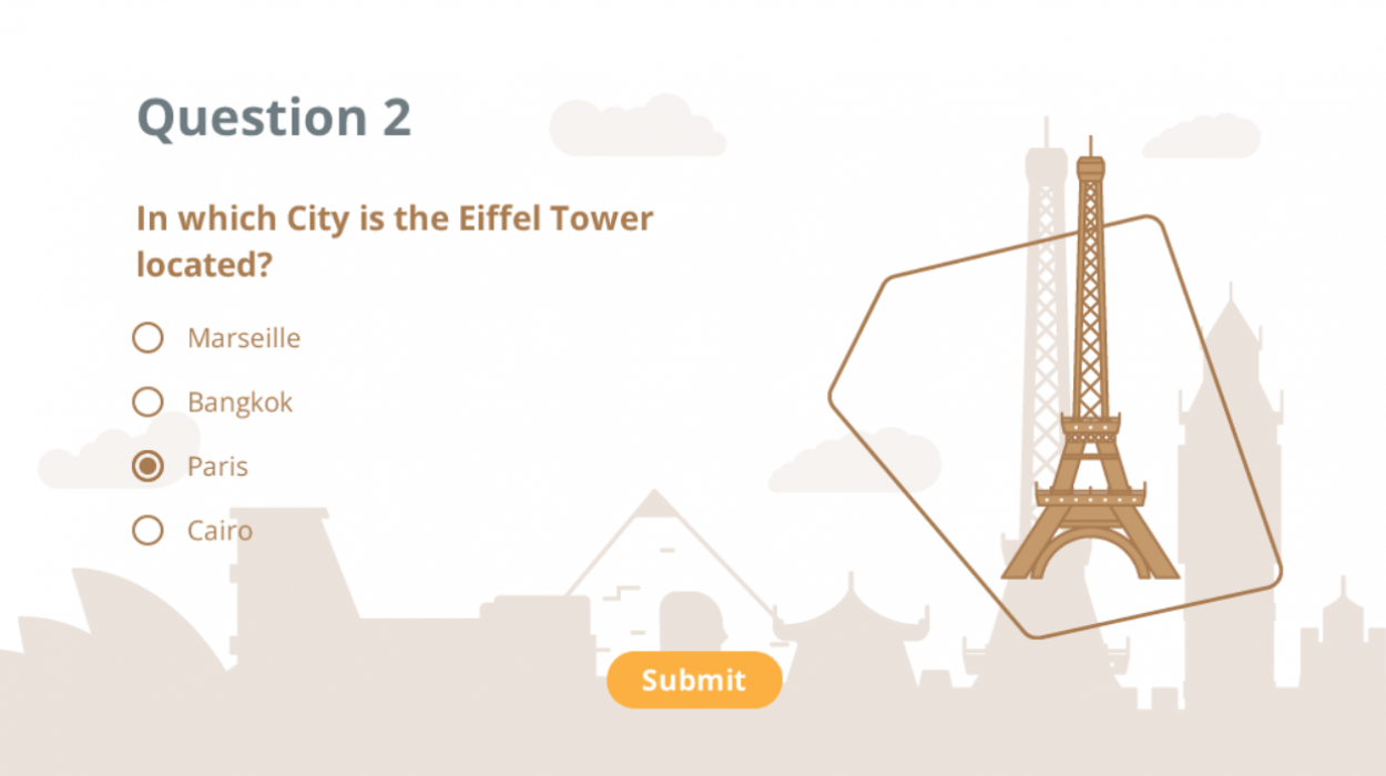
A classic way of checking knowledge – a question followed by several options, only one of which is correct.
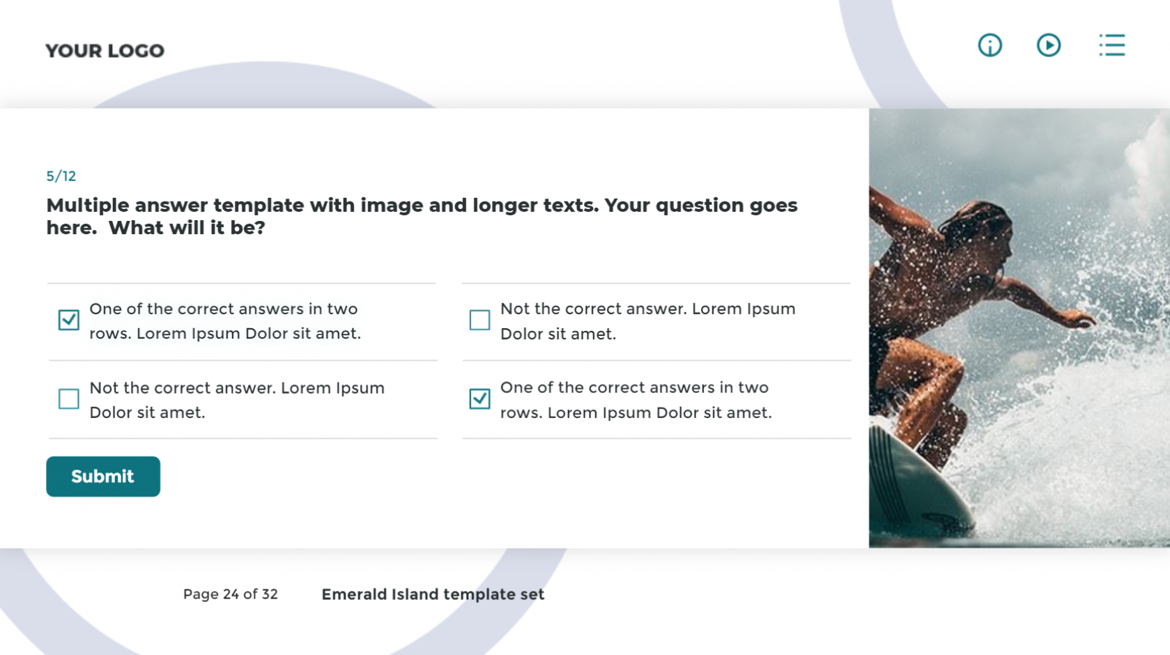
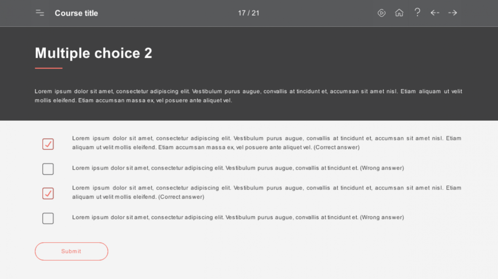
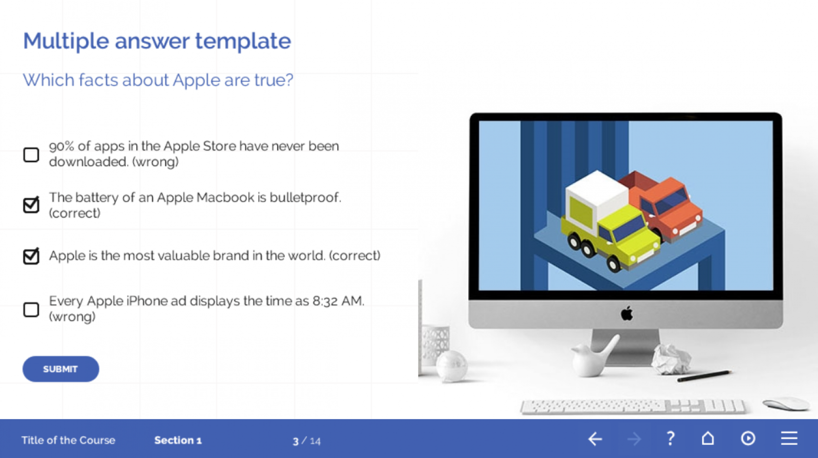
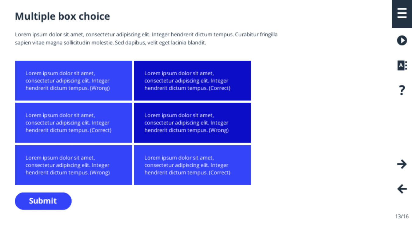
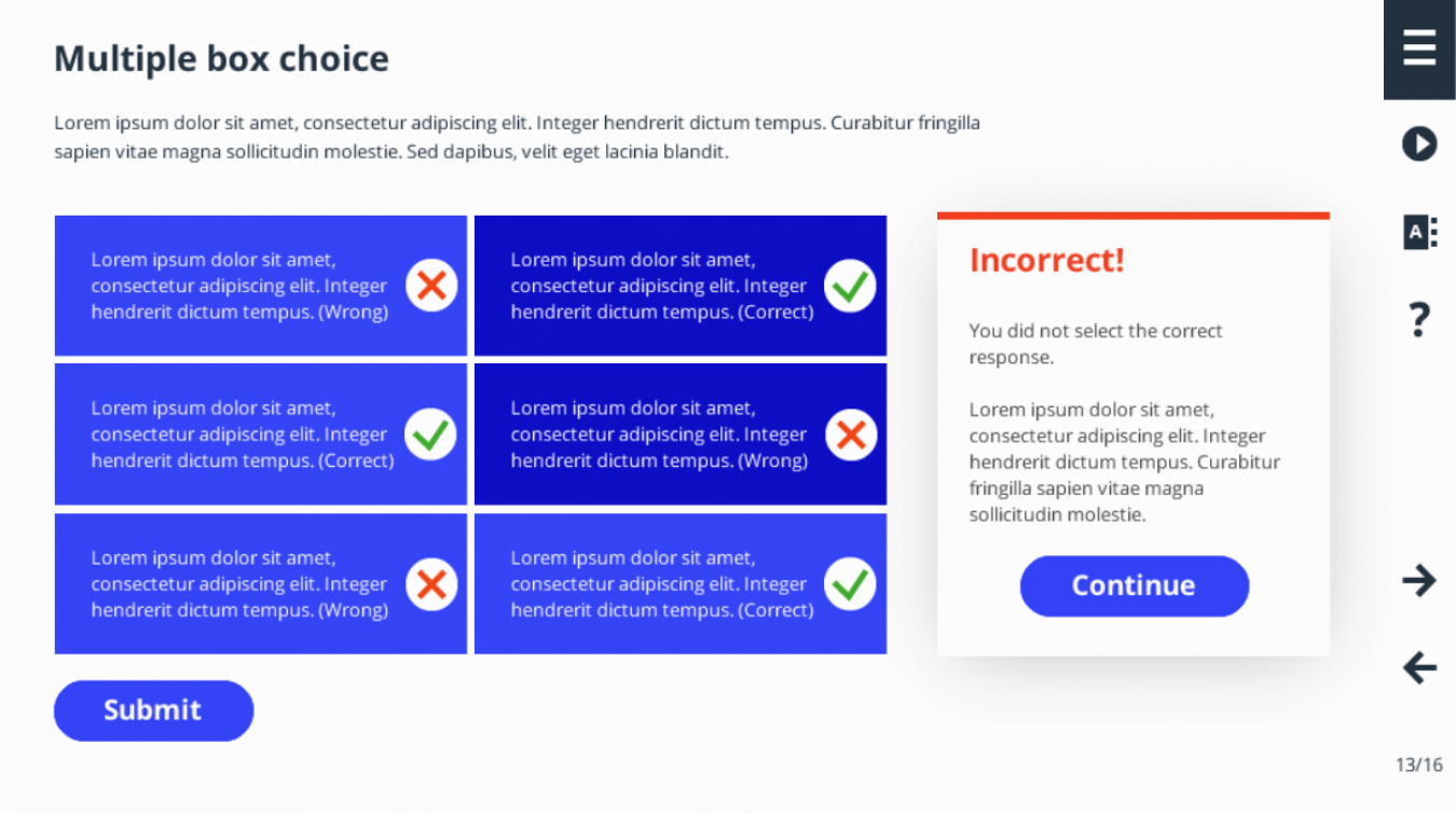
Multiple choice questions
These are a bit more tricky for the learner, as several options can be correct.
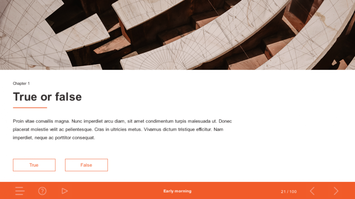
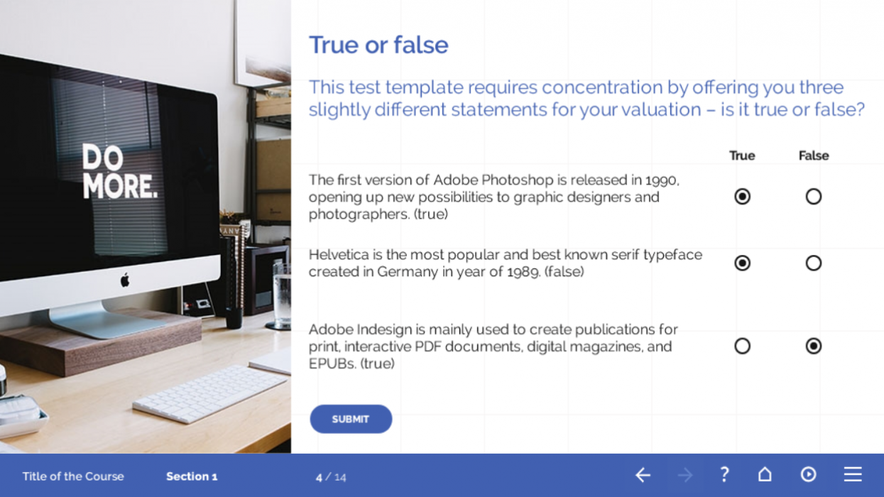
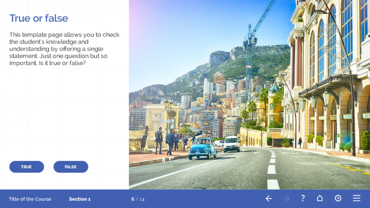
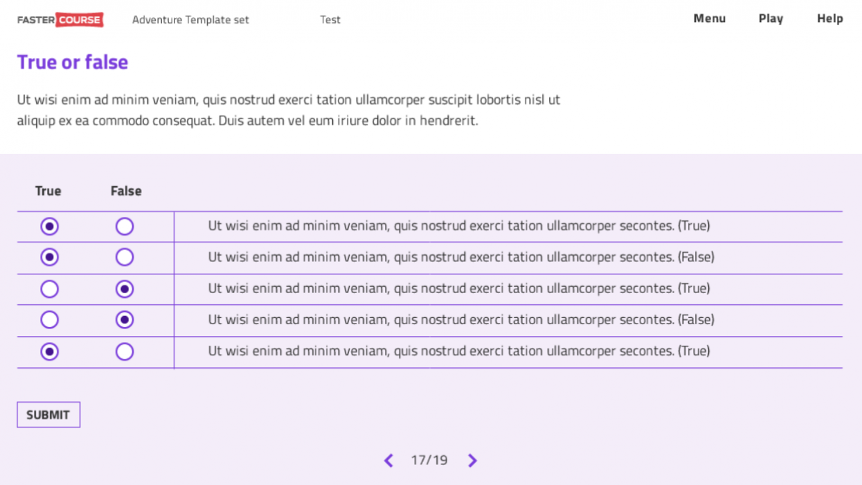
True or false
Another way of checking your learners’ understanding of the material is to make them evaluate statements and decide whether they are true or false.
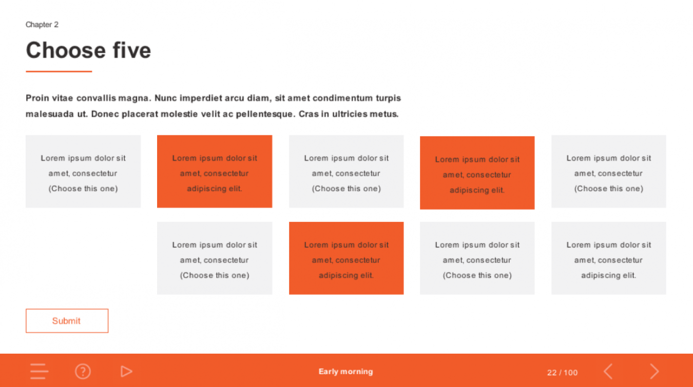
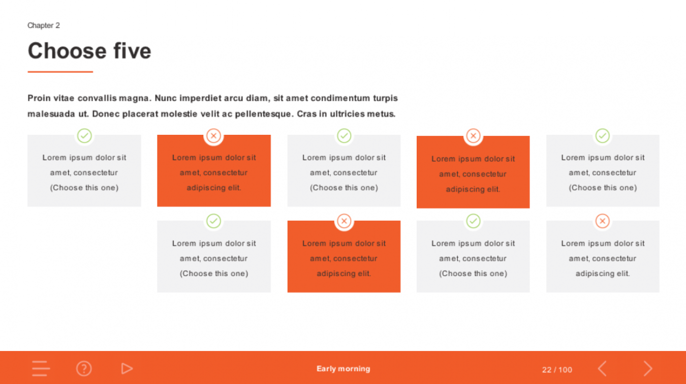
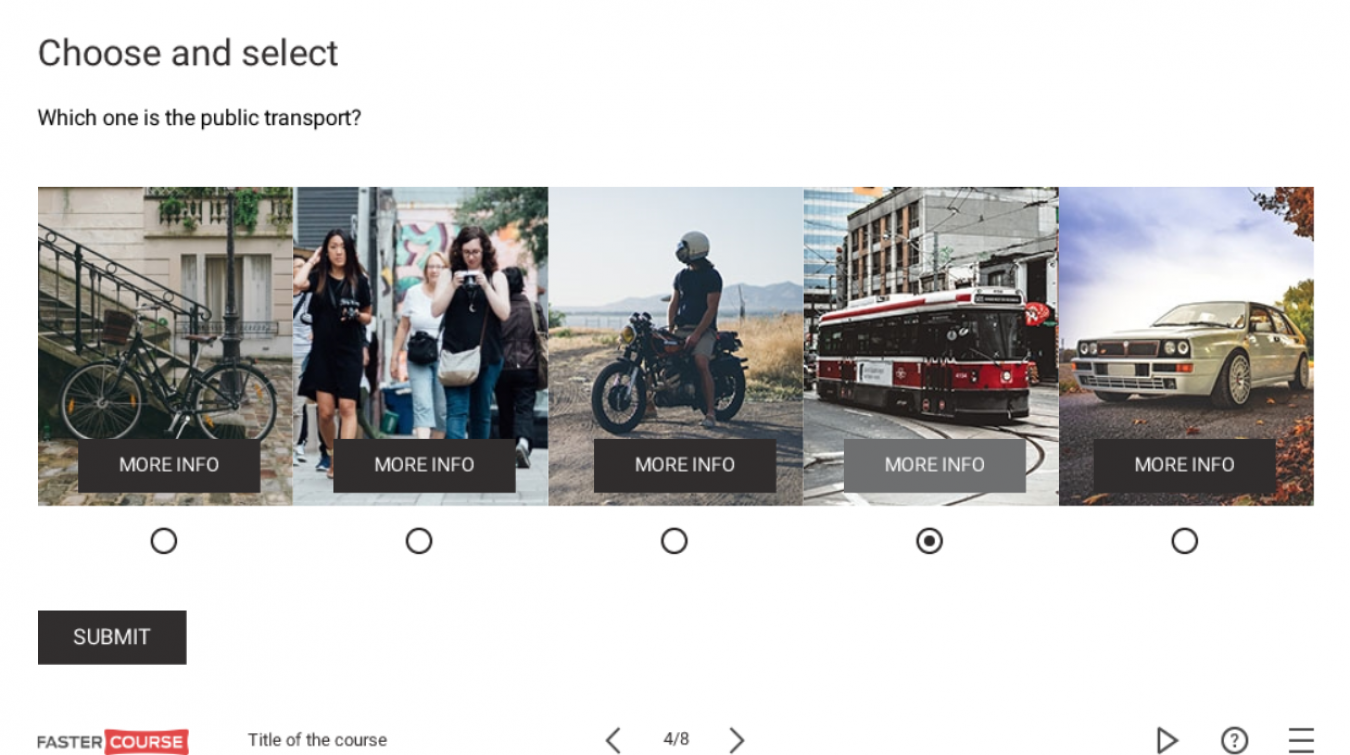
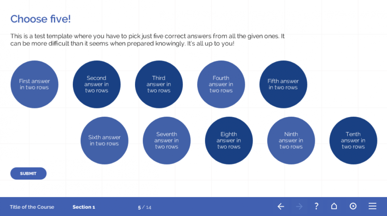
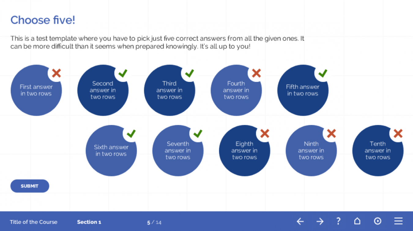
Task – choosing
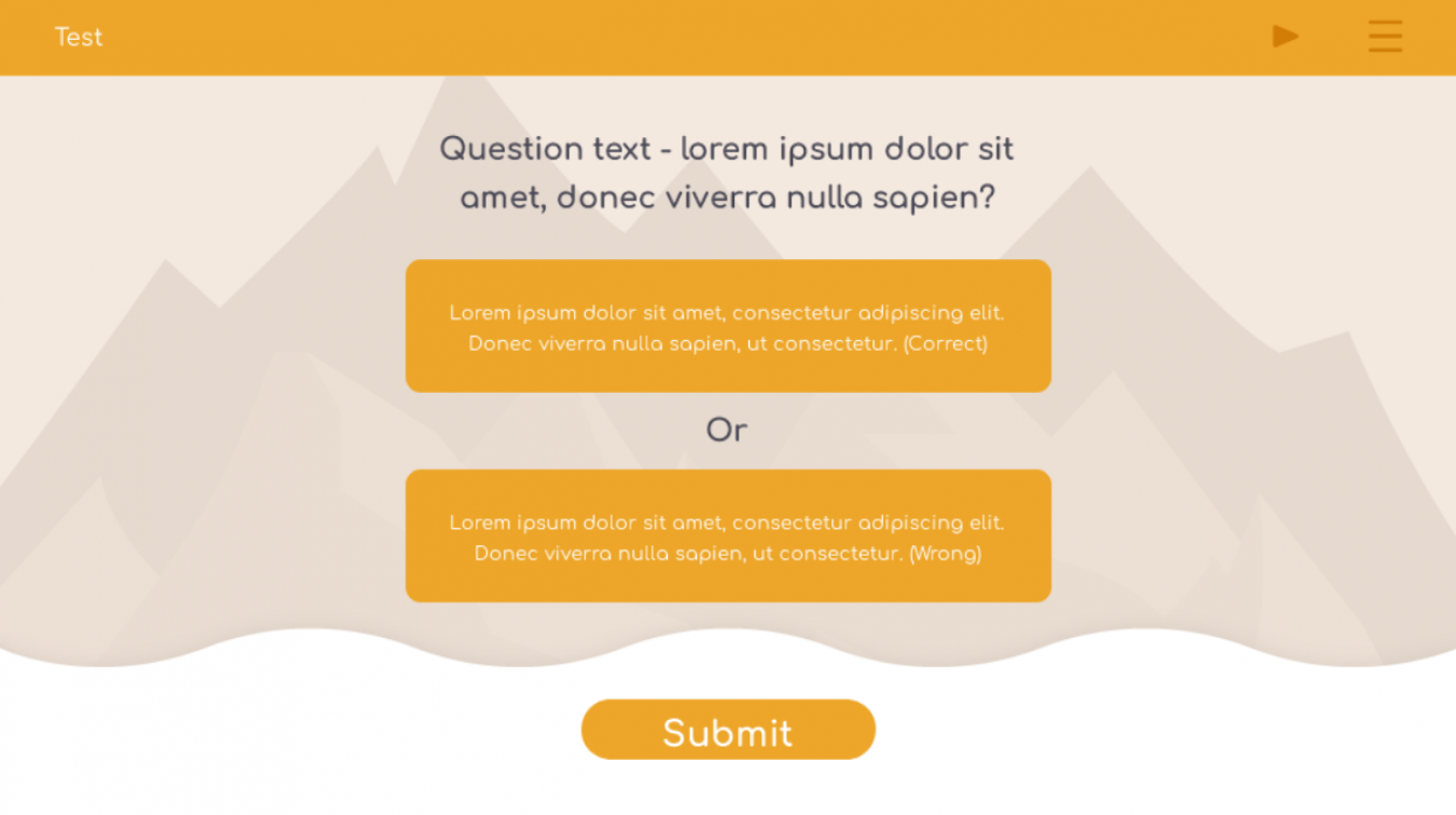
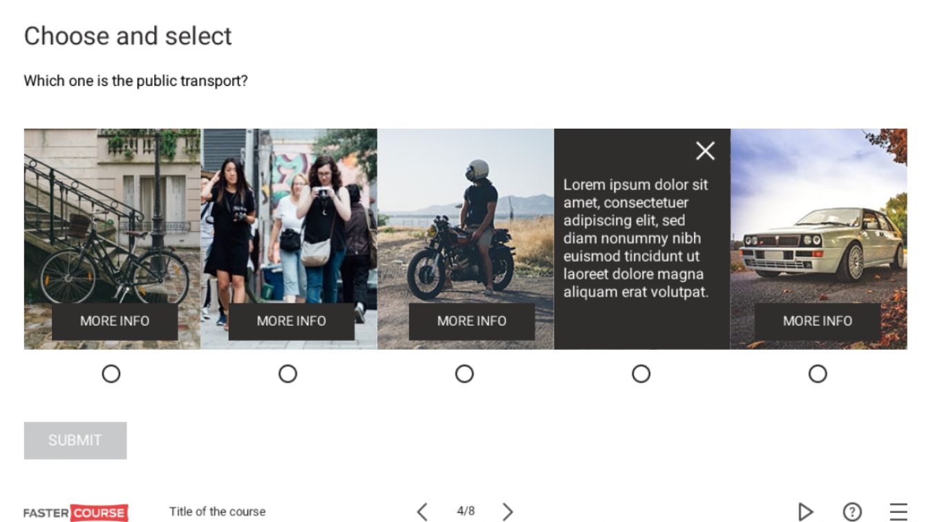
There are also interesting variations on a multiple choice question. In these, the learner has to pick the right items (text blocks or images). It can be a ‘pick one out of these two’ type of question, but you can also fit quite many (for example, 9 or 10) options to choose from.
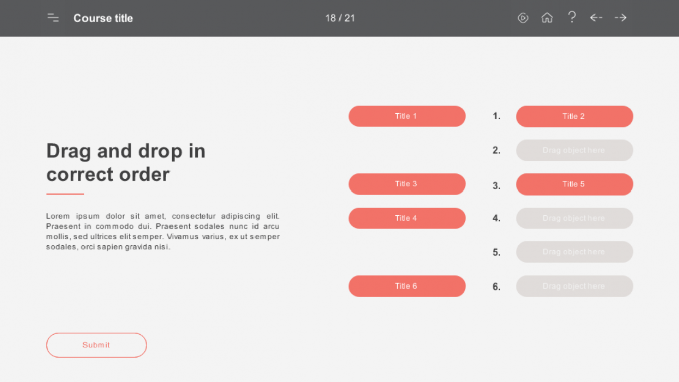
Drag and drop tasks
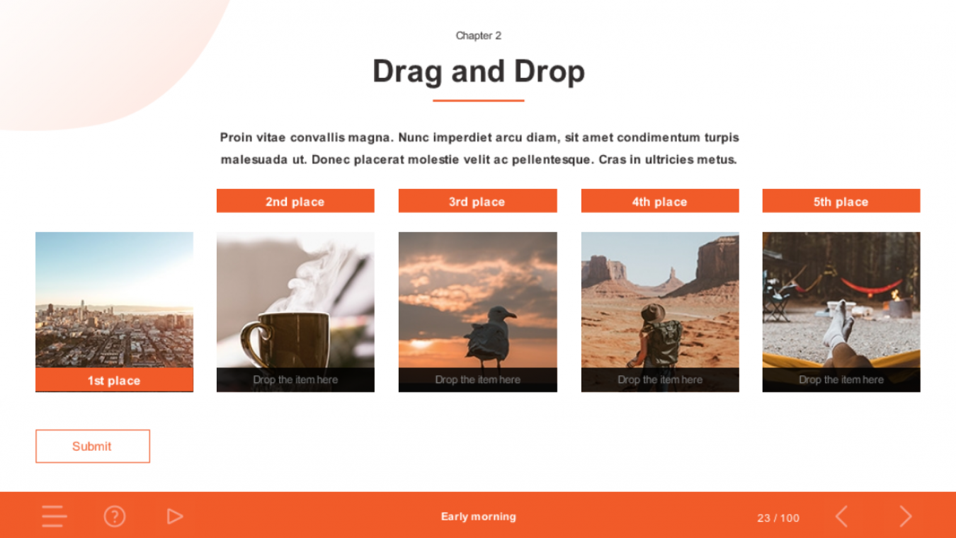
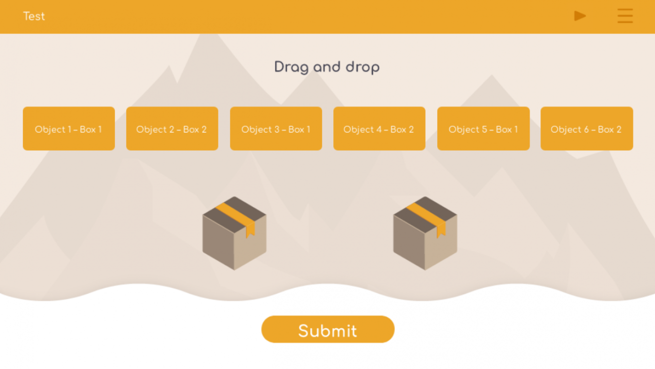
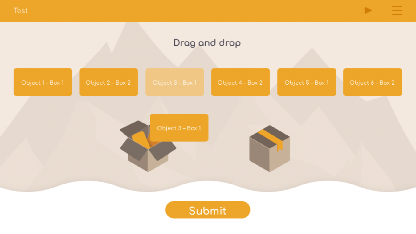
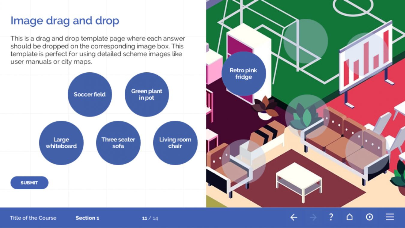
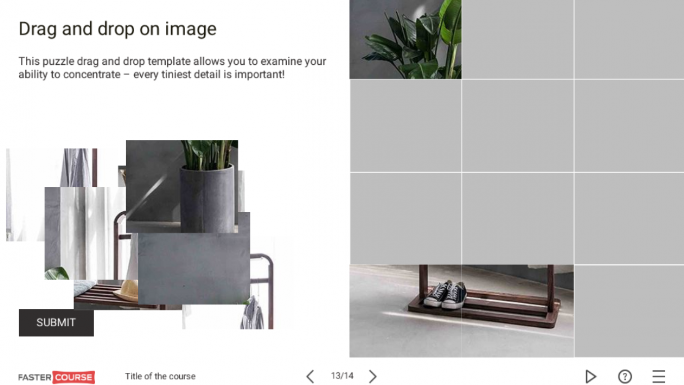
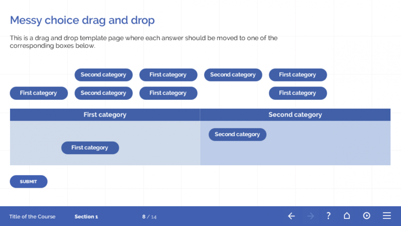
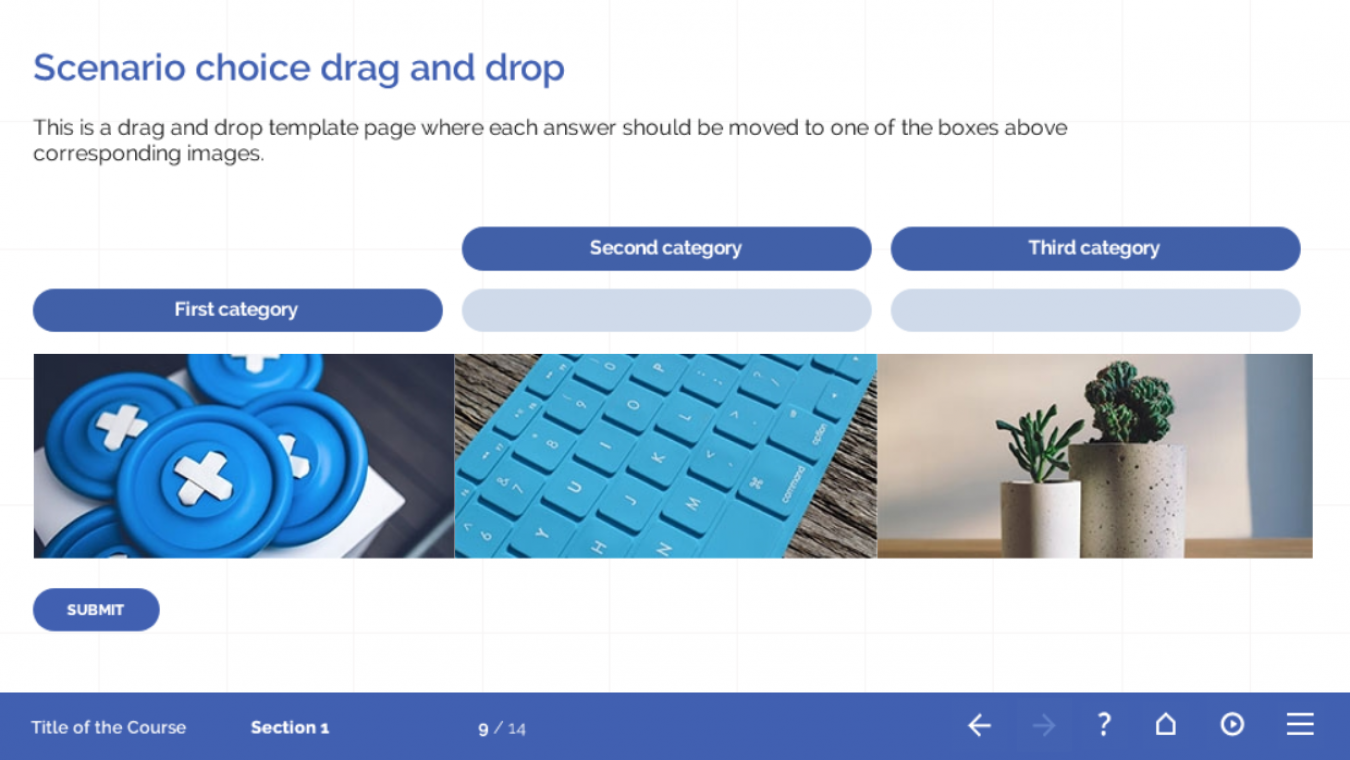
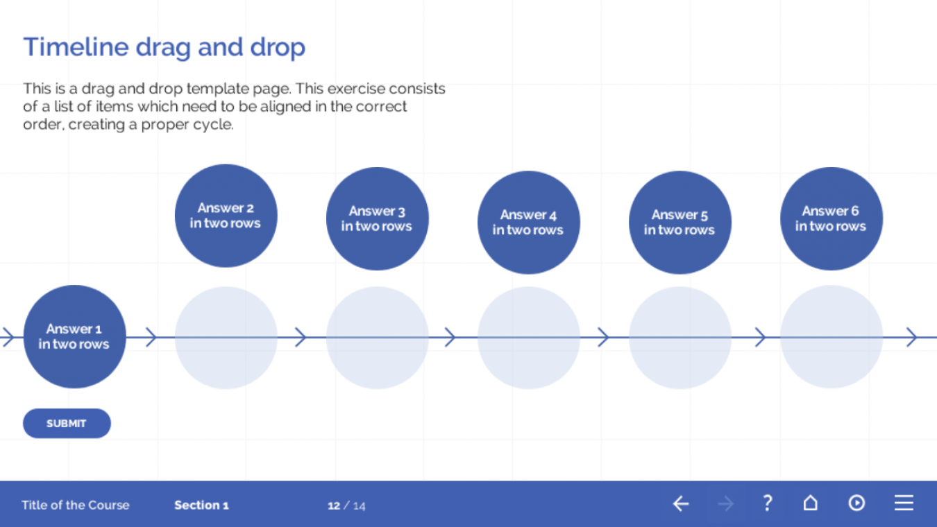
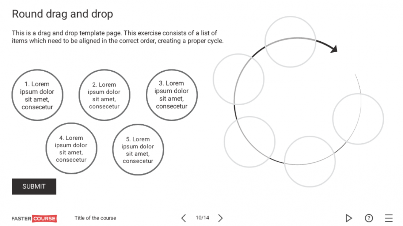
Developing drag and drop tasks can definitely be a bit tricky, but they can really challenge and engage the learner. There are many great options here, such as arranging items in the correct order, matching or sorting items, and even putting together puzzles.
Scenario tasks
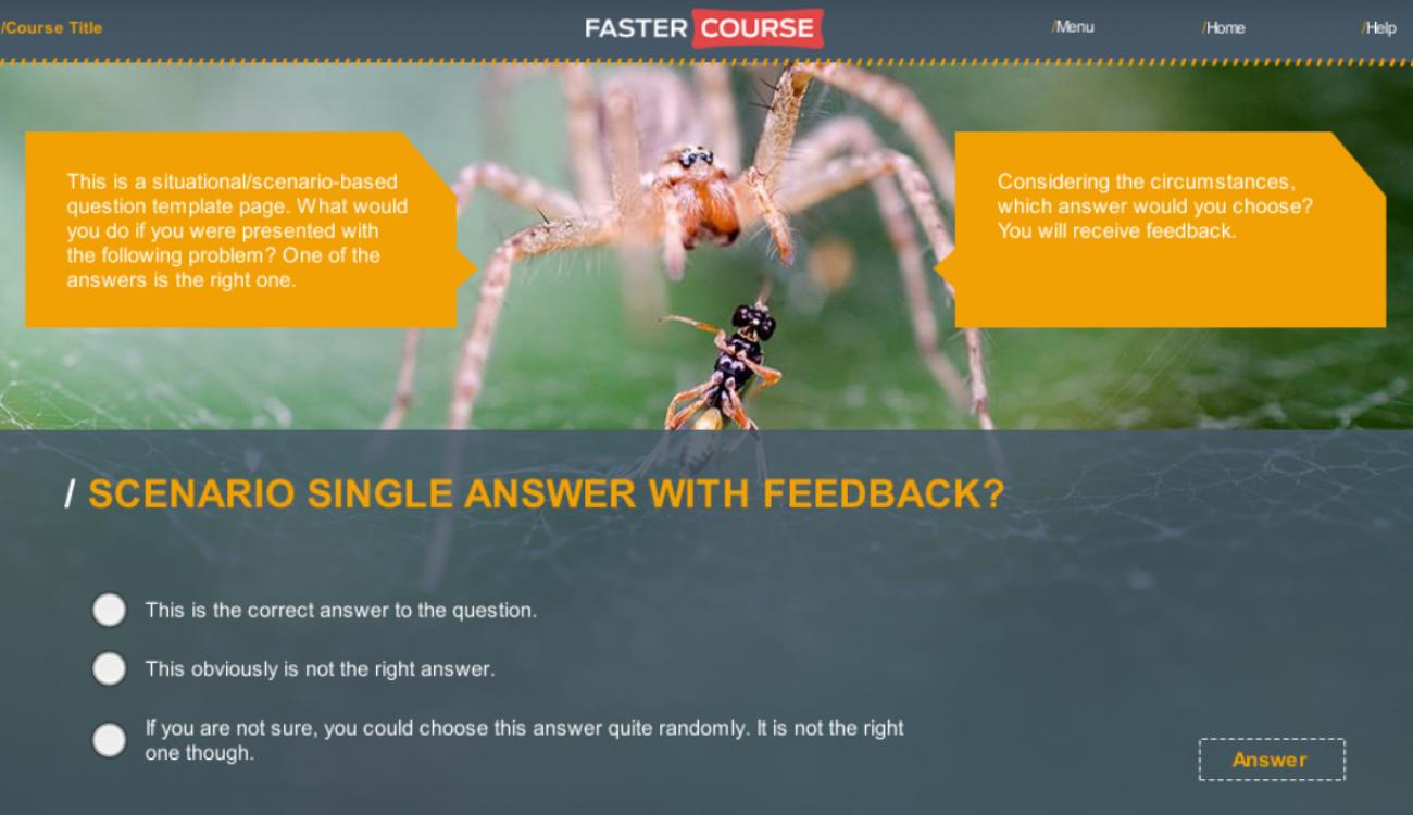
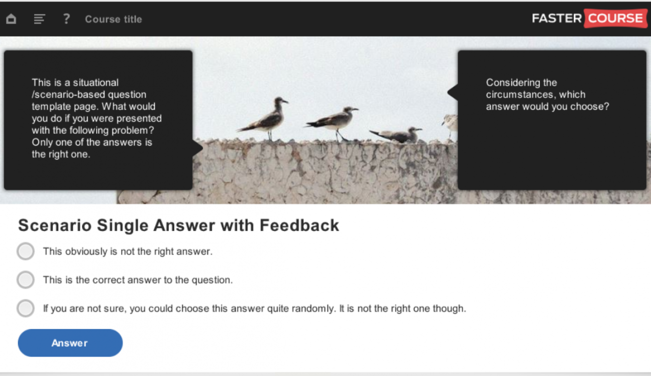
You can also enhance the classic single choice question by adding some more information, for example, a brief dialogue, before posing the question.
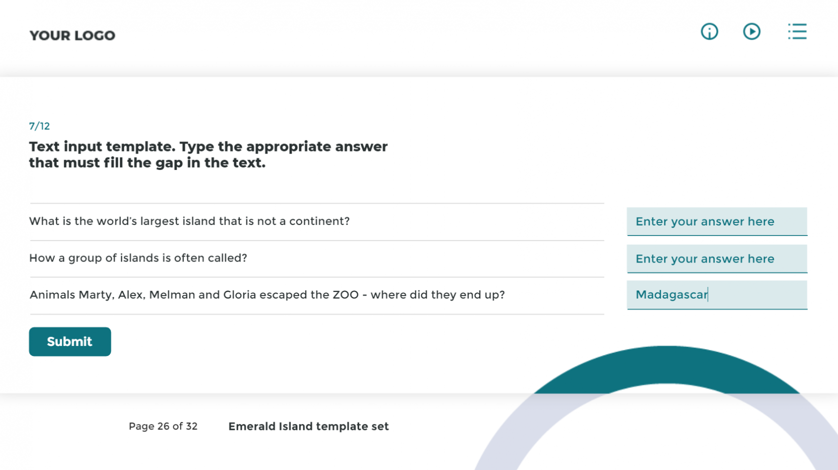
Text entry
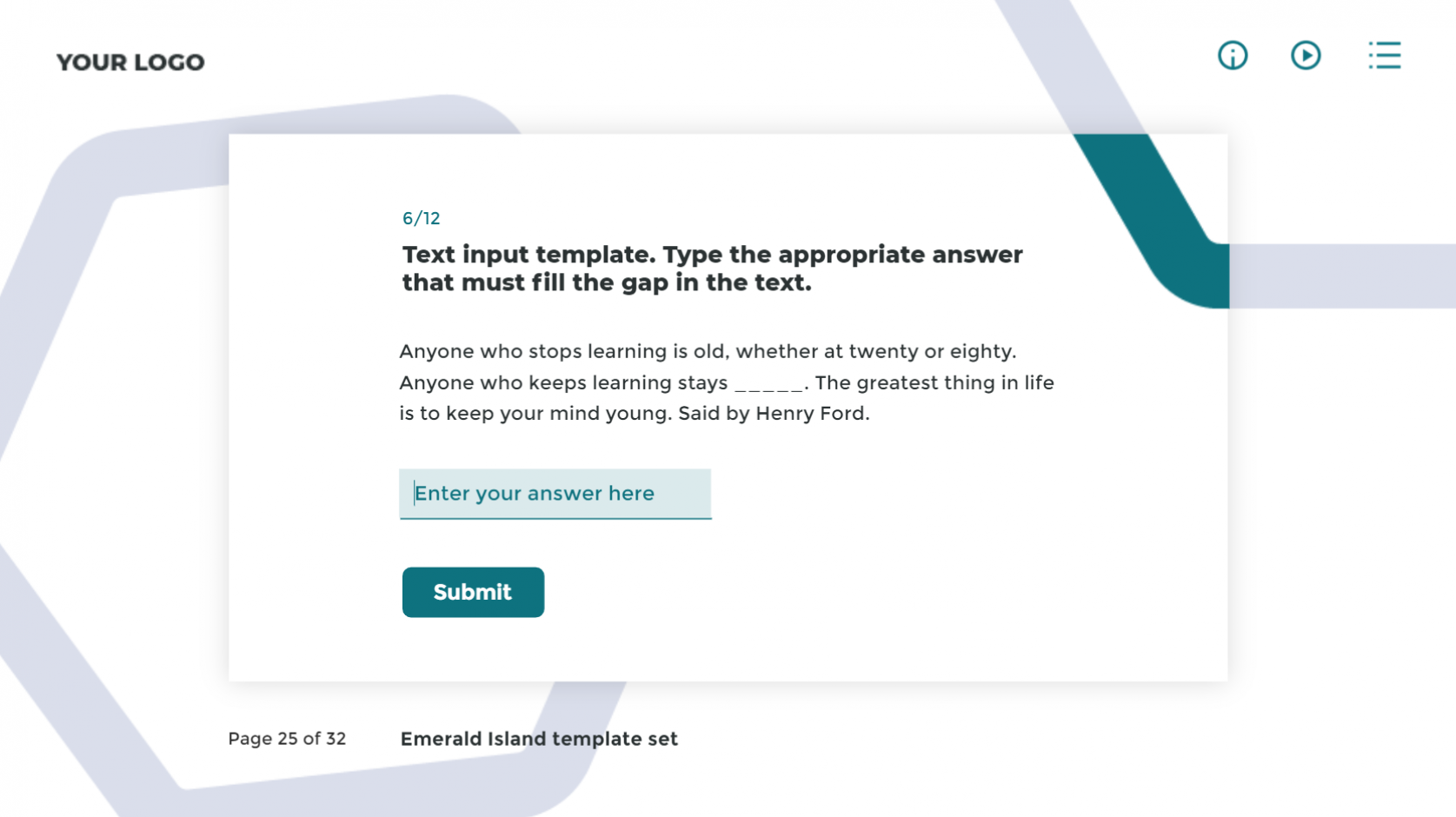
A good way to make the learner really think rather than guess is to make them type in the answer to a question or to fill in the missing words.
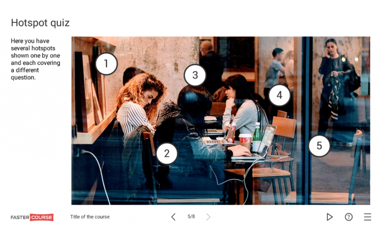
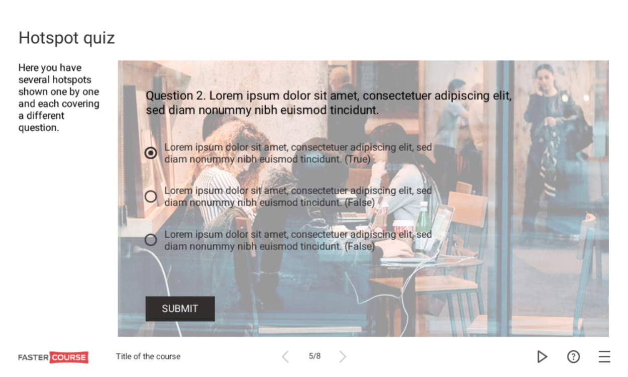
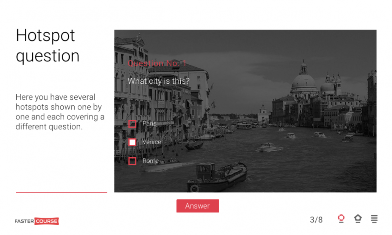
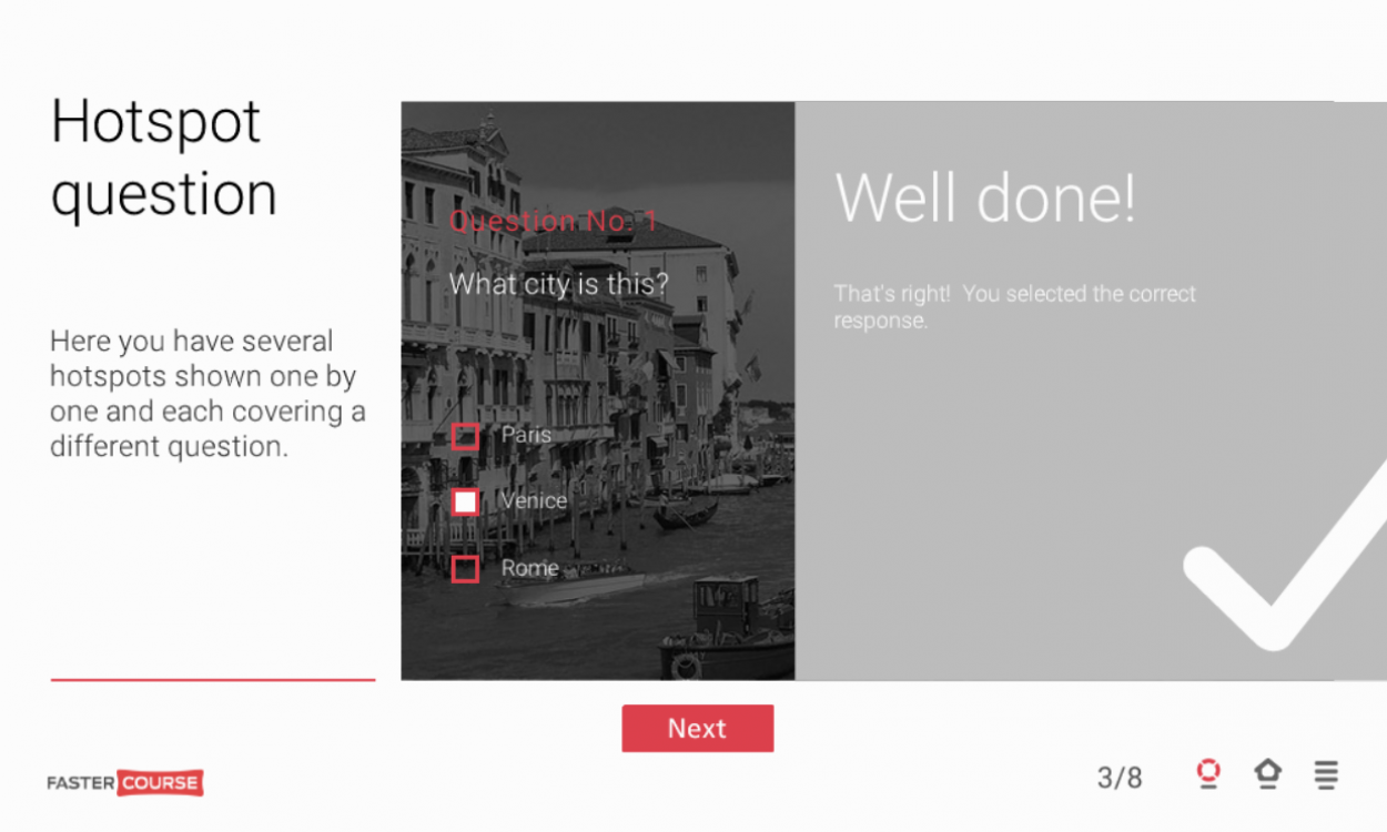
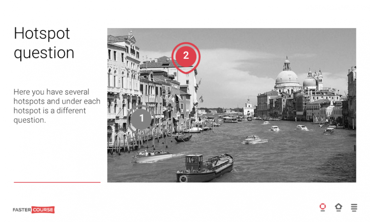
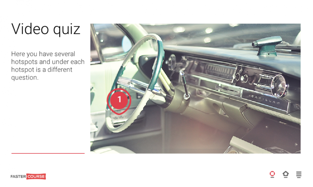
Hotspot quiz
You can also mix things up by combining a hotspot interaction with a series of questions. This means that the user can click on a marked area of an image and then answer a relevant question.
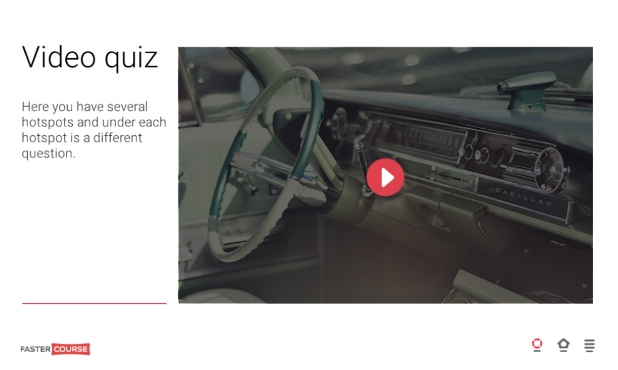
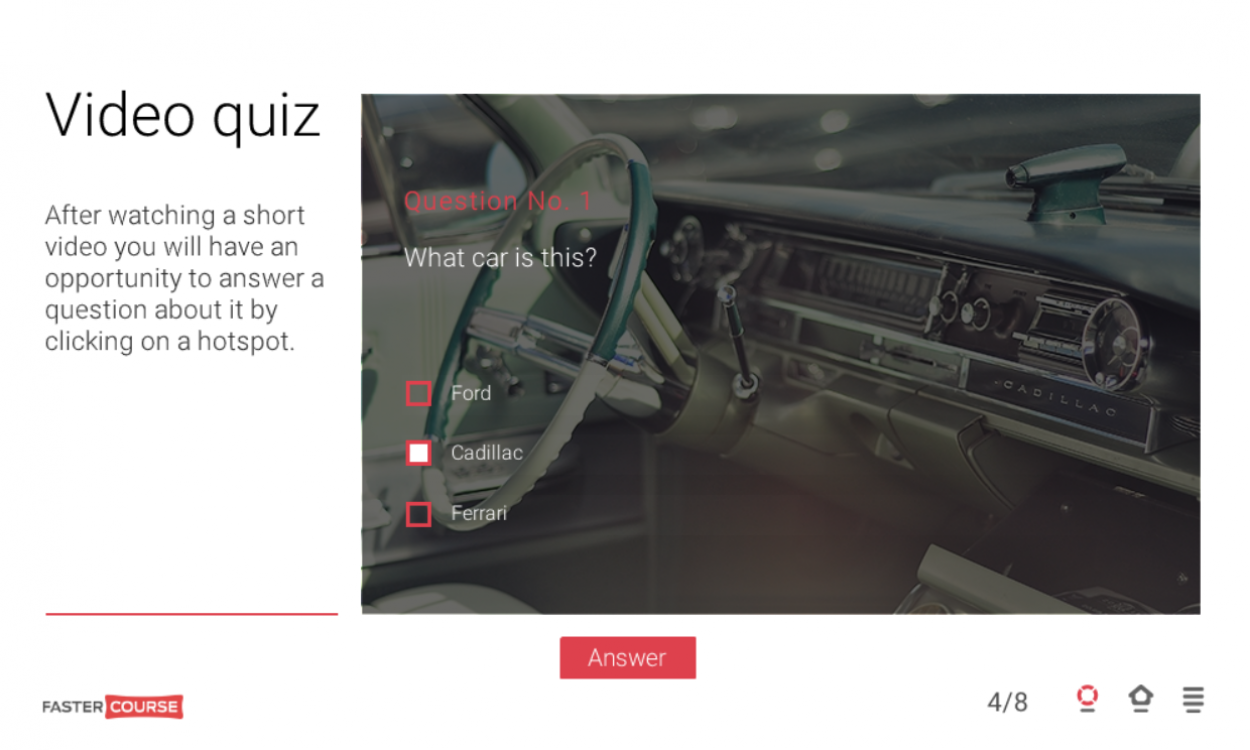
Video quiz
You can take the hotspot quiz a step further by integrating videos in it.
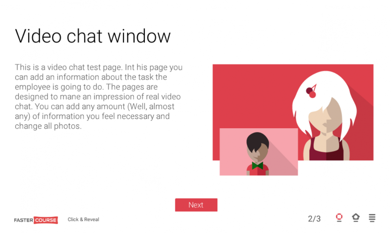
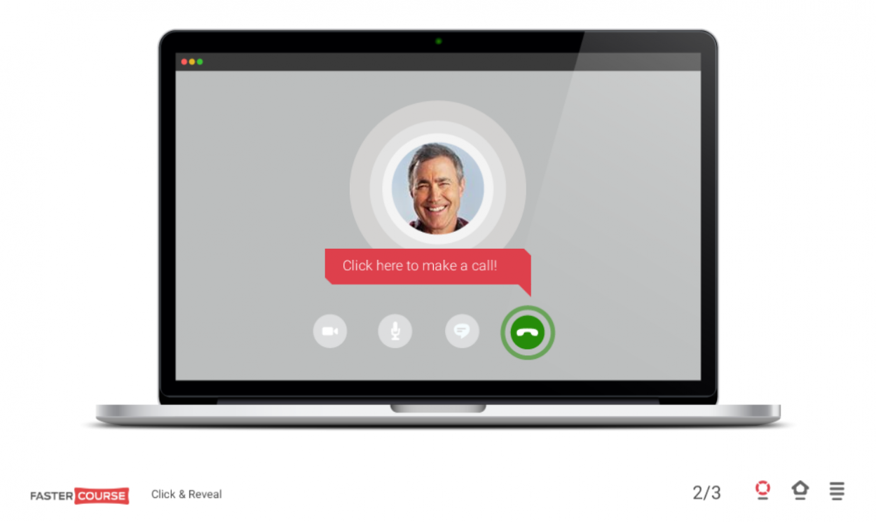
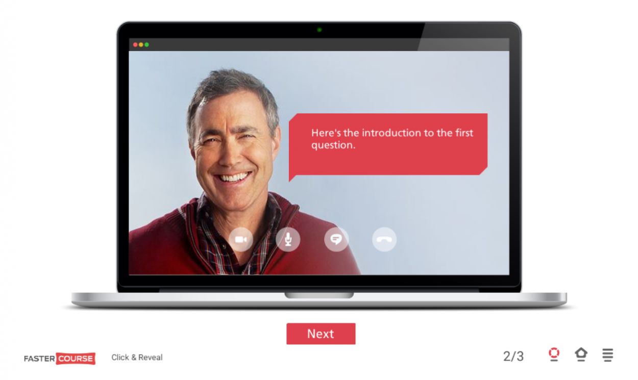
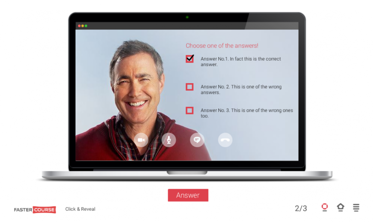
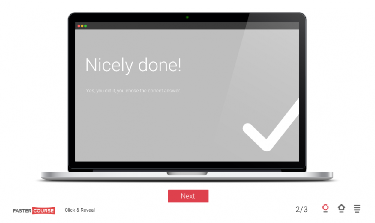
Video chat
Another interesting way of ‘dressing up’ a classic single/multiple choice test is to add modern elements to it, for example, by turning it into a simulation of a video chat.
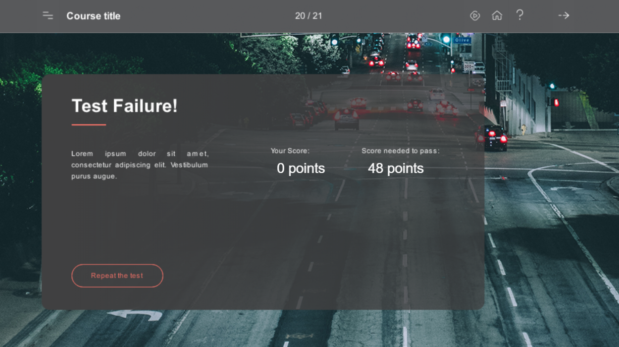
Test results page
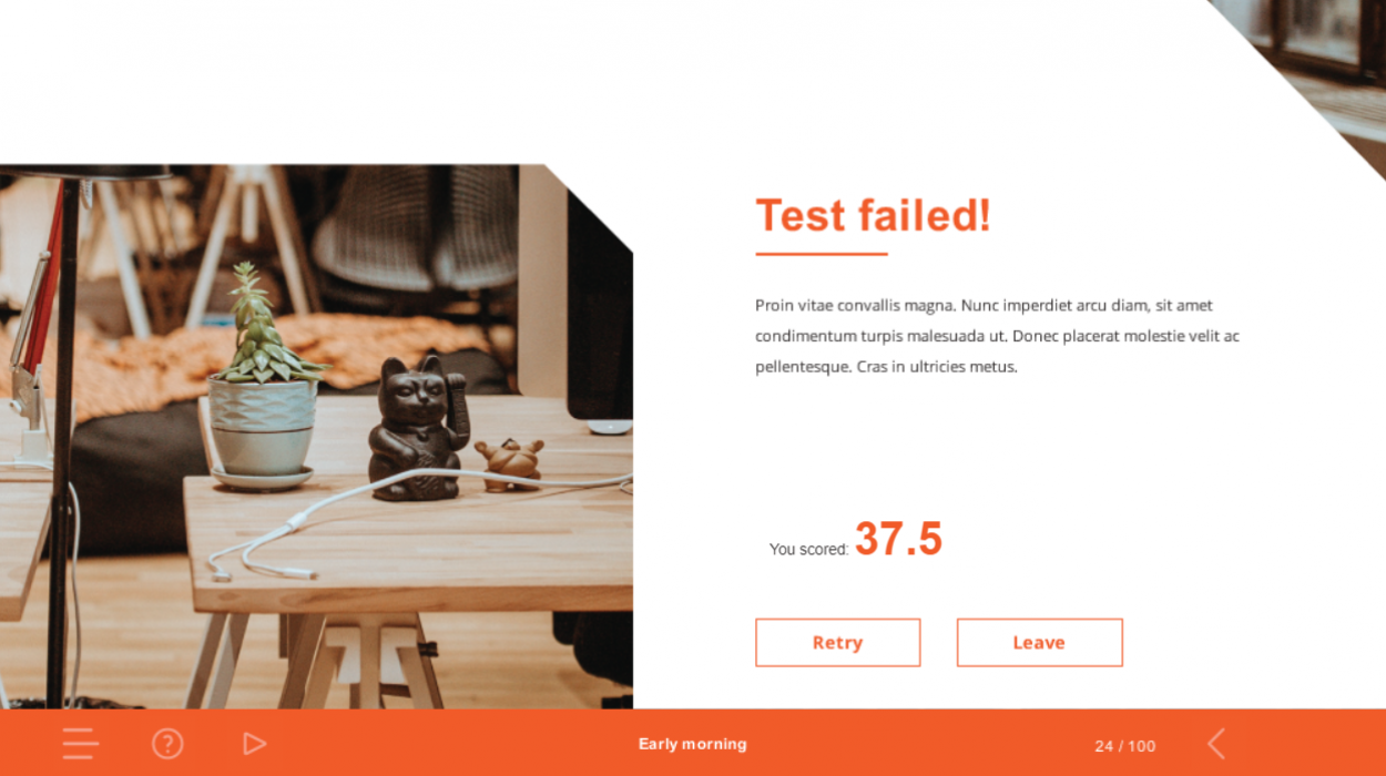
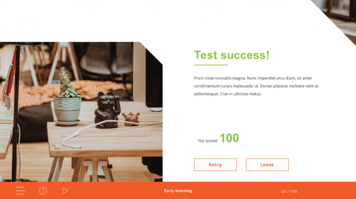
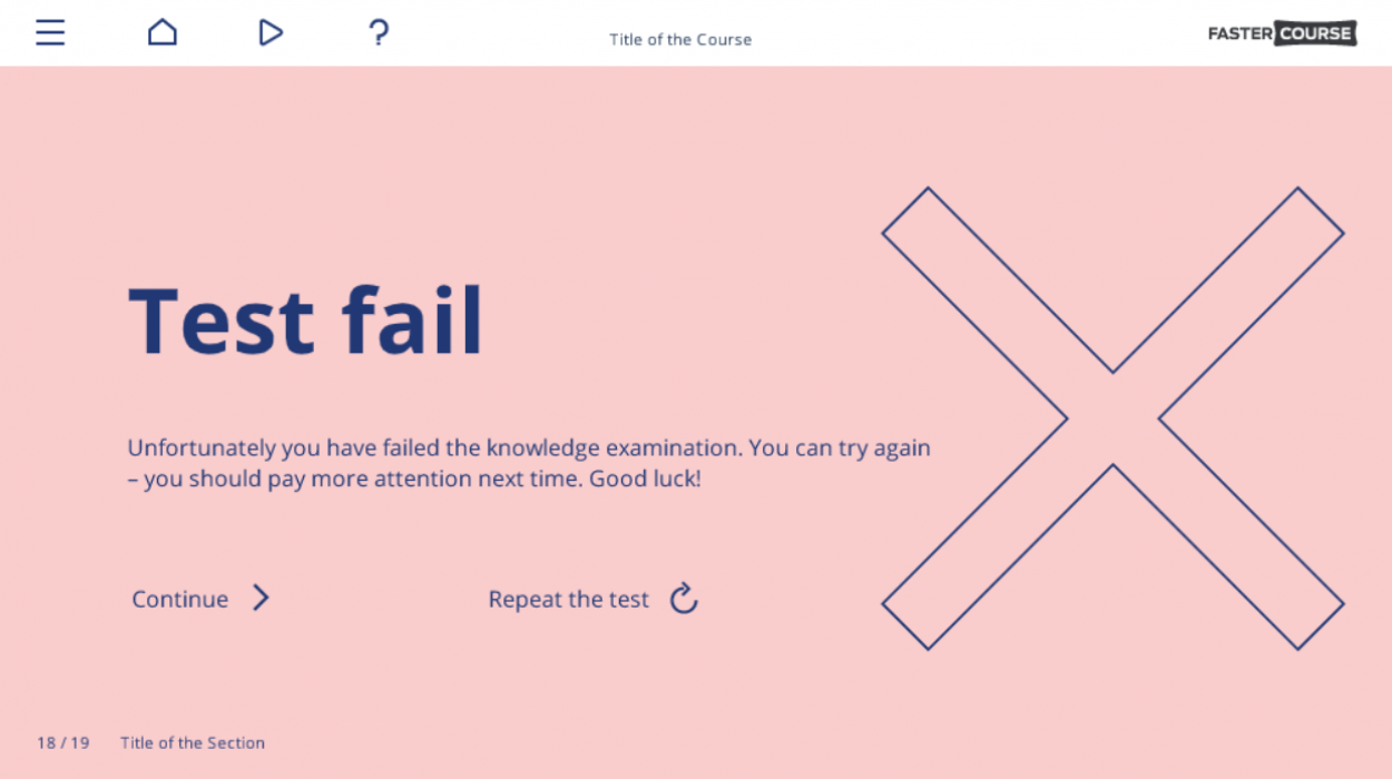
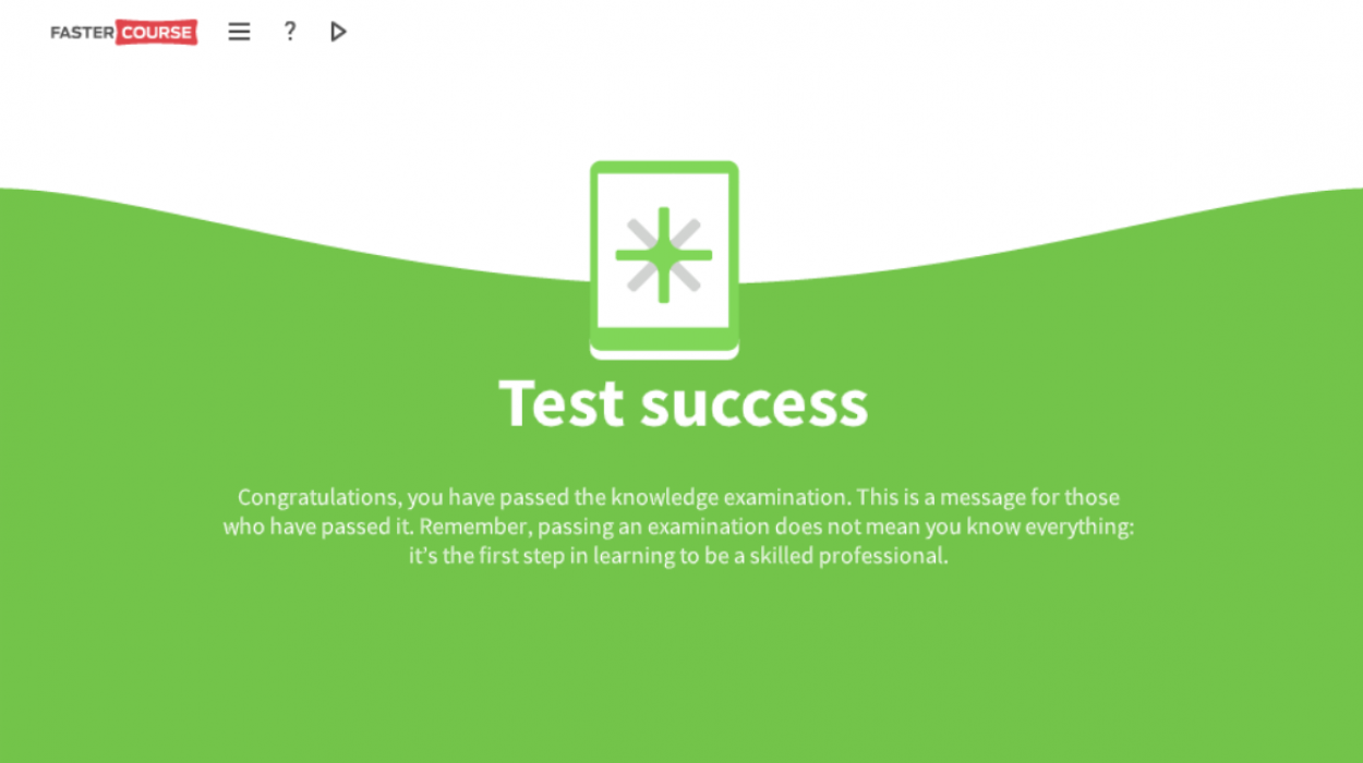
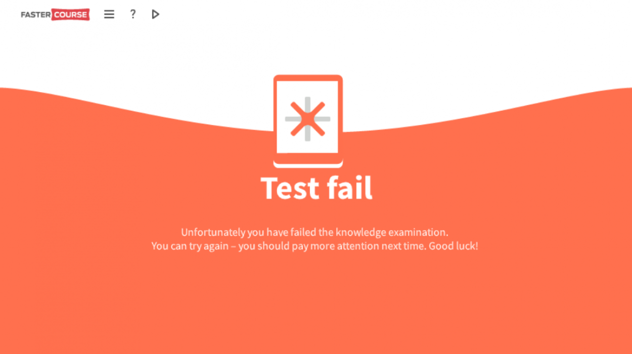
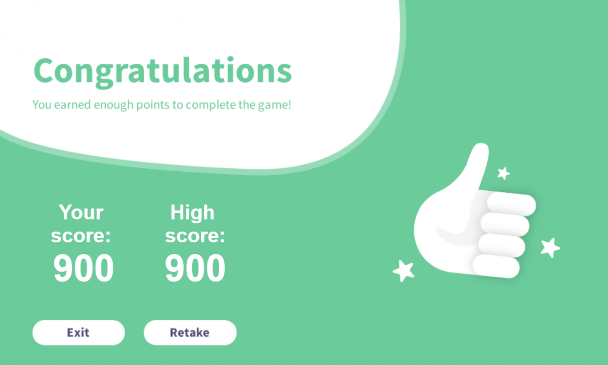
In this page, you can show the learners how well they’ve done in the test. If necessary, you can include their score and offer some options, such as to retake the test.
Course outro page
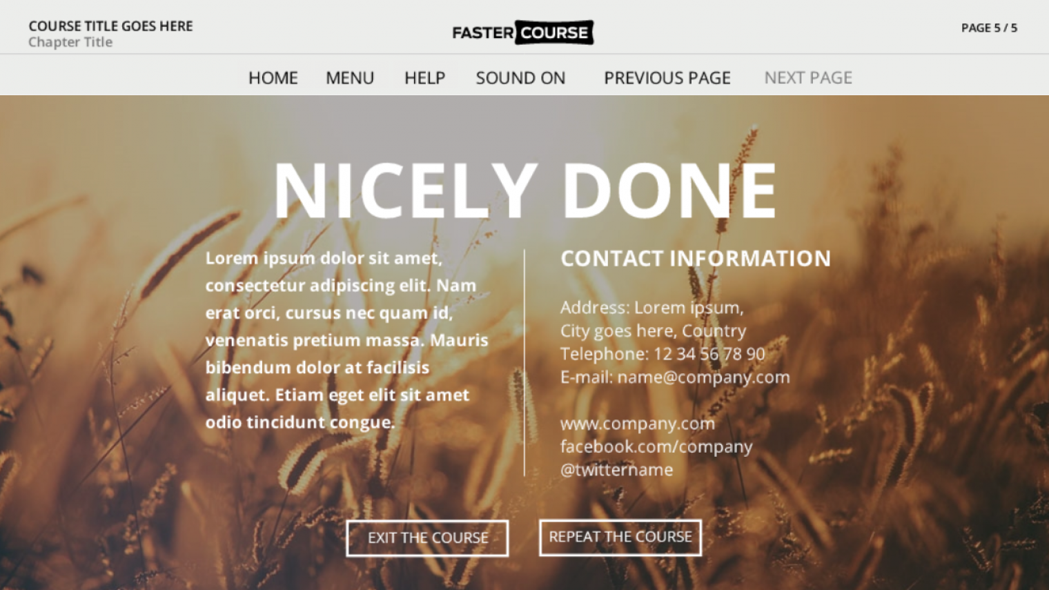
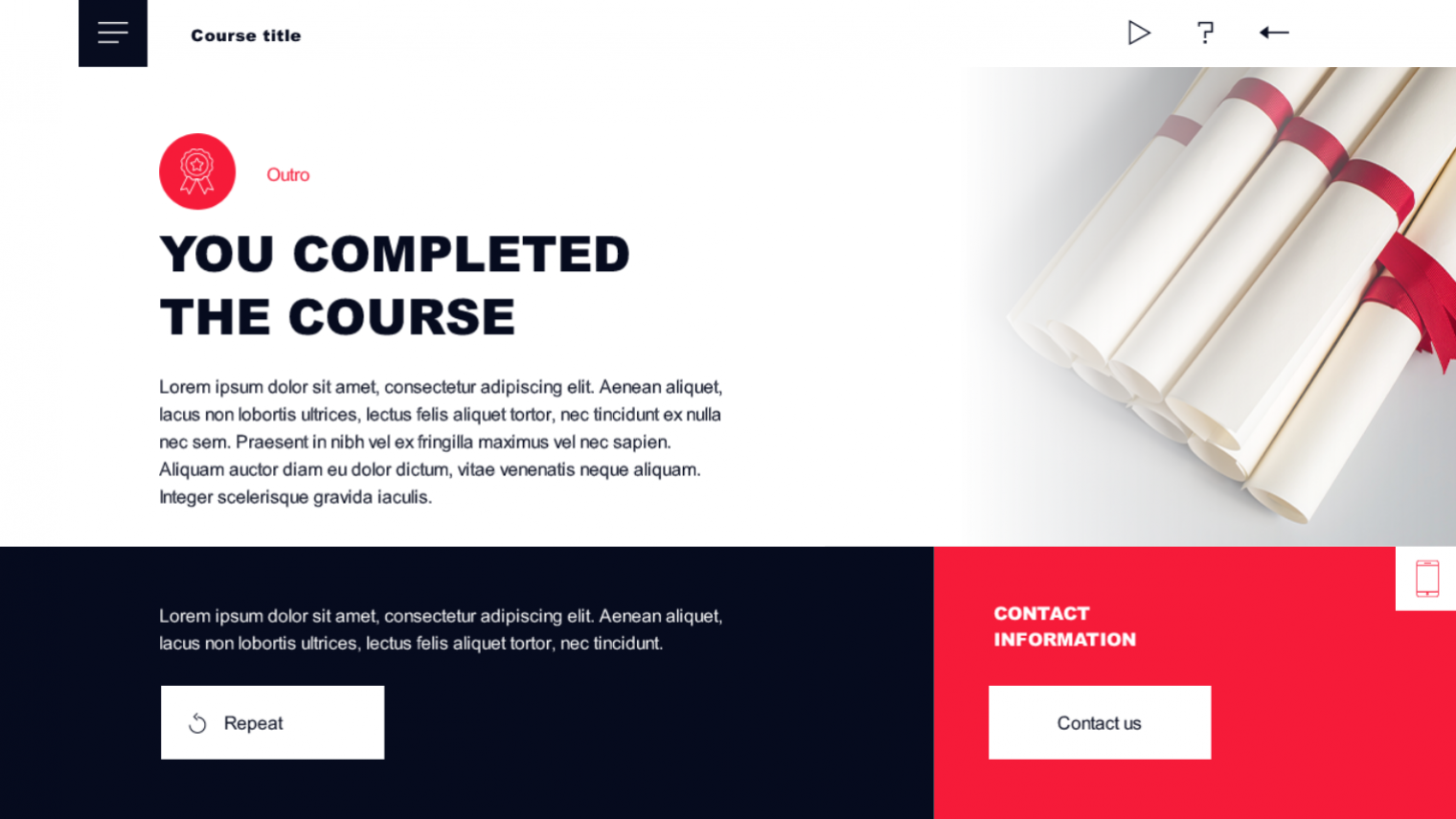
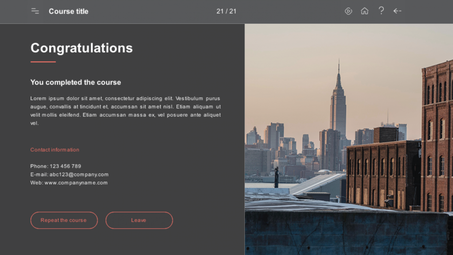
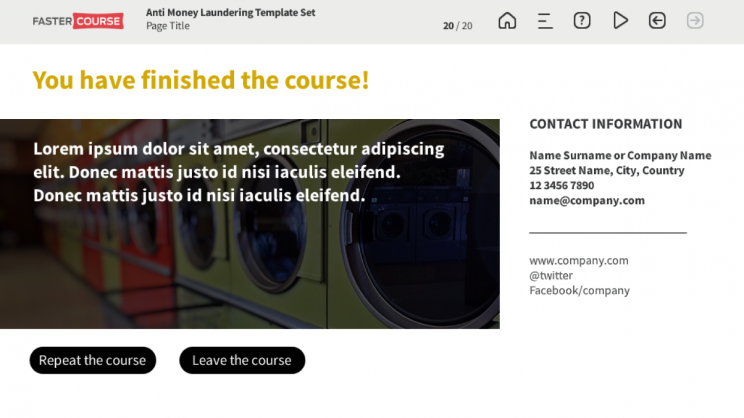
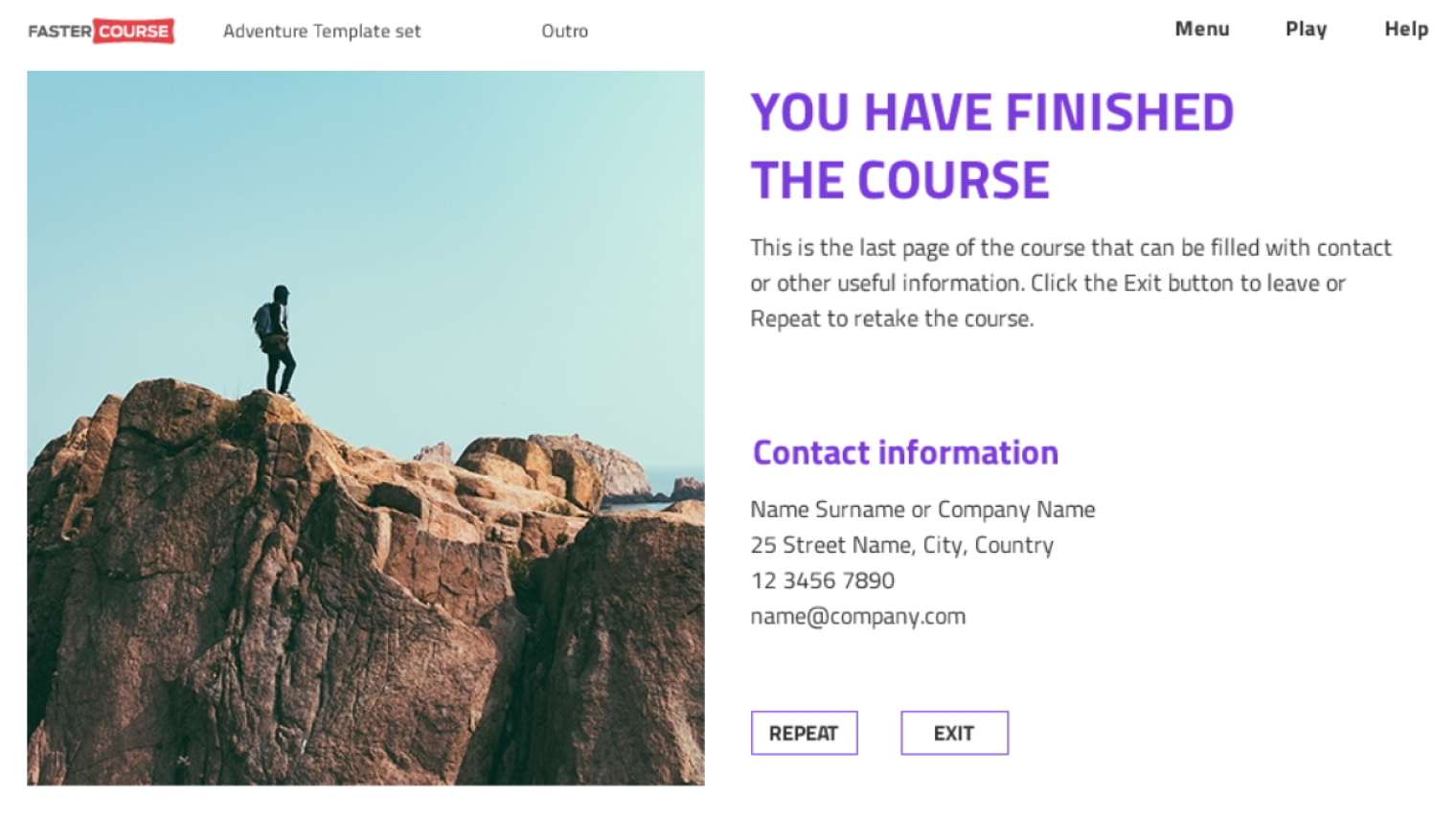
The final page of the course informs the learner that they have finished the training. This page can also include some useful links, contact information, as well as options to repeat or leave the course.
And then come the games…
Now that we’ve looked at all sorts of templates, starting with simple content pages and ending with complex interactions, let’s take a peek into some ideas for gamified e-learning content.
Branching
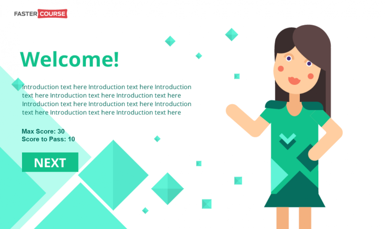
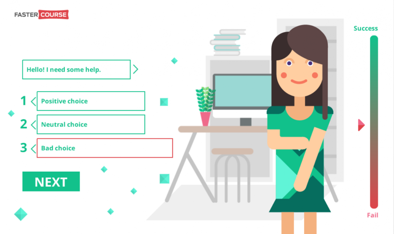
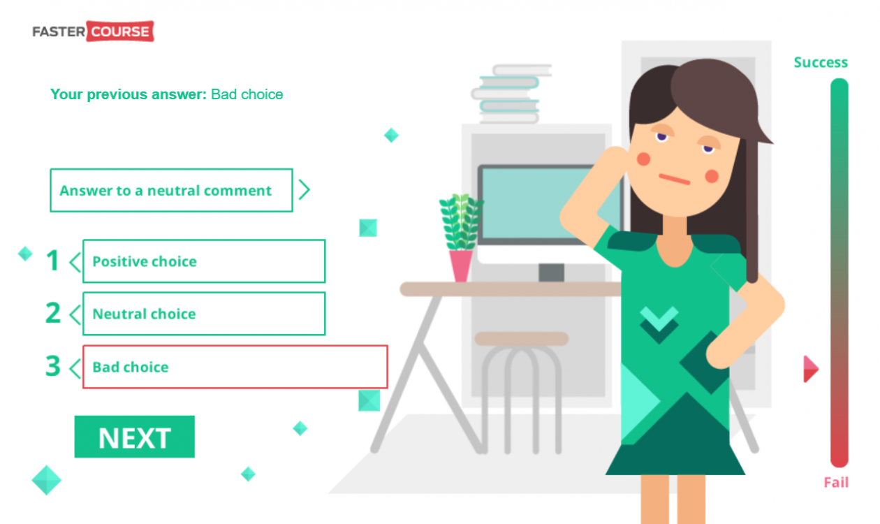
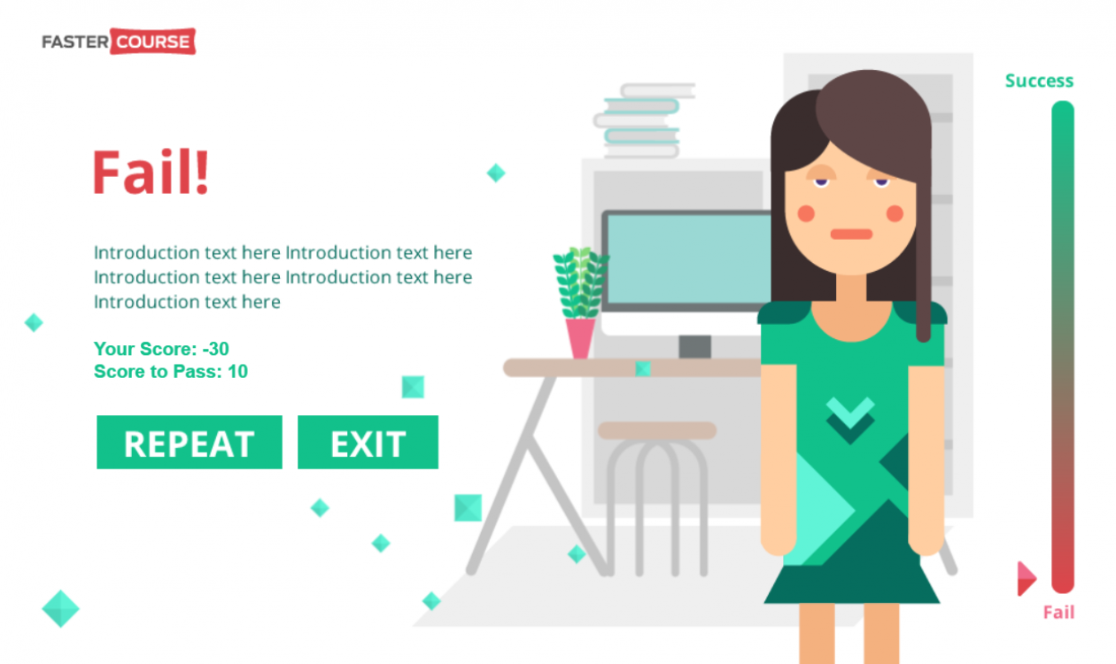
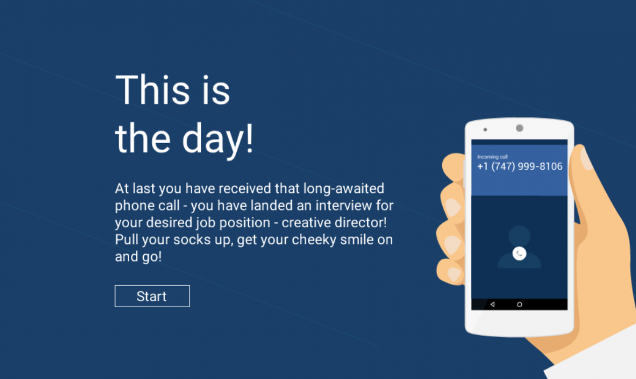
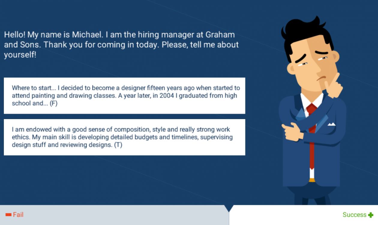
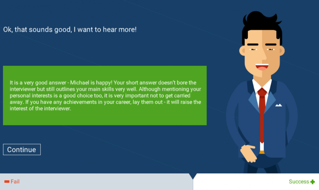
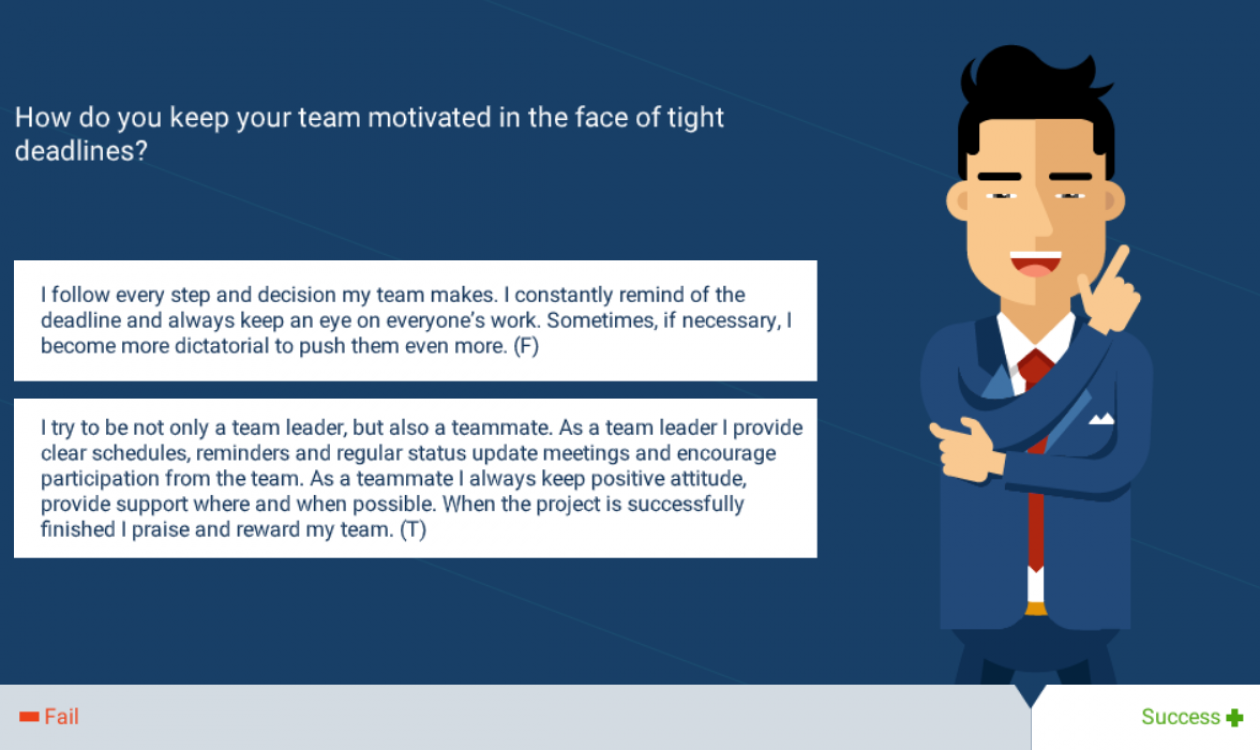
A branching scenario is great for simulating real-life situations. Usually, a branching scenario consists of a situation description, followed by a series of questions. The upcoming questions depend on the learner’s previous answers. The outcome will also differ, depending on the overall amount of successful choices. You can add a character and/or a progress bar to indicate how the learner is doing. Although a branching scenario is quite complex from an instructional design point of view, it can be a really useful learning experience for the learners.
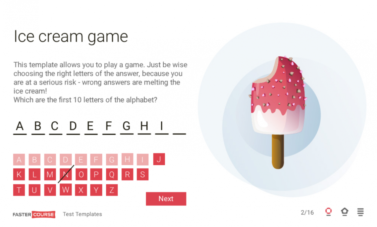
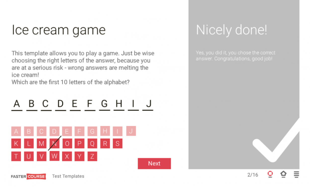
Ice cream game
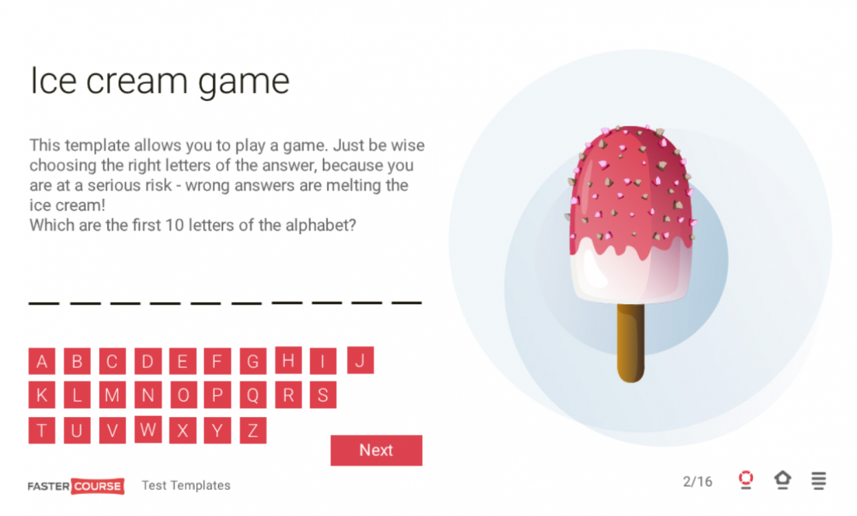
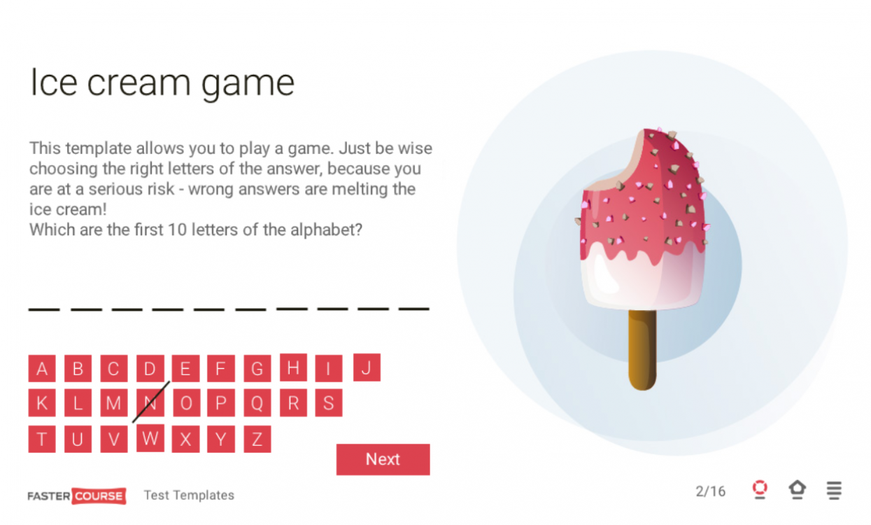
Another fun way of entering an answer to the question is by putting it together letter by letter. Get a letter wrong, and there will be consequences (as we’re not fond of violence, we replaced the classic ‘hangman’ with ice cream).
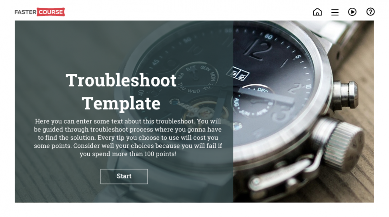
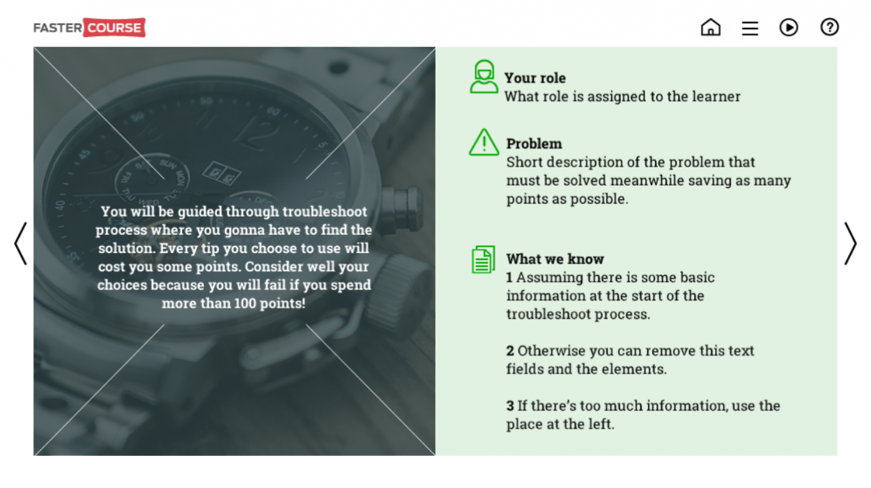
Troubleshooting
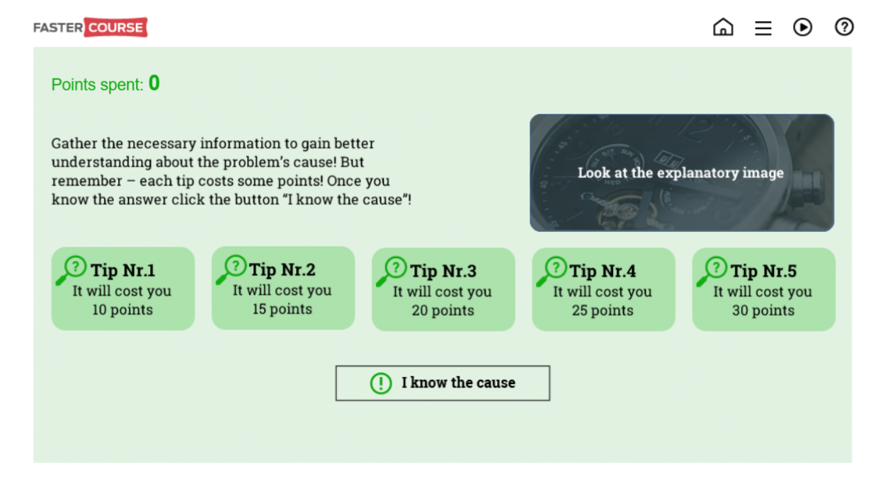
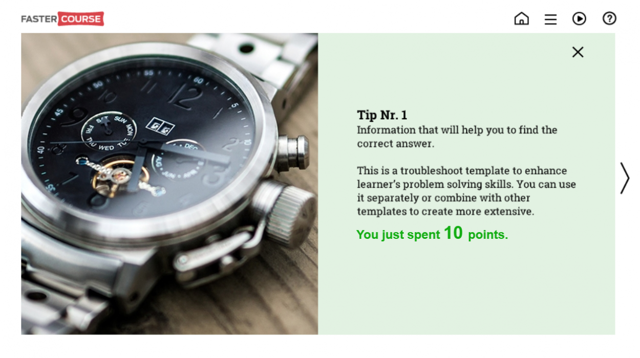
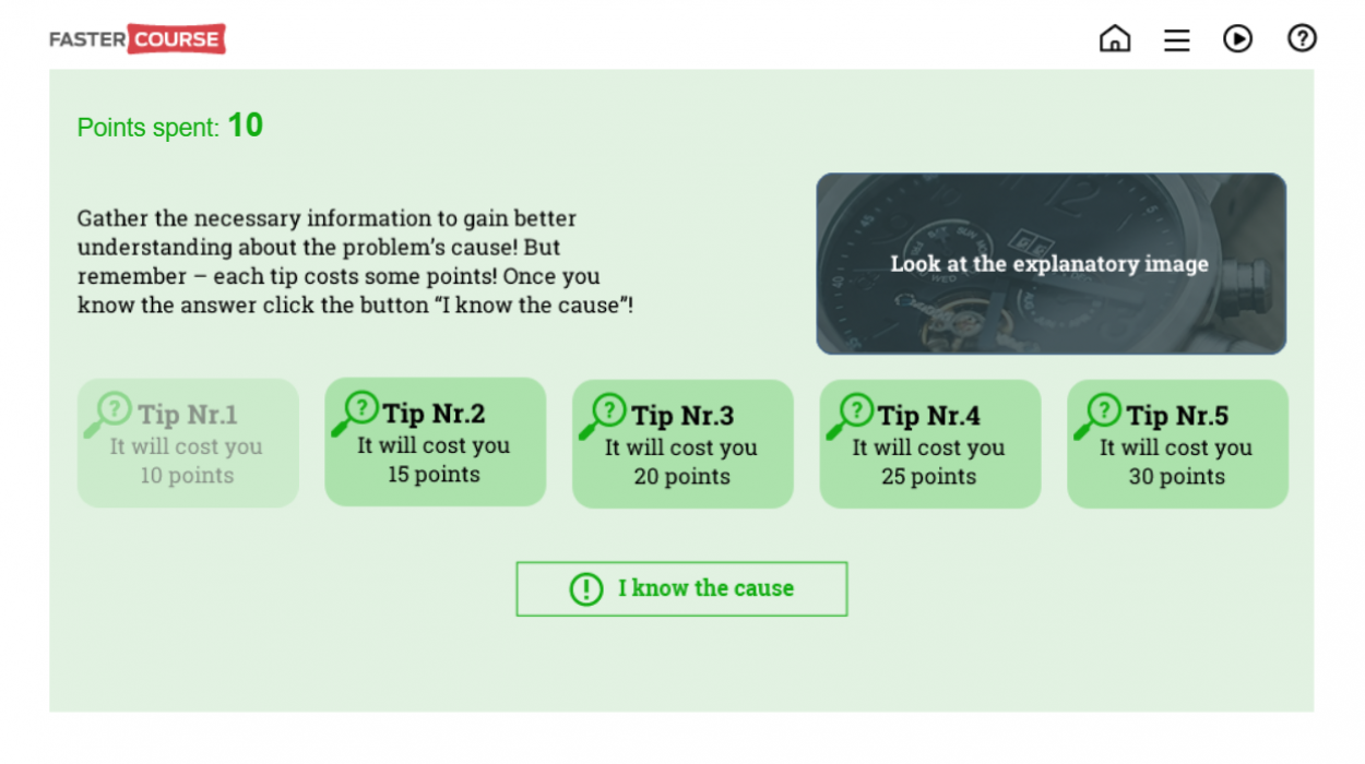
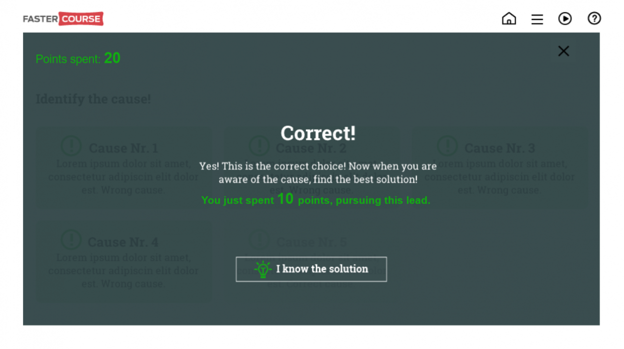
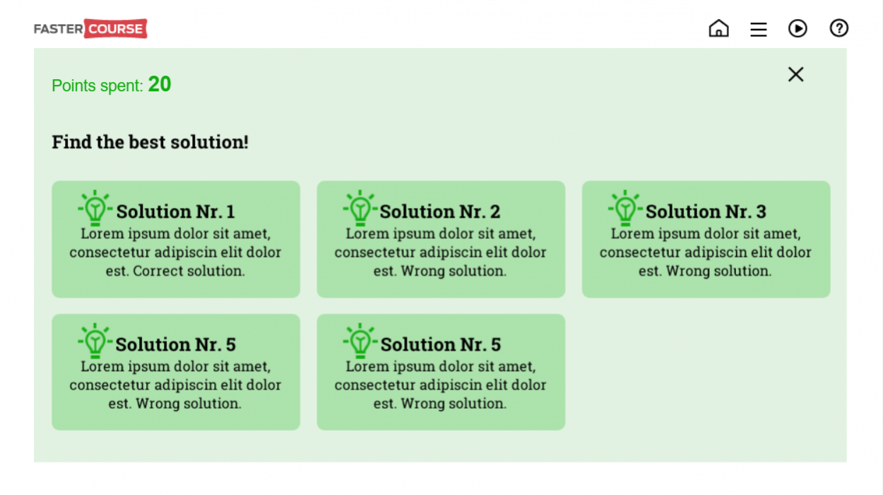
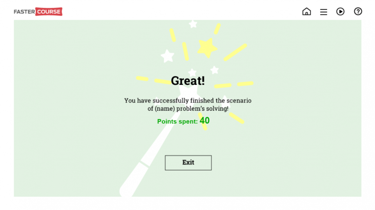
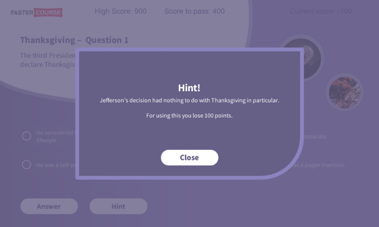
If you need your learners to properly evaluate situations, determine causes and select the best solutions, this type of interaction might be just the thing. It begins with an introduction that informs the learner about their role and the problem that they need to investigate. Then, the learner can look at some tips to gather more info. However, this needs to be done strategically, as each tip costs points. Once the learner determines the right cause, they can move on to selecting a solution.
Trivia games
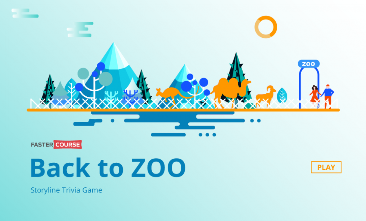
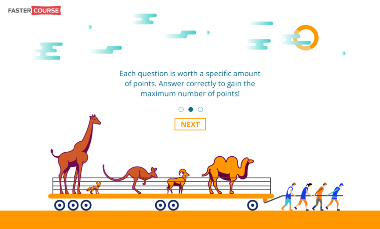
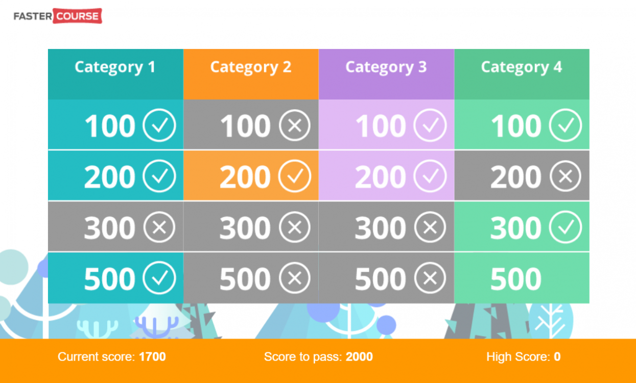
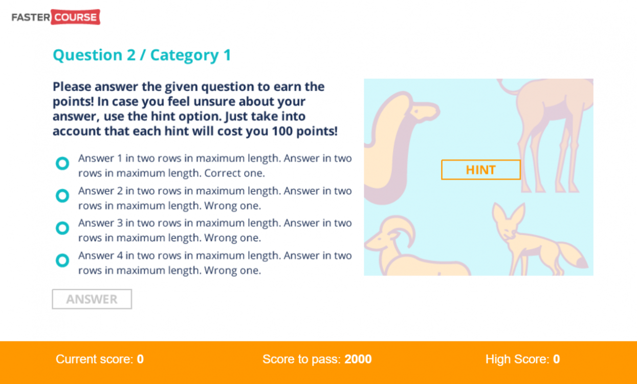
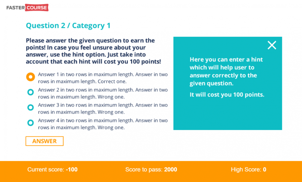
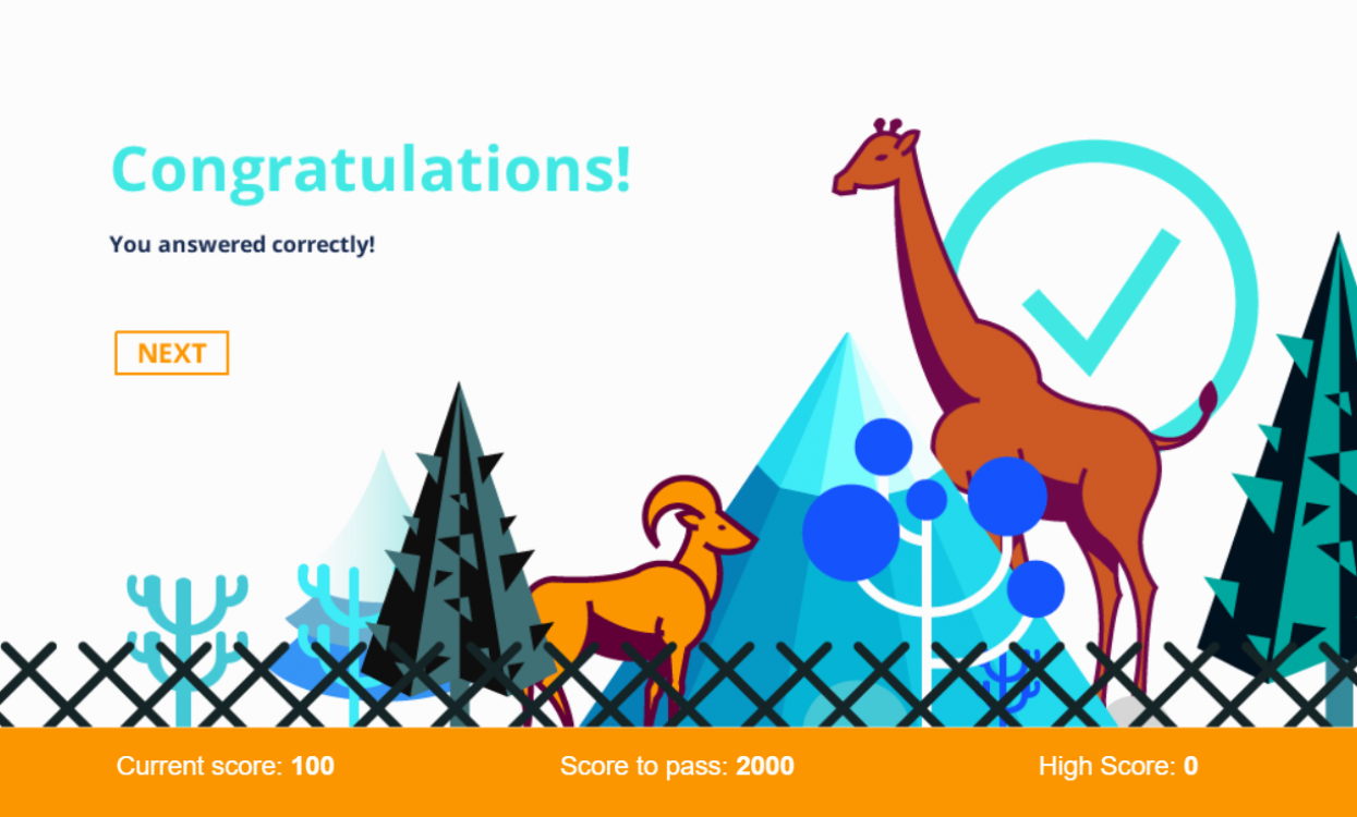
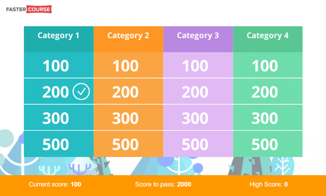
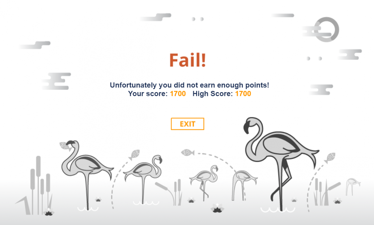
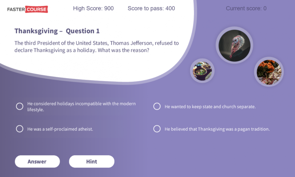
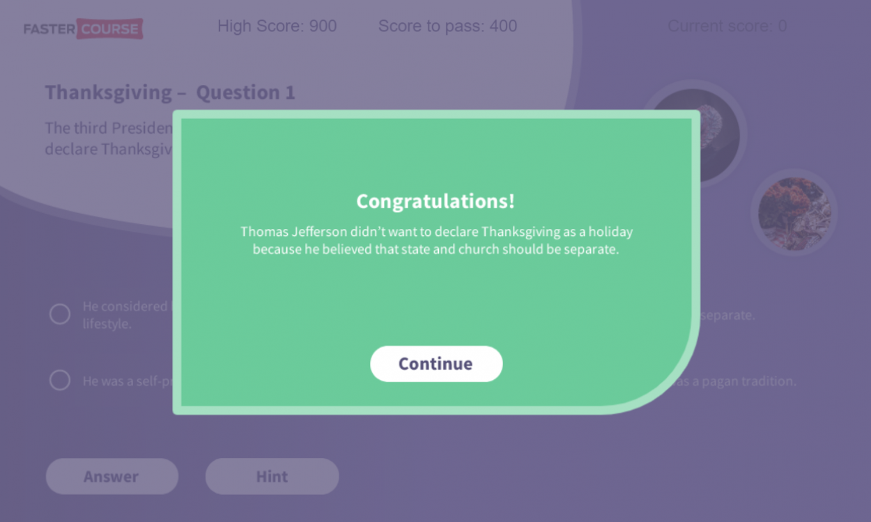
‘Back to Zoo’ is one of our most colorful and fun games. It’s a trivia game where the learners need to collect as many points as they can by answering questions in 4 categories. They need to get at least 2000 points to win the game.
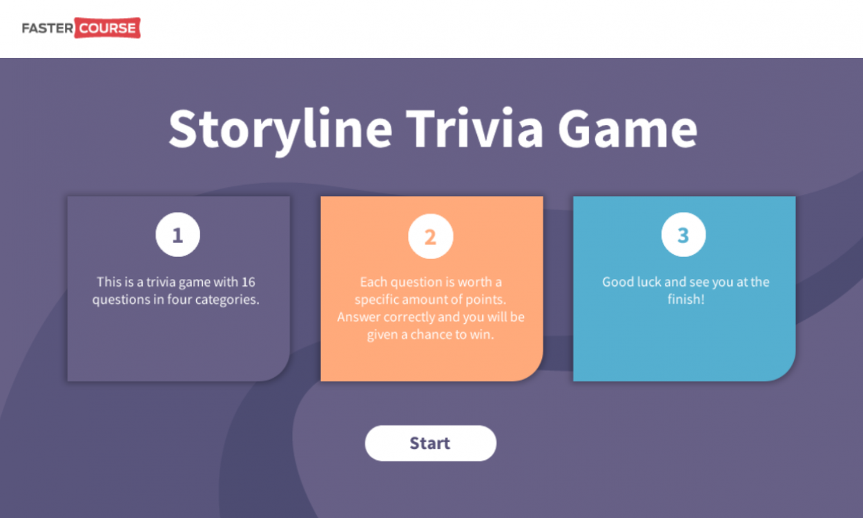
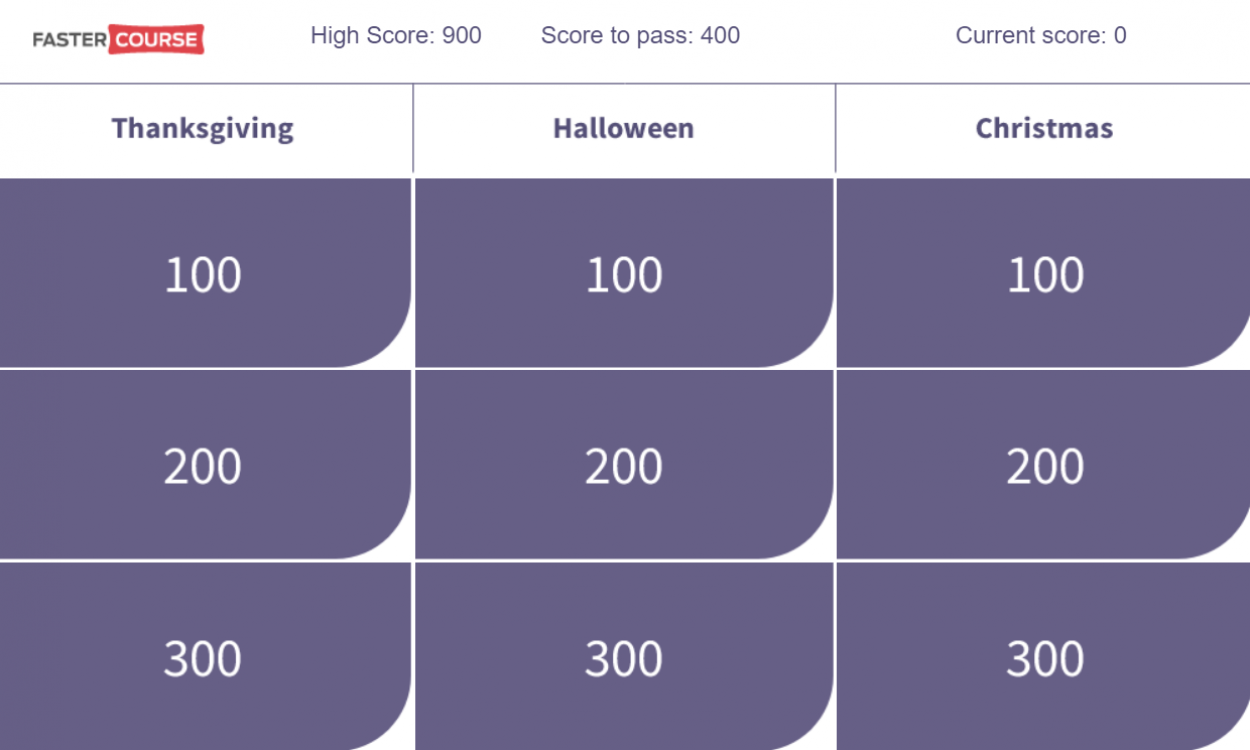
We’ve used a similar principle with different page layouts and overall feel in our Purple Trivia Game.
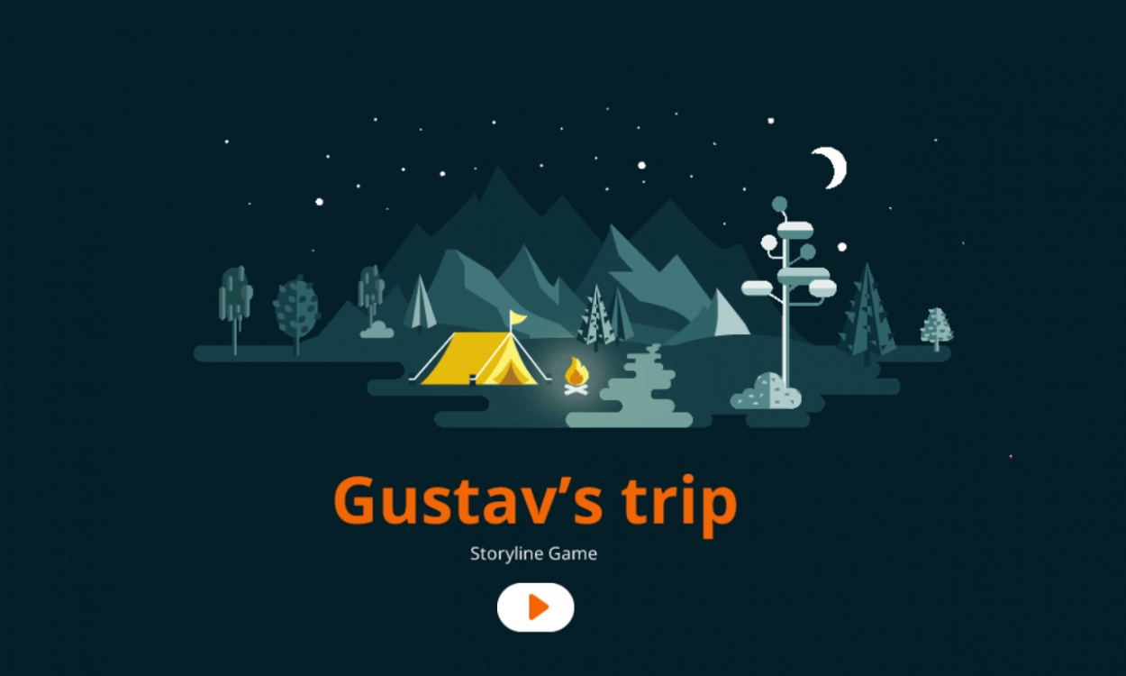
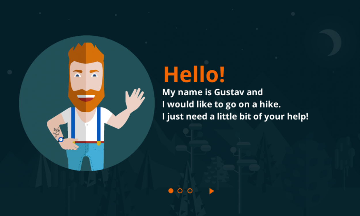
Gustav’s trip
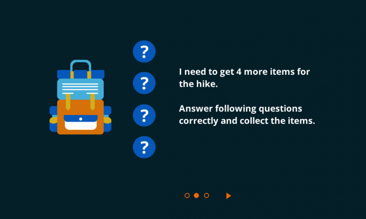
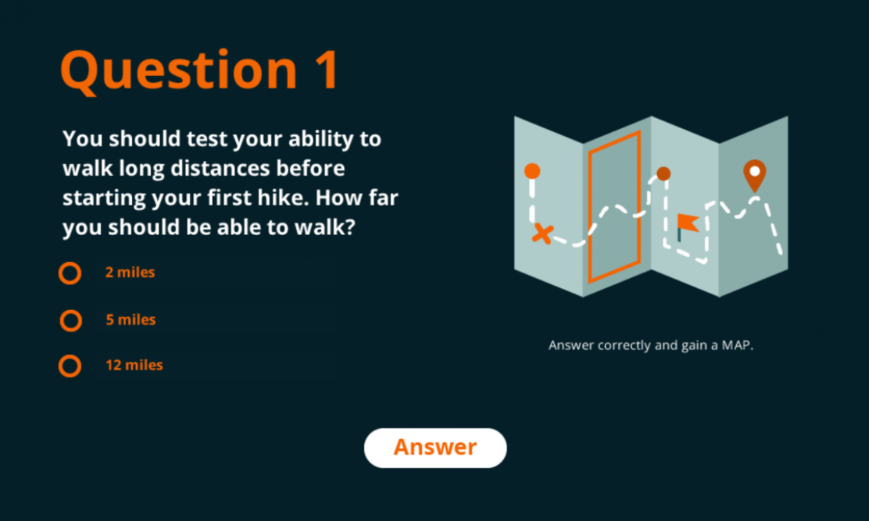
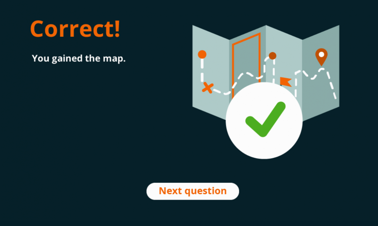
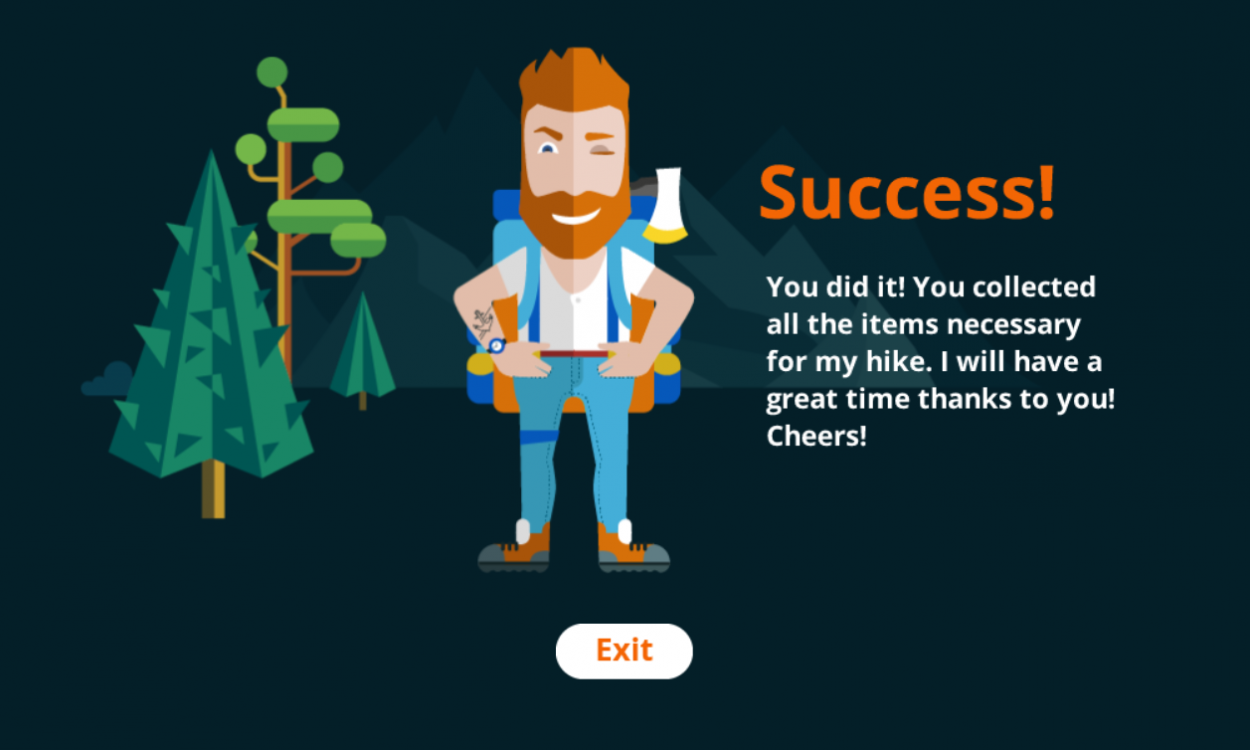
In ‘Gustav’s trip’, your objective is to help the main character collect items for his hike. The game is basically a series of single choice questions. You gain one item for each correct answer. You need to collect all items to succeed.
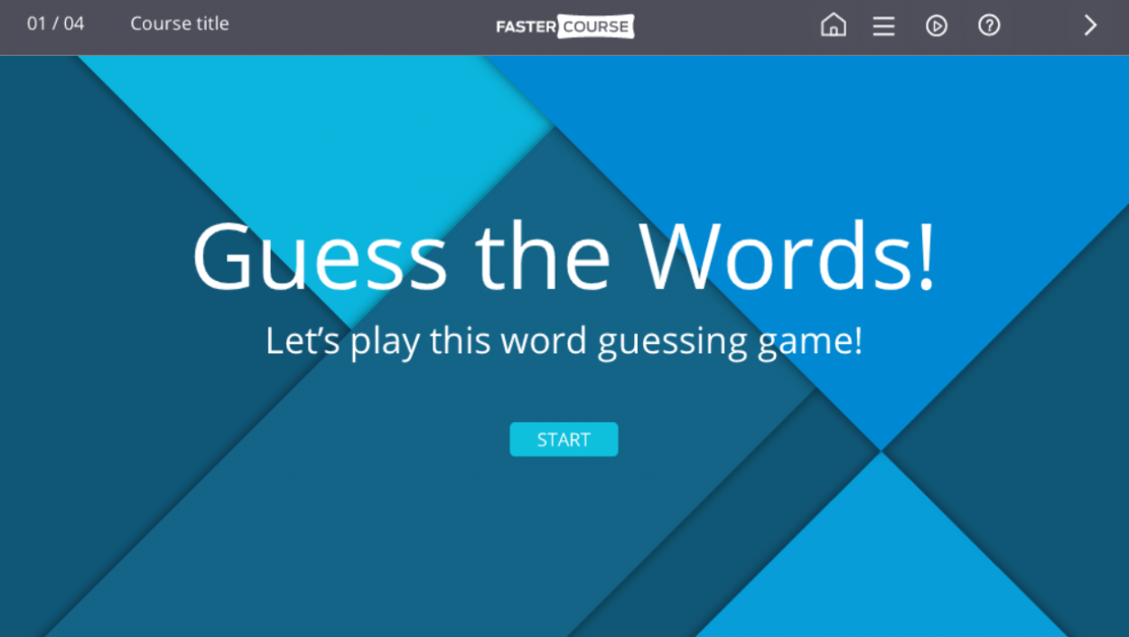
Guess the words!
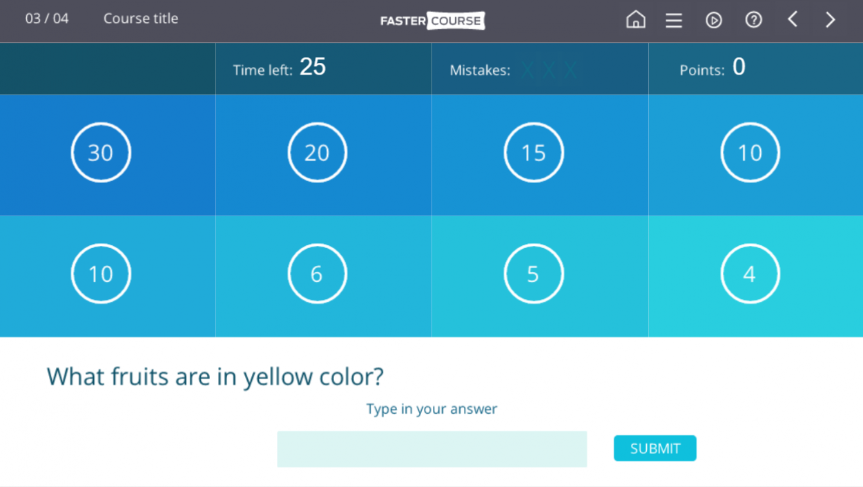
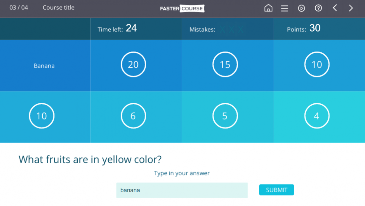
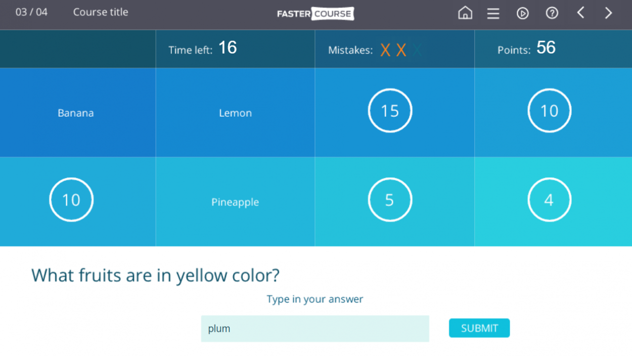
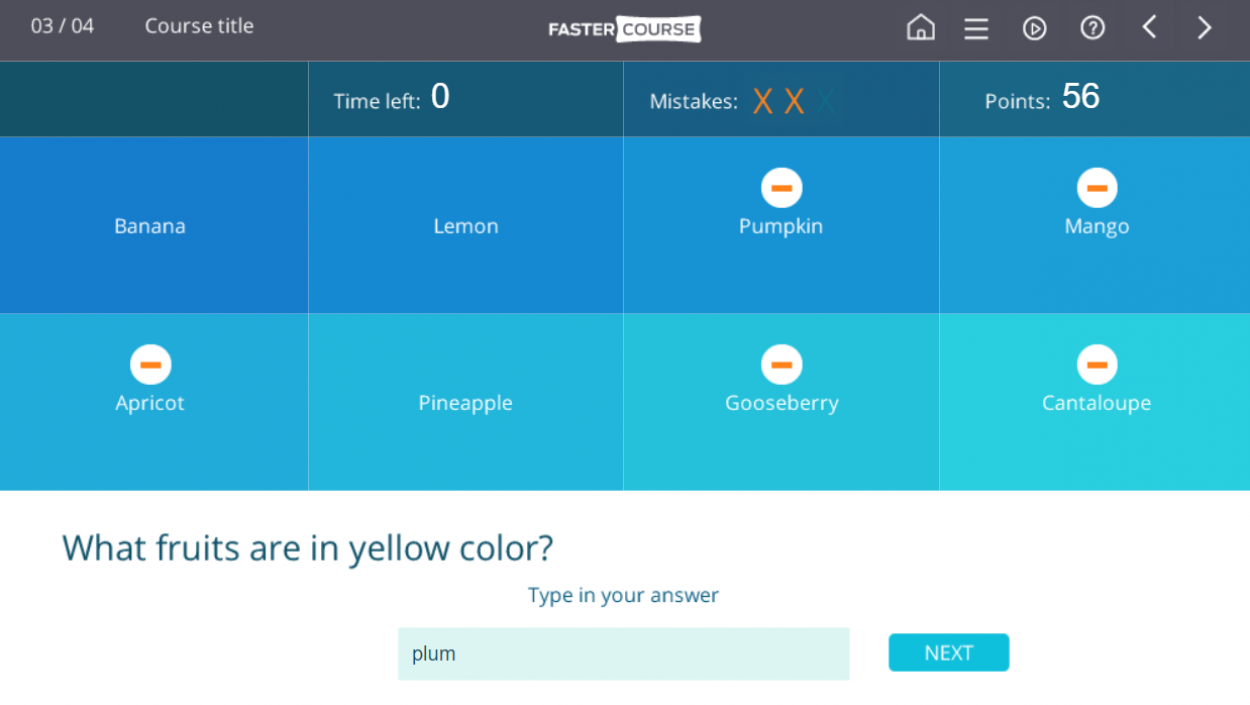
As the title suggests, this is a word guessing game. In the game, you are given a question and you need to type in the answers. Each answer is worth a certain amount of points. To add some pressure, there is a time limit and you can only get it wrong 3 times.
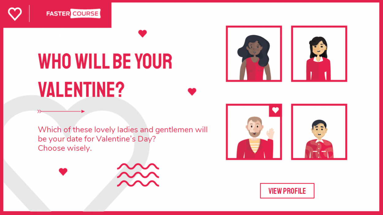
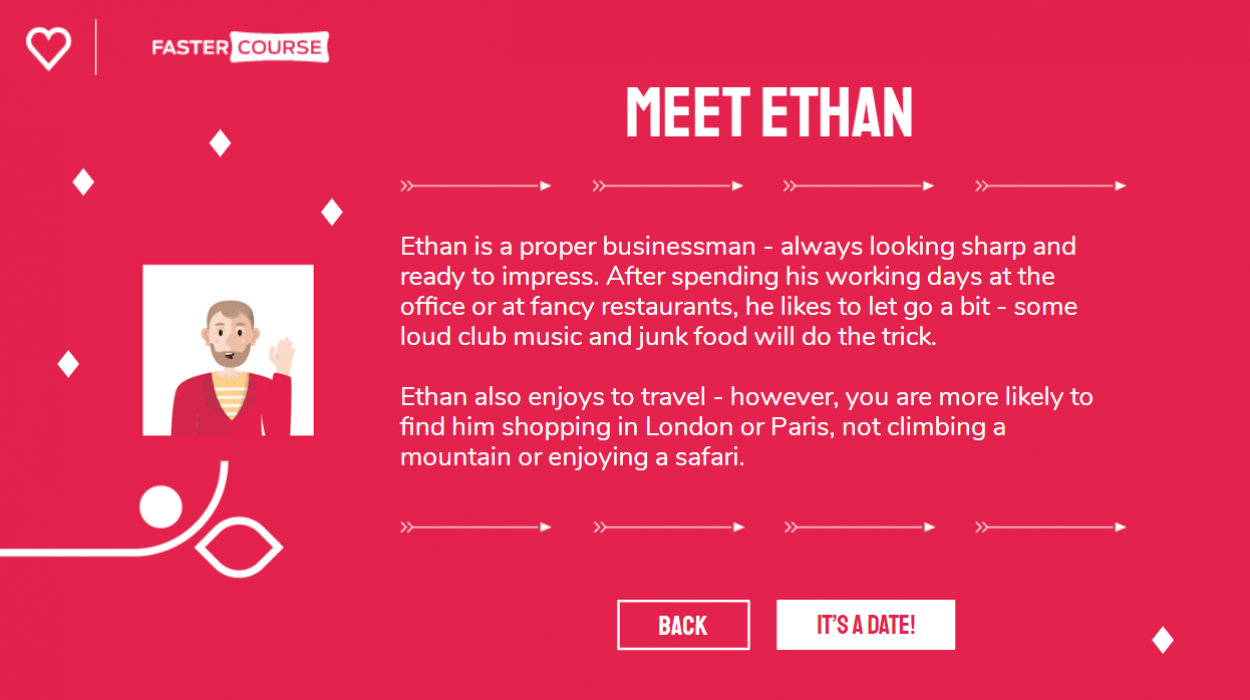
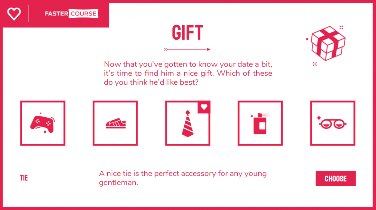
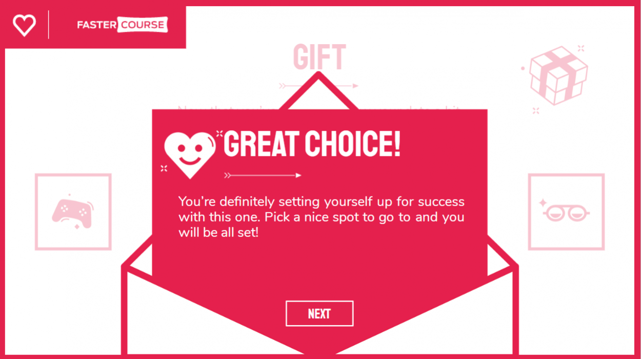
Dating game
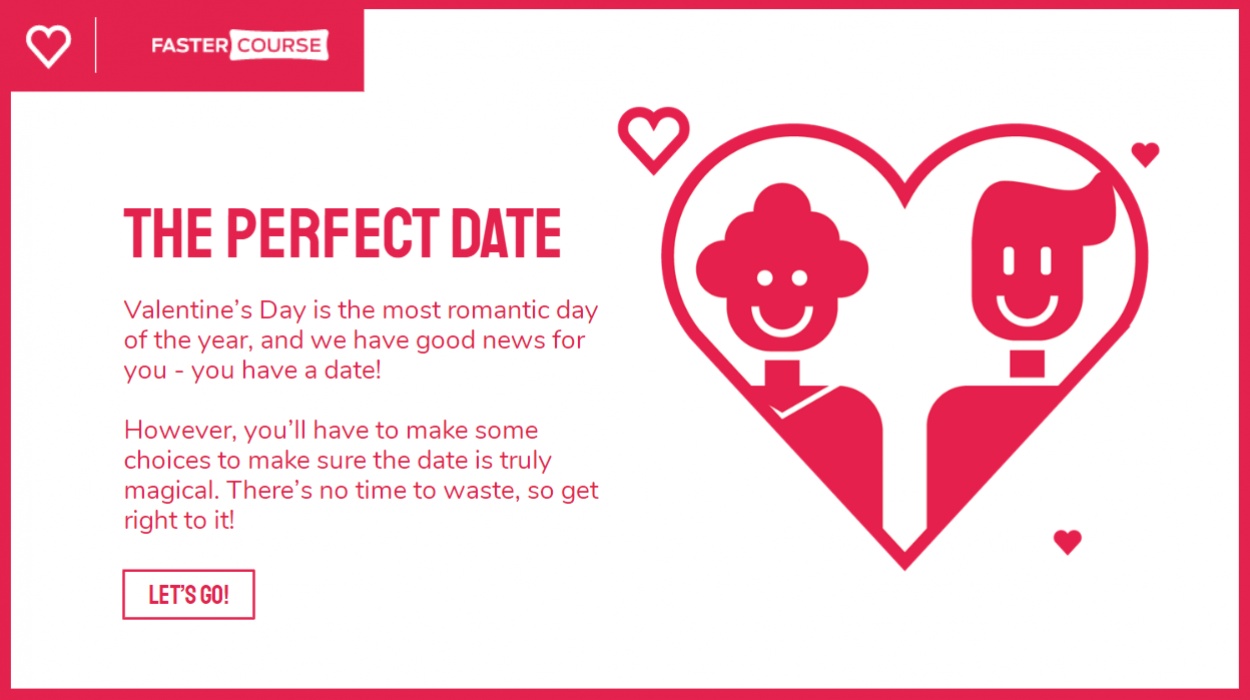
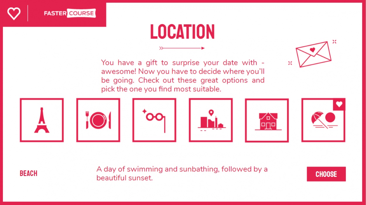
This little game is not only adorable, but also contains several nice elements that you might find useful. First, you can select a person (in this case, a date) and read some background information about them. Then you need to pick the best things (gift and date location) for this particular person. Feedback after each selection lets you know if your choice matches the description you read earlier. This type of game is great if the learner needs to recall facts and make informed decisions.
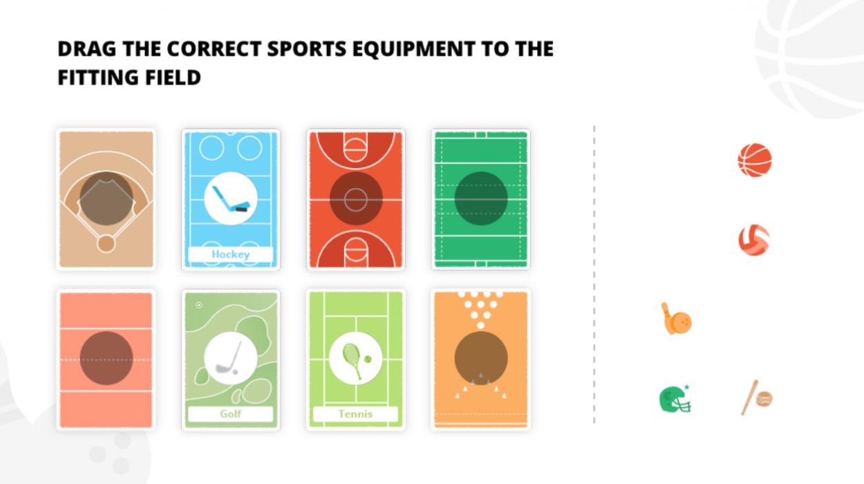
Sports matching game
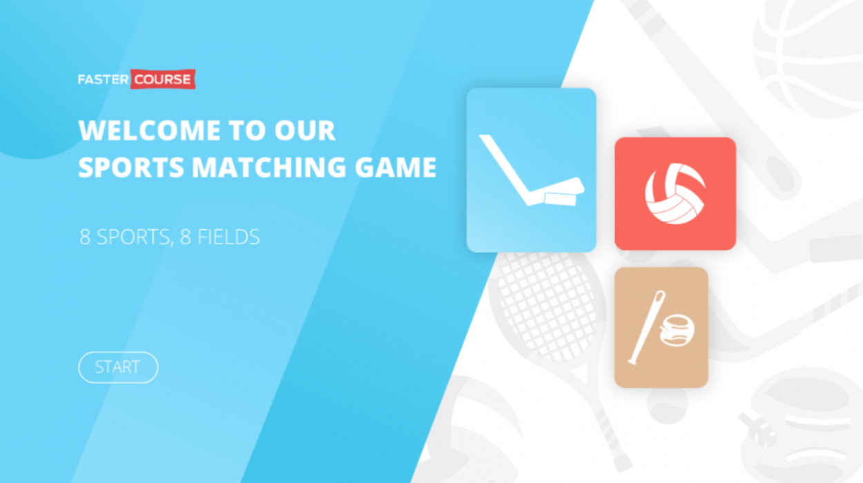
The objective of this game is quite simple – prove your knowledge by matching each piece of sports equipment to the corresponding field.
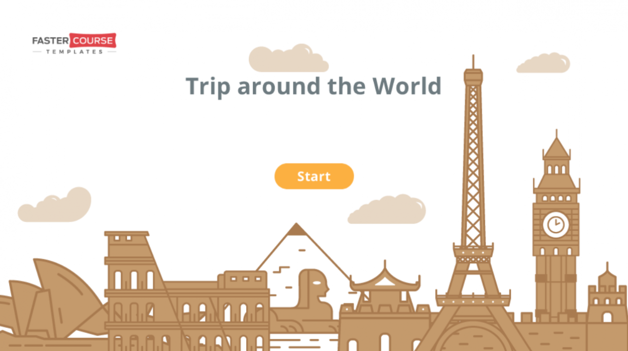
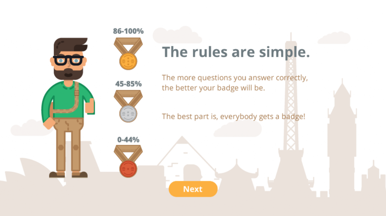
Trip around the world
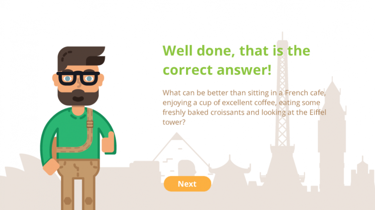
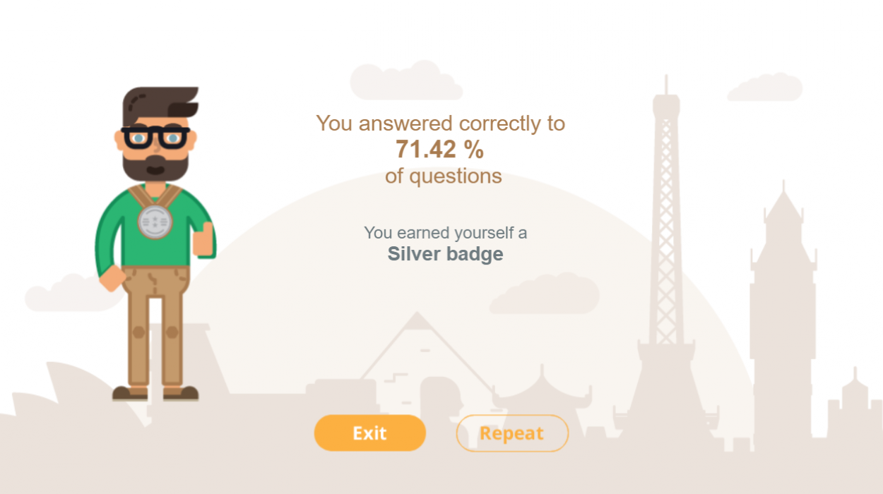
This game is interesting because it features badges as a reward. The more questions the learner gets right, the better the badge that they’ll receive.
…But there’s always more!
Well, that’s it for now. We hope that you found this template list useful and inspiring! E-learning is so great because it keeps changing and offering new and exciting features all the time, so you can expect further updates to this list in the future. All the screenshots are from templates that are part of the FasterCourse template library. If you feel like seeing all of them in action you can take a look at demos.
Explore all e-learning templates
This post covered all template types, but not all templates, we have hundreds of template design variations that were not featured here. Explore hundreds of course starters, games, click & reveal, info pages and other test and quiz templates. If you want to see all the demos and explore FasterCourse template library click below.





Comments