Hello, Everyone!
About a month ago, Articulate started their external experts webinar series, and I was really happy to be the first guest in a webinar hosted by one and only David Anderson from Articulate. It was really a lot of fun. And this time I tried to show what is under the hood of FasterCourse templates, and dive a bit into the whole template creation process.
You can watch the webinar in full on Articulate website here:
https://community.articulate.com/kb/storyline-tips-tricks/going-under-the-hood-of-a-fastercourse-storyline-360-course-template/1225602
However, if you prefer reading rather than listening, here are a few main points from the one hour webinar.
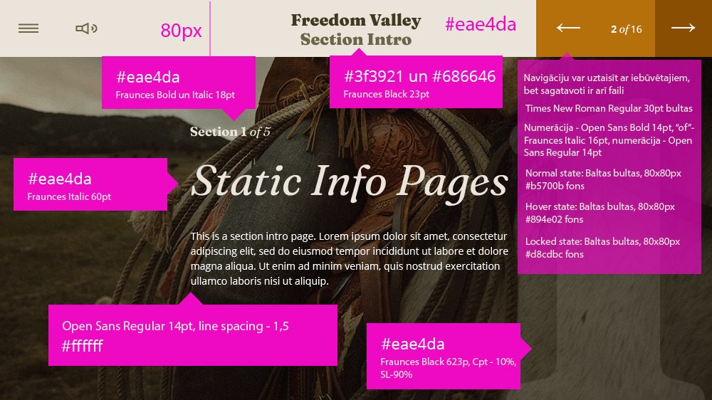
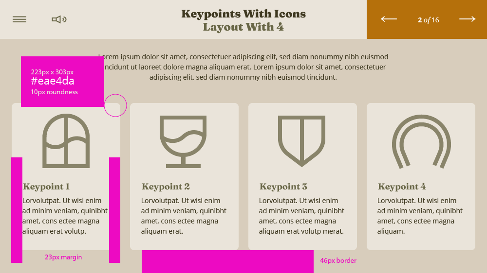
1) FasterCourse when creating templates, use a team of graphic designer and Storyline developer, and so far those have always been two separate people. It is possible to find people who are great at graphic design AND development, but that is not super often. So our process starts with graphic designer creating sketches, getting them approved, and then preparing production files, that include sketches with notes, icons, pictures and other assets for the development. Here are a couple of examples of real life sketches. We are Latvians, so some of the notes are in Latvian, some in English as sometimes it is easier to convey the message, as Storyline is in English and sometimes in broken English :).
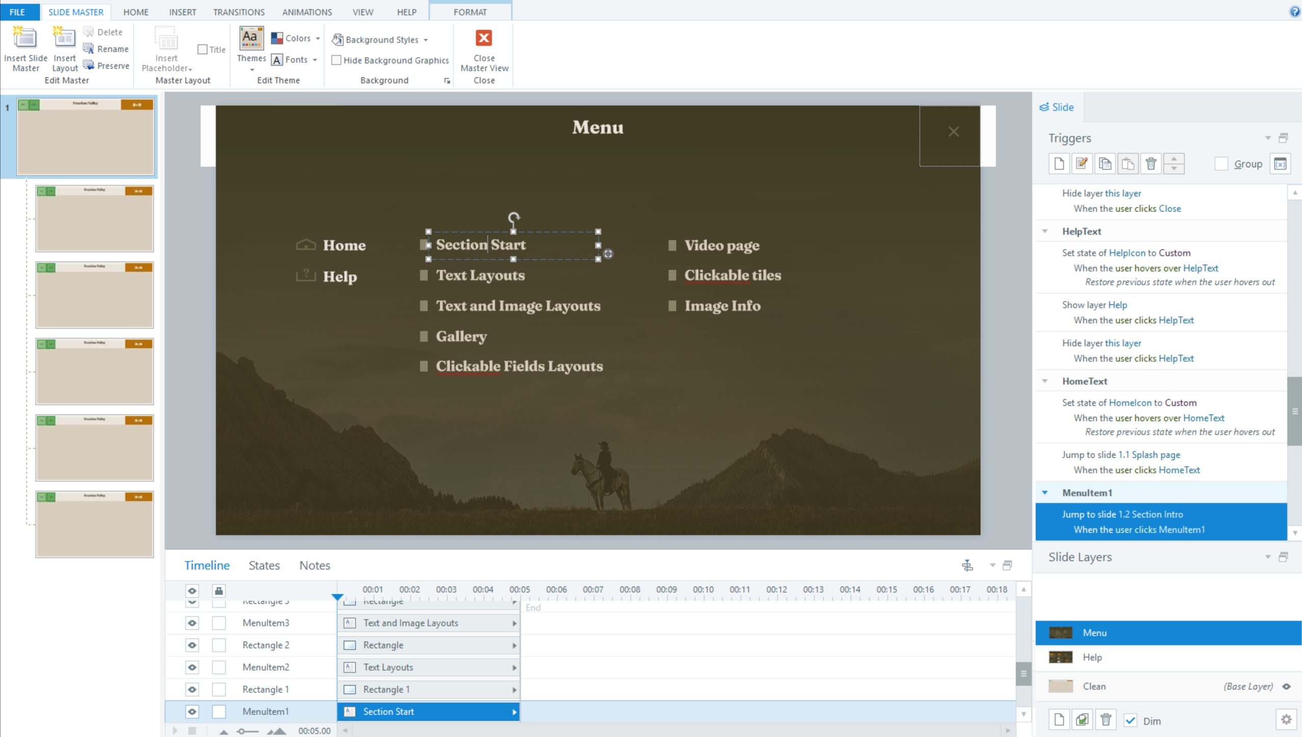
2) We love to use Slide Master for Menu pages. Sometimes people cannot find where we hid the Menu page, and how to change it. Well it usually is in the Slide Master in a separate layer.
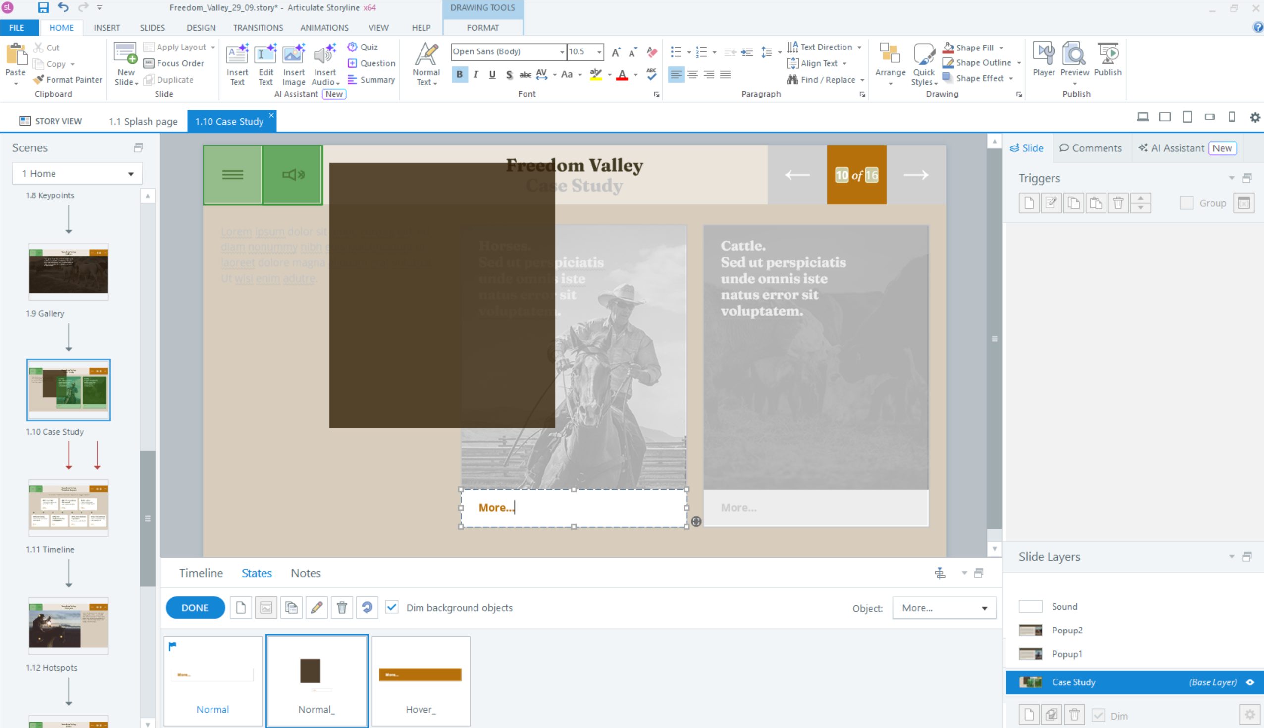
3) A great feature in Articulate Storyline, that we like to utilise a lot is “Object States”, we love to play around with the “Hover” and other states to create visual effects needed. Here is a screenshot of a real life example, where several object have been added to “Object States”.
Bonus Question
I was asked why we don’t use Powerpoint for graphic design. And to be honest I was surprised, because it never occured to me that Powerpoint is used as a graphic design tool, because in our humble opinion that is not its strongest suite. Of course if you like doing it, please continue, whatever works. But to answer the question, designers are used to Adobe Illustrator and other graphic programs like Figma, as they are easier to work with, they are more precise, and work in pixels, rather than inches. I consulted our designers about this, and here is brief answer from our design team:
Even though Powerpoint has been developing a lot lately, Adobe Illustrator and Adobe products are still the industry standard for graphic design, as they are very convenient to use, to creat logos, infographics, iconography, posters and other visual materials, that require scalability and precision, that you cannot achieve in Microsoft Powerpoint. Adobe Illustrator and similar programs allow much better control over forms, lines, text etc. Toolset allows to create simple and also sophisticated illustrations, by using gradients, masks, effects, and other tools. Illustrator works well with Adobe Photoshop, After Effects, and other Adobe Creative Cloud tools, that can be critical in complex projects, where different file types are used, and files need to be delivered to end client in a format that is convenient for him or her. Our suggestion is also to experiment with new tools like Figma for elearning design creation. As Figma has become a really logical choice, as it is one of the leading tools in the industry due to its ease of use and pricing model. However, we believe it is still easier to create illustration in Adobe Illustrator, but for the User Interface design – which is essentially elearning design, Figma is absolutely great.
Btw this is not an advertisement, meaning Adobe or Figma does not pay us for this :).
Thank you, let me know if you have any questions.
Best Regards,
Karlis
Comments