It’s nice. But… Maybe make it a bit more interactive.
If you’re in the business of producing eLearning content, chances are you’ve heard this phrase before. Every client will have a different understanding of what makes eLearning ‘interactive’. However, I find in many cases they just want the learner to click something. Anything.
Although I fully support using the occasional click-reveal interaction, I strongly believe it should have a purpose that goes beyond ‘the need to click’. Therefore, I want to take some time to consider meaningful ways of using click-reveals.
Type of content
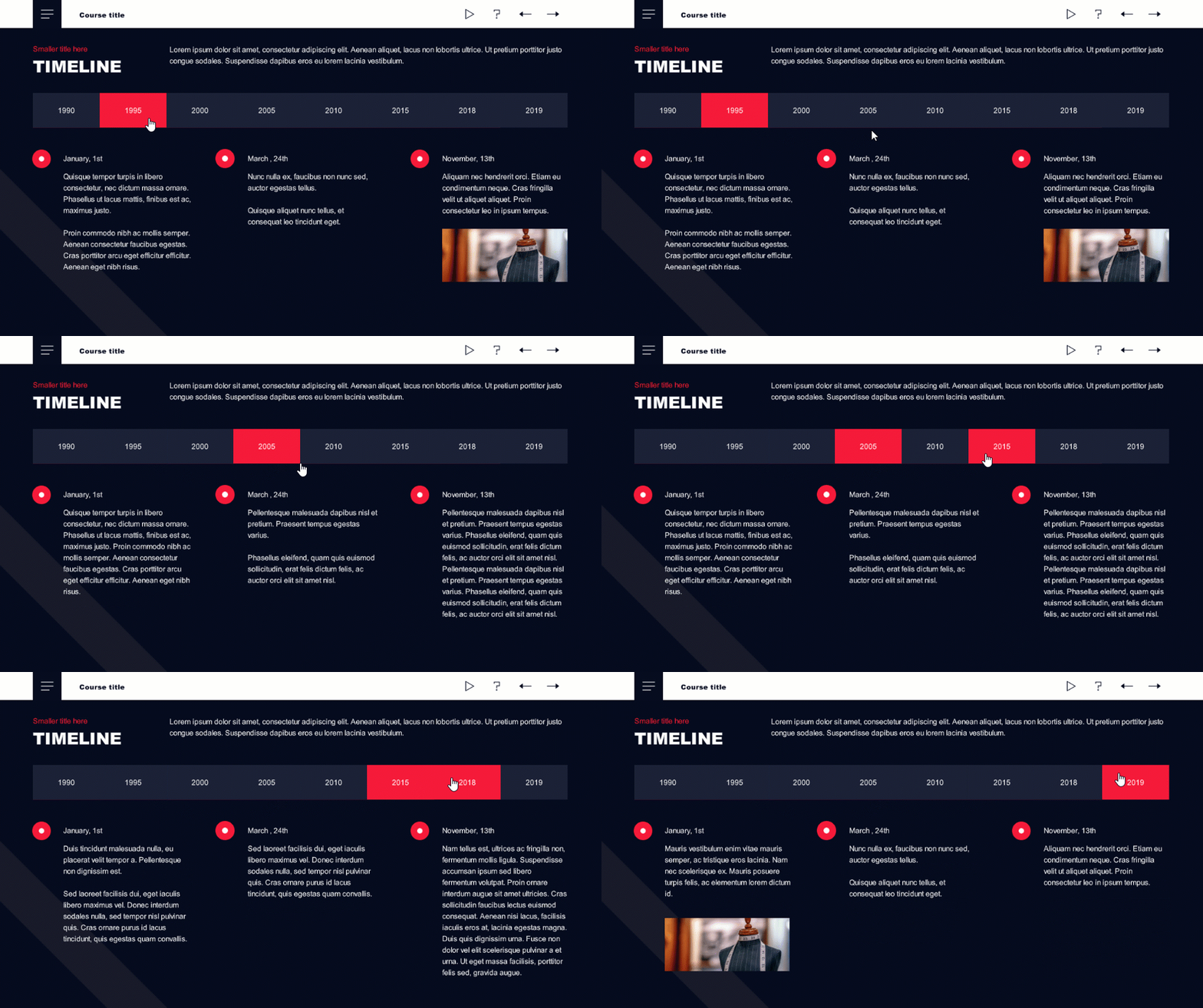
There are certain types of content that are a perfect fit for particular click-reveal layouts. For example, if the content describes a timeline of events or a sequential process, you can really do the learners a favor by arranging the content into a timeline/process type of interaction. This way, the learners will see the process as a whole as well as have access to more detailed descriptions – all on the same page.

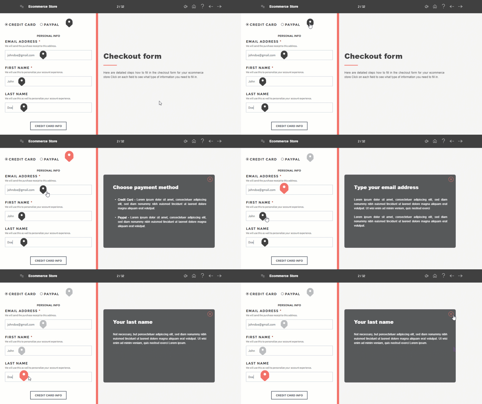
Another case when the clicking really pays off is if you need to describe an image, for example, sections on an application form or the parts of a piece of equipment. A nice hotspot interaction will enable the learner to read the descriptions as well as see what they refer to.

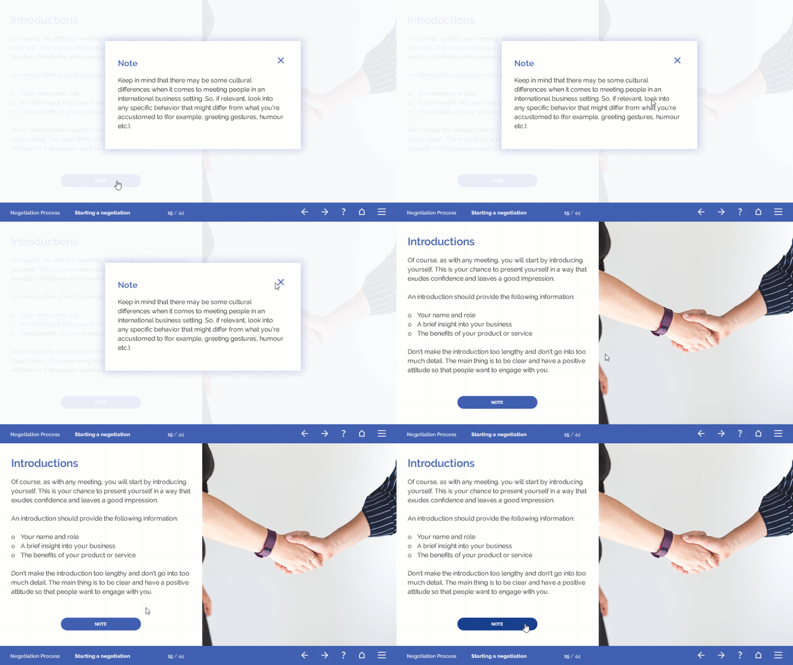
Although it’s an instructional design ‘sin’ to include good-to-know information into our training, sometimes it happens whether we want it to or not. I find that if the information really is additional rather than compulsory, you can ‘hide’ it in a pop-up and leave the ‘to read or not to read’ dilemma in the hands of the learners.

Amount of content
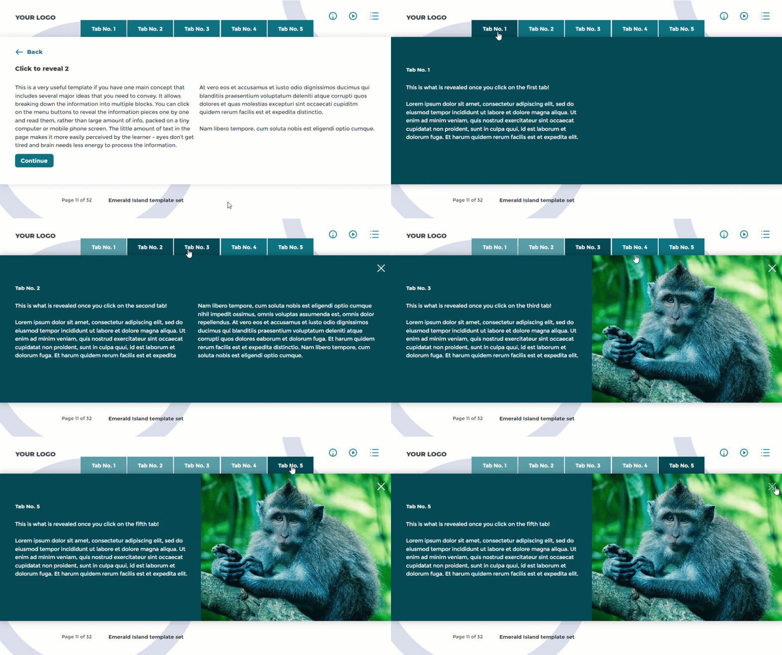
Another factor that, to my mind, can justify click-reveals is the amount of content that you need to present. If you’re putting together a storyboard and see a long string of text-image pages, it’s very possible that they can be merged together in a layout with tabs or a slider. Although the amount of content won’t change, it will reduce the page count and make the learner’s life a bit easier.

Click responsibly
There are many great click-reveal layouts, but it’s important to remember that clicking alone won’t do much for engaging your learners. If the content isn’t great, revealing it with a click won’t make any difference. So, as with many things in instructional design, it’s always worth asking yourself (or your client) “Why?”.

This way, you can make sure that the image, layout, interaction or anything else you think of adding, truly supports the content and the way it’s perceived by the learners.
Explore all e-learning templates
Explore hundreds of course starters, games, click & reveal, info pages and test templates. Click the button below and see all of our e-learning templates!


Comments