Today I want to share some simple pieces of advice that can help you when designing your elearning projects. By being aware of how we perceive what we see, you can structure information in a way that will bring out the most important things and make the overall look of your elearning more tasteful and neat.
I will talk about a few general elearning course design principles that will help you when developing or updating your e-learning, but you will also find them useful in any other daily work that requires a ‘designer’s eye’. They will be especially valuable for beginners who are taking their first steps in instructional design.
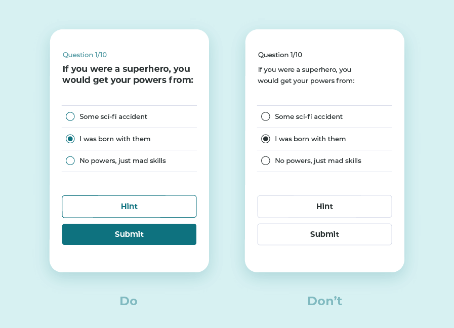
1. IF IT’S IMPORTANT, MAKE IT STAND OUT
When looking at several similar objects, you will notice the one that differs. This works with anything, starting with marked text in a book and ending with CTA (call to action) buttons.
Color is not the only tool for making an object stand out – you can also use size, shape, whitespace, underlining, typeface, animation etc.
Take into account that if you highlight too many items, you lose the isolation effect and are at risk of creating unnecessary noise.
A common use for this principle could be, for example, drawing attention to the most important buttons in the layout.
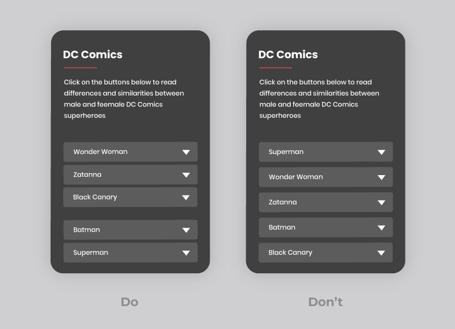
2. GROUPING
We have a natural tendency to organize, group, join and sort items. Things that are near one another will be perceived as a group of items that are somehow linked, as opposed to things that are placed further away.
If you’re aware of this, you can place objects more thoughtfully, so that the user wouldn’t have to struggle to understand what the relationships between these objects are. As you can see in the examples below, we have grouped the superheroes by gender as it is stated in the slide instruction text.
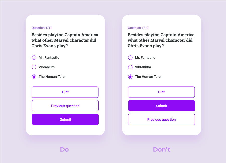
3. FIRST AND LAST IMPRESSIONS
When it comes to positioning, the first and last objects are the easiest to remember. For example, in mobile apps, the most important (and most often used) action buttons are often placed in the first or last position. The same goes for e-learning slides, where you should place the most important information at the beginning and at the end (for example, place the most important button first or last, but not in the middle).
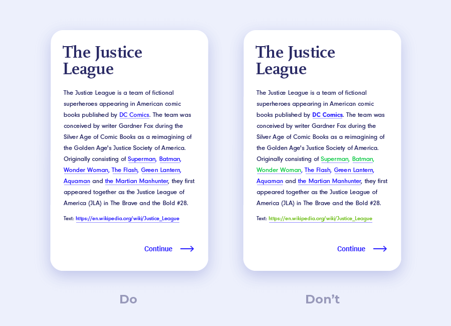
4. SIMILAR OBJECTS – SIMILAR FUNCTIONALITY
Elements can be grouped according to common visual characteristics.
If we see visually similar objects, we will not only group them together, but also assume that they all have a similar function. For example, if we view a section where the function of green buttons is to confirm something, we will automatically assume that a similar button in a different section will still do the same thing. Another example – if hyperlinks on a page are underlined and marked in blue, we expect the same principle throughout.
If you are consistent and stick to the same formatting for similar elements, the users will develop patterns that will allow them to navigate your content quicker and easier.
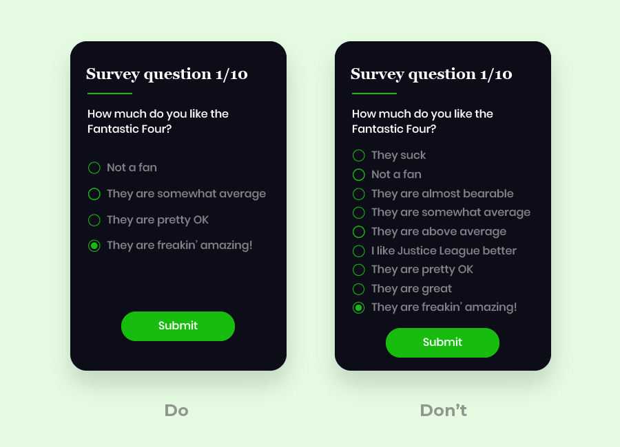
5. DON’T OVERWHELM USERS
The more options we have, the longer it takes us to decide.
So, you can draw a simple conclusion – don’t overwhelm your users with options. If you have no other choice, you can take advantage of the similarity principle and use visual similarities to present the options in groups.
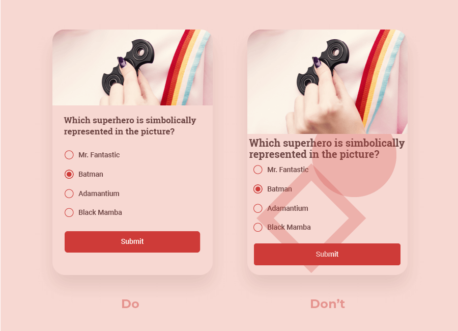
6. EMBRACE WHITESPACE
Whitespace is empty space (not necessarily white) around and between elements. It’s important to understand that whitespace is not a waste of space that could be occupied by more content. In reality, sufficient whitespace is essential for getting your content across successfully.
If a page is cluttered with elements, the users won’t know where to focus their attention. This is why you need proper line spacing and paragraph margins to ensure good readability. If there is space around an element, the user’s eye will be drawn to it.
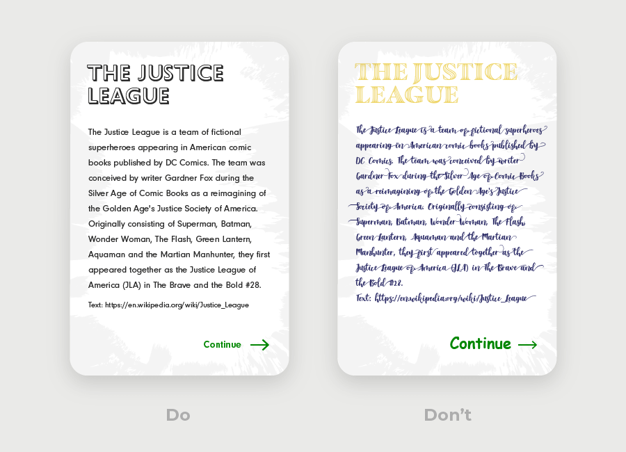
7. REALLY THINK ABOUT YOUR TYPEFACE
If your text is difficult to read, people may not bother – makes sense, right? So, you have to be careful about what typeface you choose. Usually, Sans Serif typefaces will be easier to read on a screen. The more distinctive the shape of each letter is, the more legible your text will be.
Don’t forget about size and color, too. The text needs to be readable on different devices, and the contrast ratio needs to be sufficient – you can consult accessibility guidelines to determine what font size and color contrast will work best for your users.
You should also restrain yourself from using too many different fonts in one project – just one or two should be sufficient.
References:
good post with valuable visual examples.
Great tips!! I will keep them in mind as i design.
GREAT, THNX!